
1What did HOHOHO emphasize when rebranding From Xoy?
We strived to build a brand concept and a solid brand identity by defining its direction, value, and giving the brand its own personality.
2Please tell us more about the process from identifying a brand concept to creating a final outcome.
First, we conducted an interview (i.e. we defined the brand direction, value, and personality). Second, we studied other brands in the market. Third, we understood the strengths of From Xoy and what to improve and defined its personality as being “friendly, bright, and trusty.”
Fourth, we learned that the name “Xoy” is in fact an English name of the daughter of the CEO. We began to think that “Xoy” is a character with outgoing, optimistic, and cheerful personality;this character conveys a message to audience and
we can find optimistic value from the message.
and cheerful personality; this character conveys a message to audience and we can find optimistic value from the message.
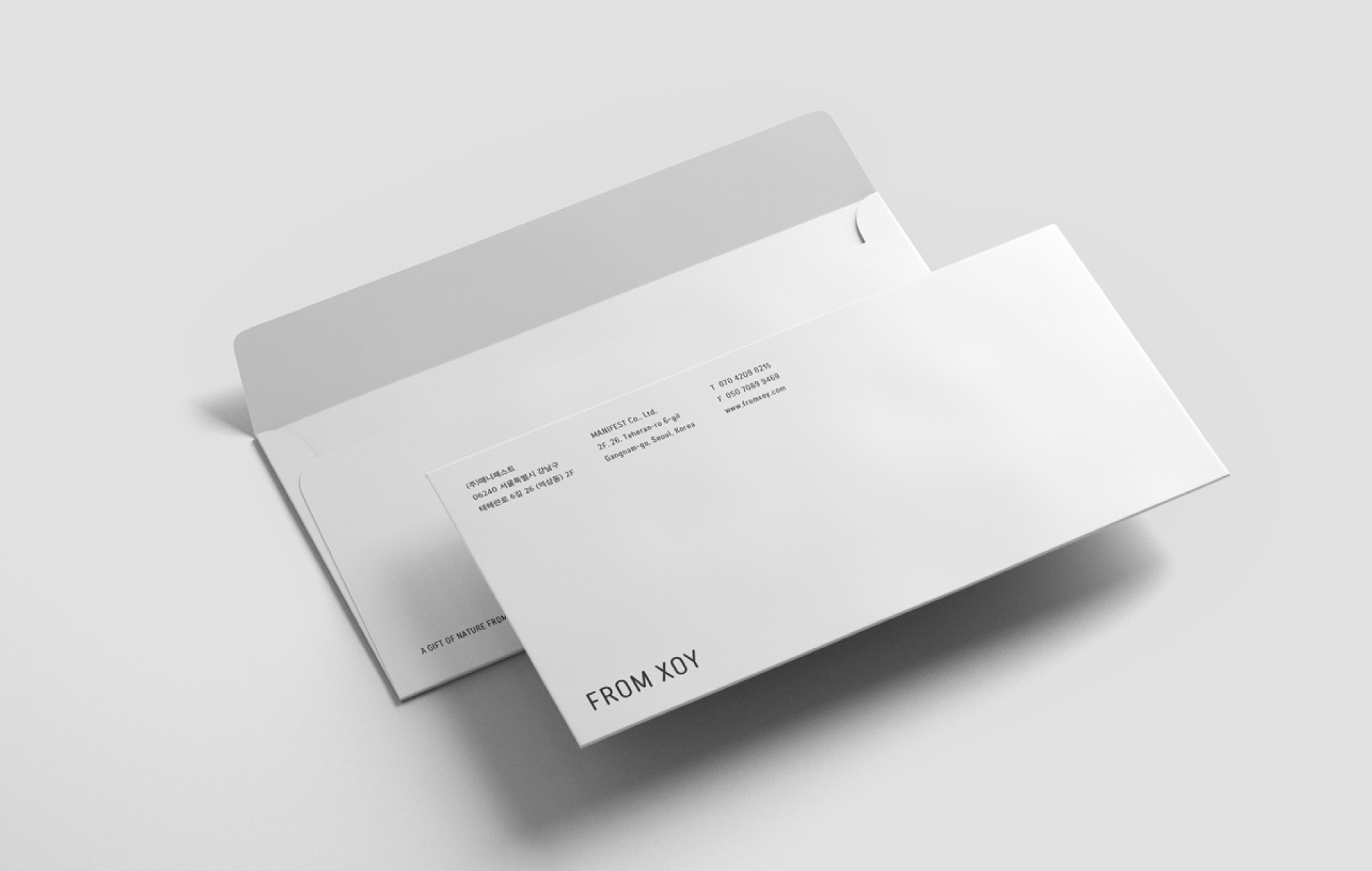
That is how we designed a brand identity. Xoy’s message helped us to come up with a metaphor of “letter.” The metaphor is an excellent medium to express emotion that Xoy has because people understand the expectation and joy that exchanging letters can bring. This idea became the background for design concept.
3We found many interesting elements such as the postage stamp of packaging. Is it from the metaphor of “letter” that you just mentioned?
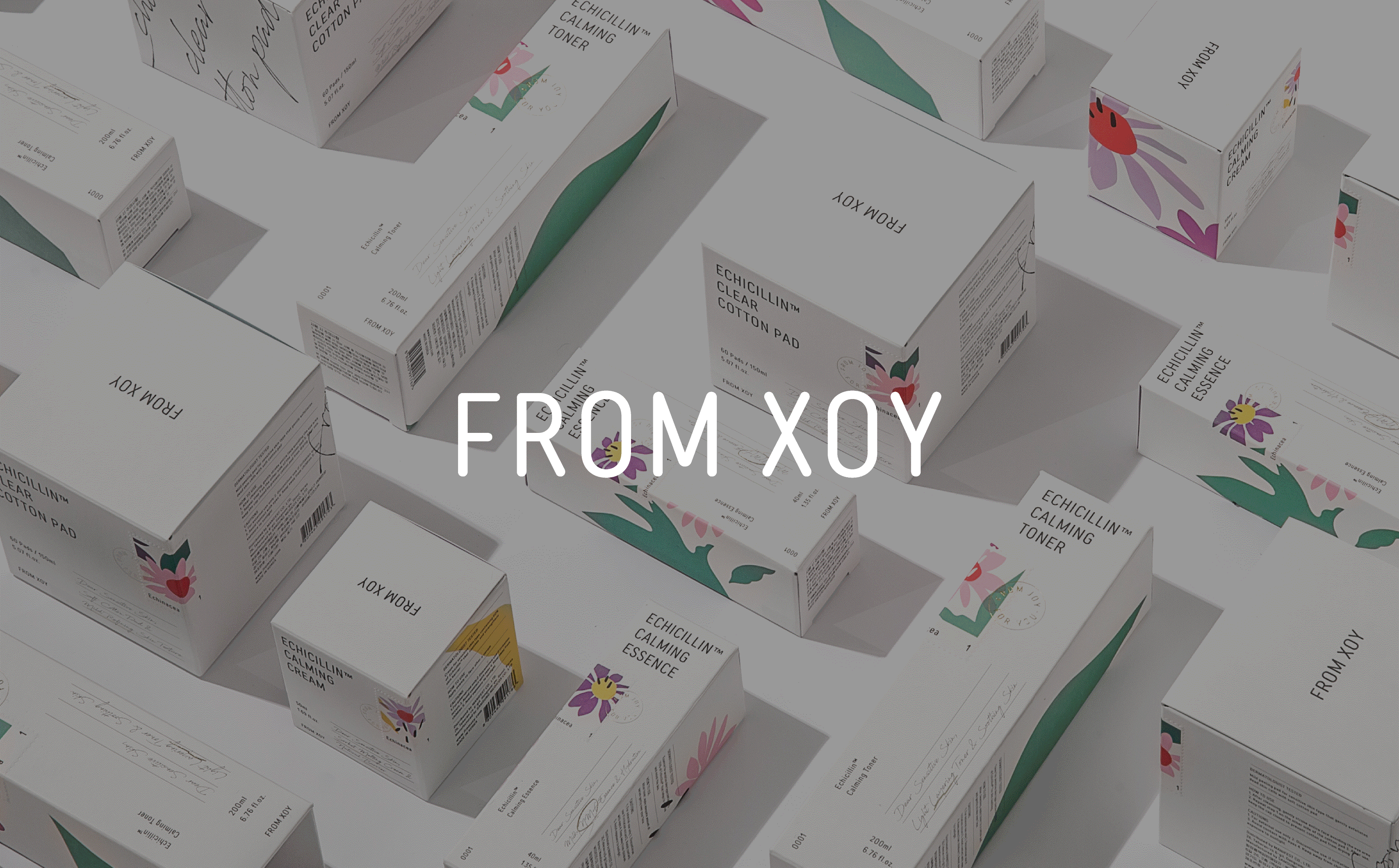
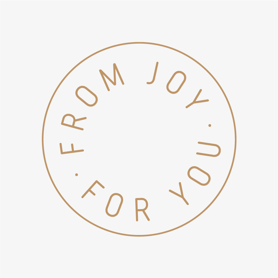
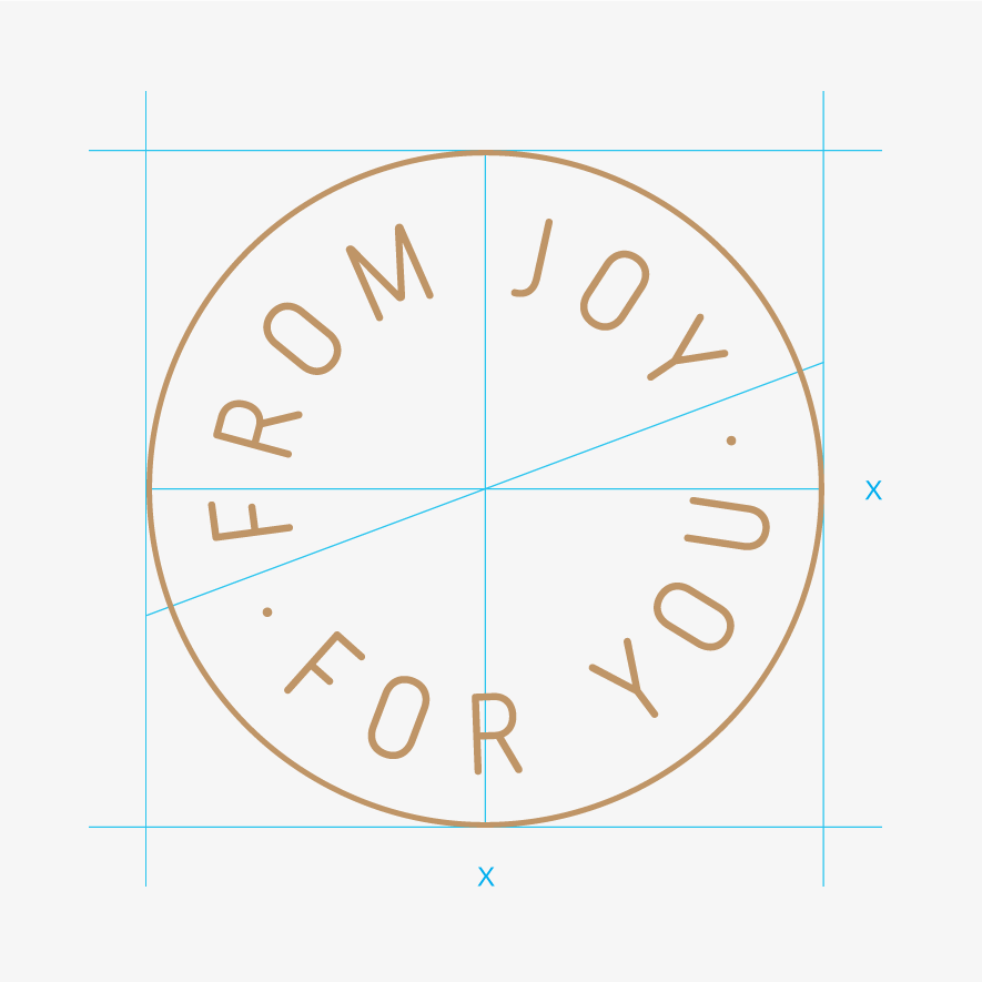
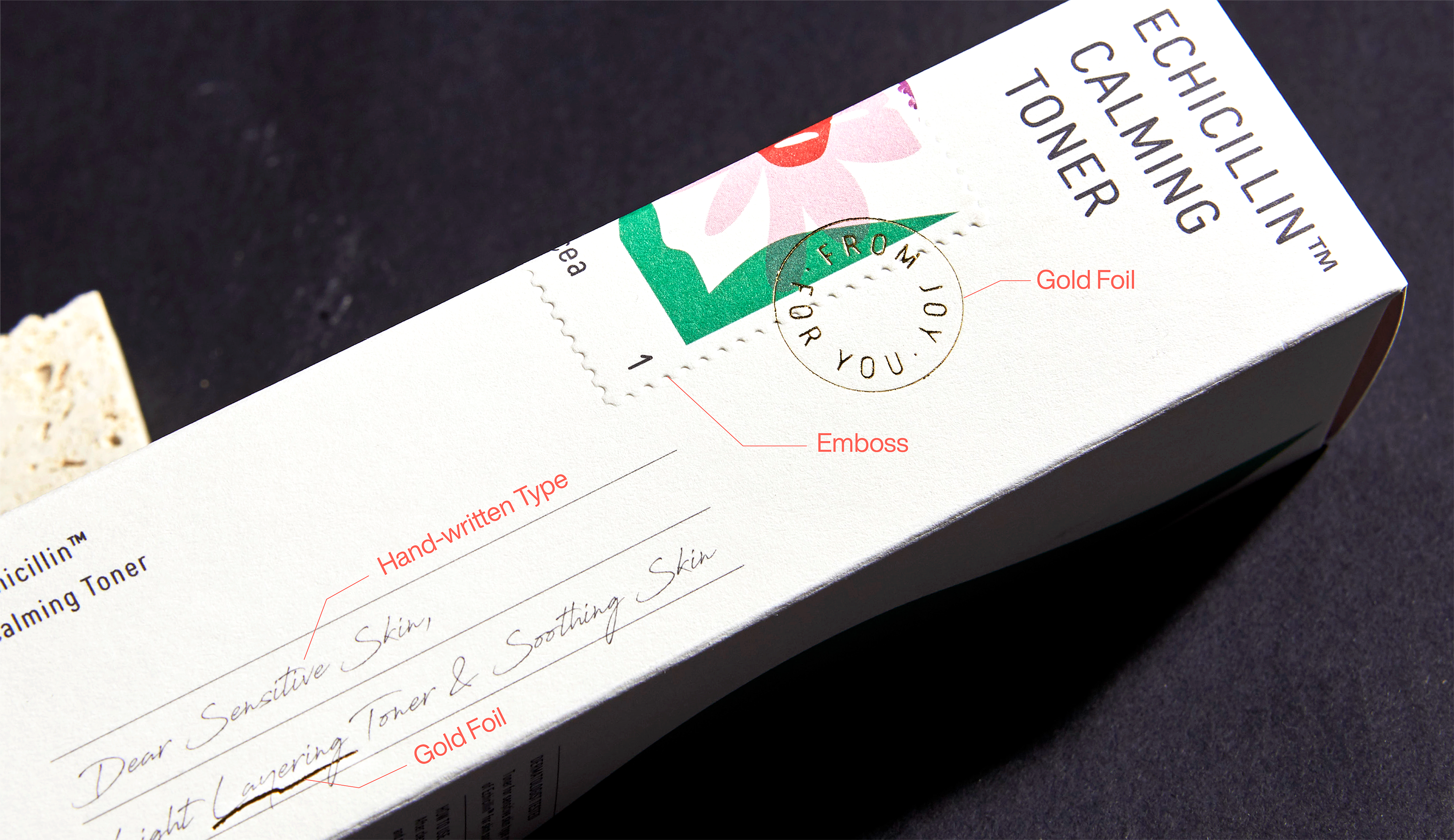
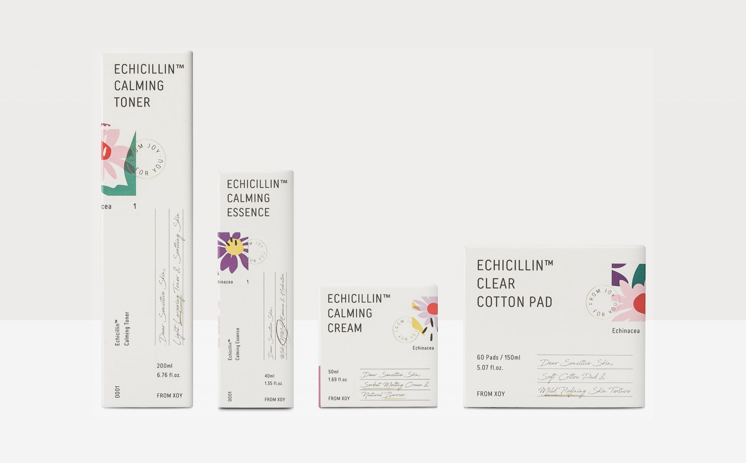
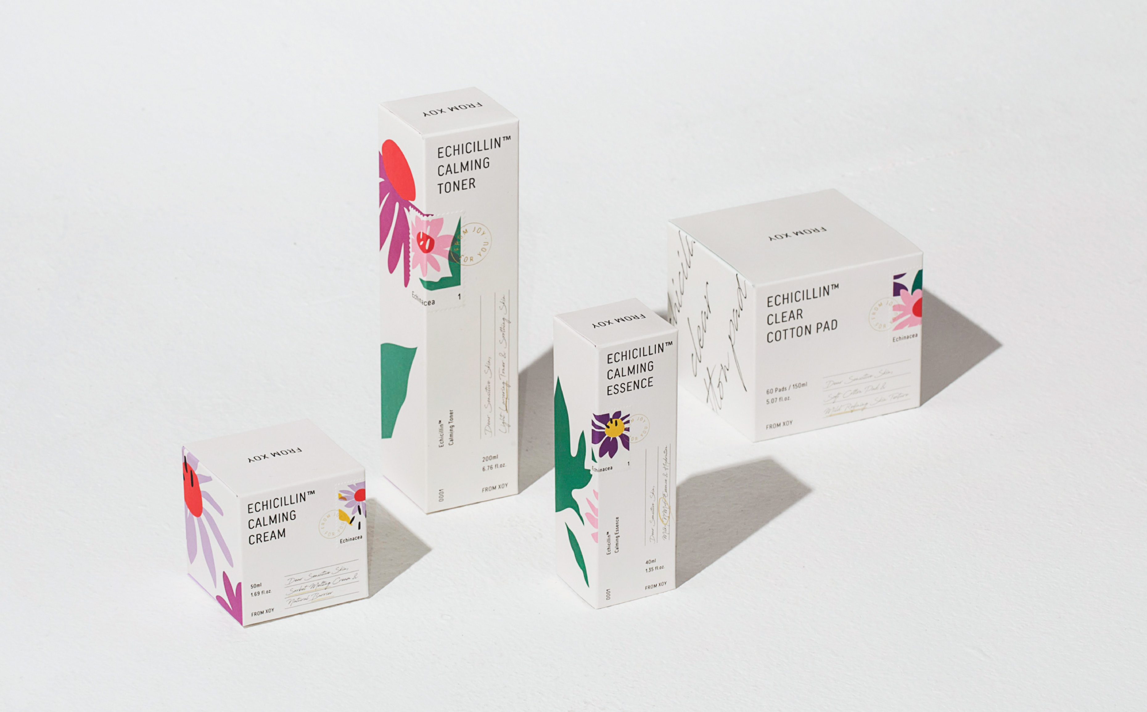
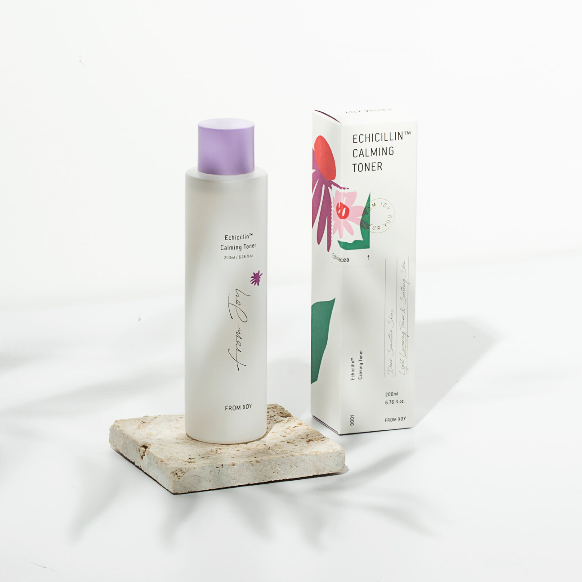
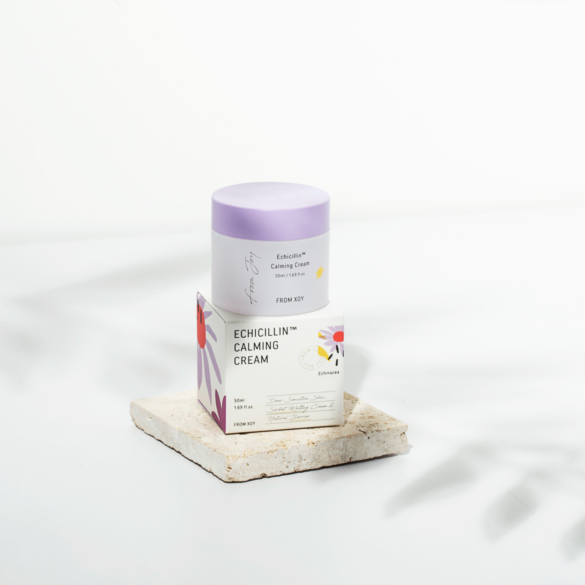
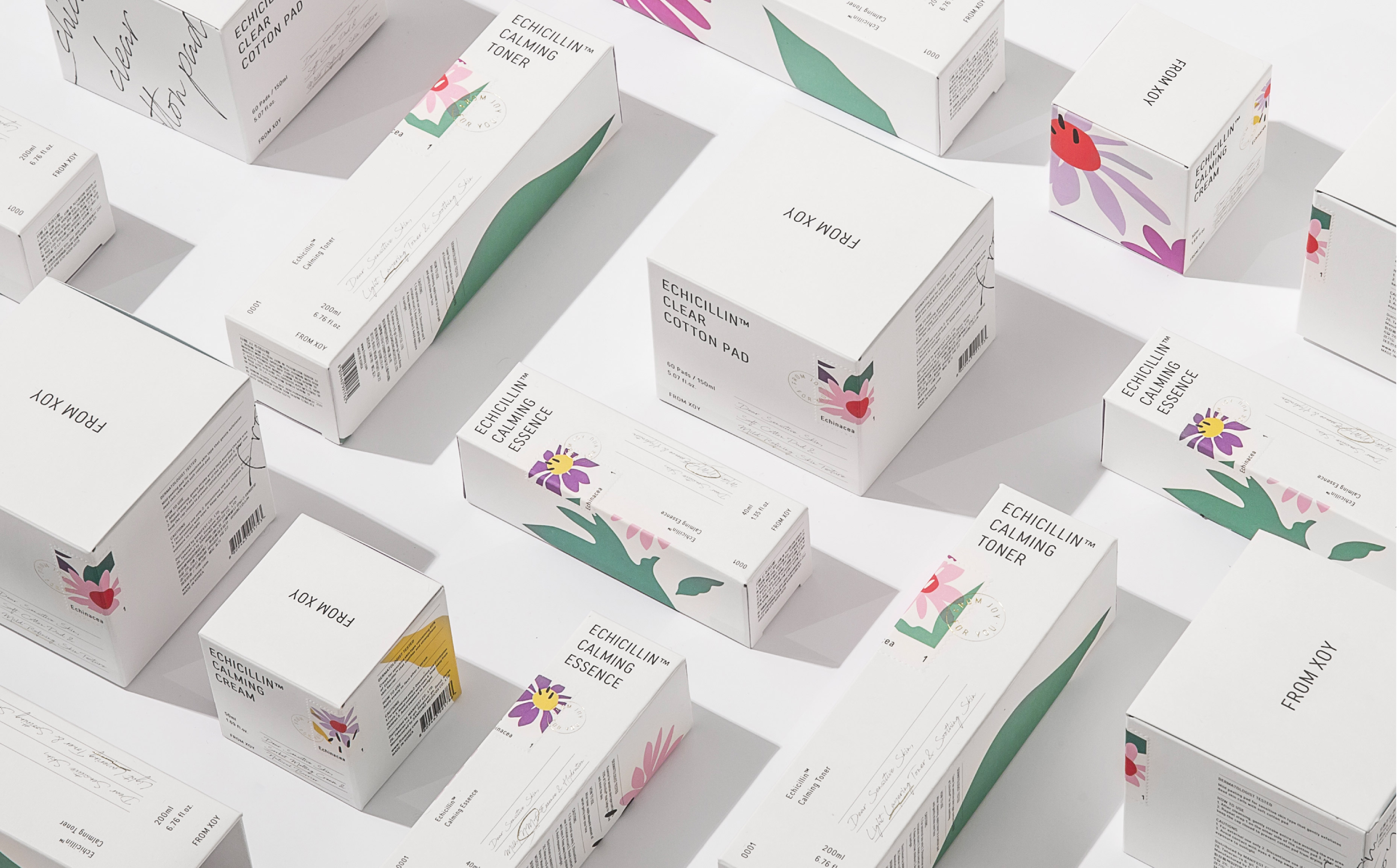
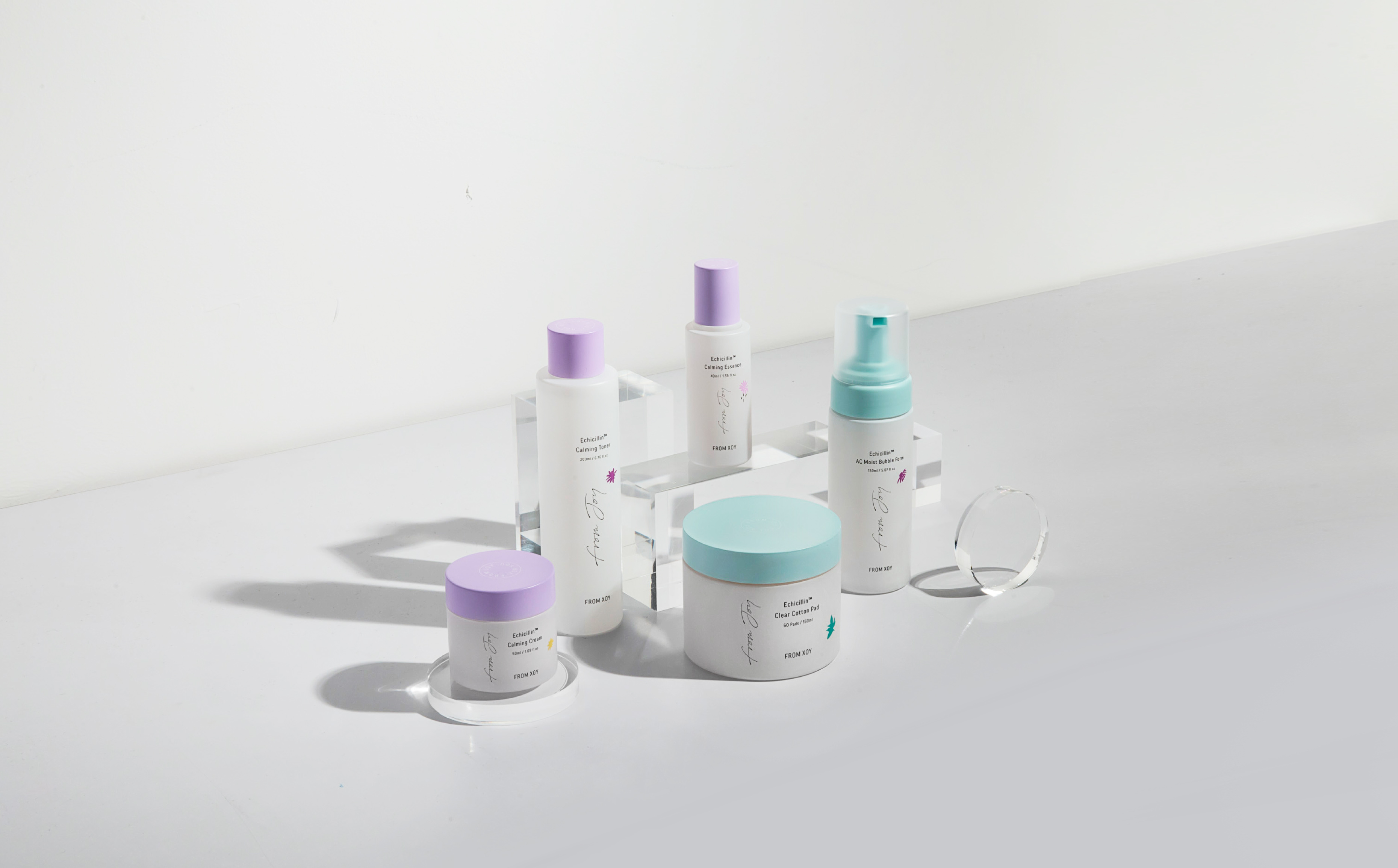
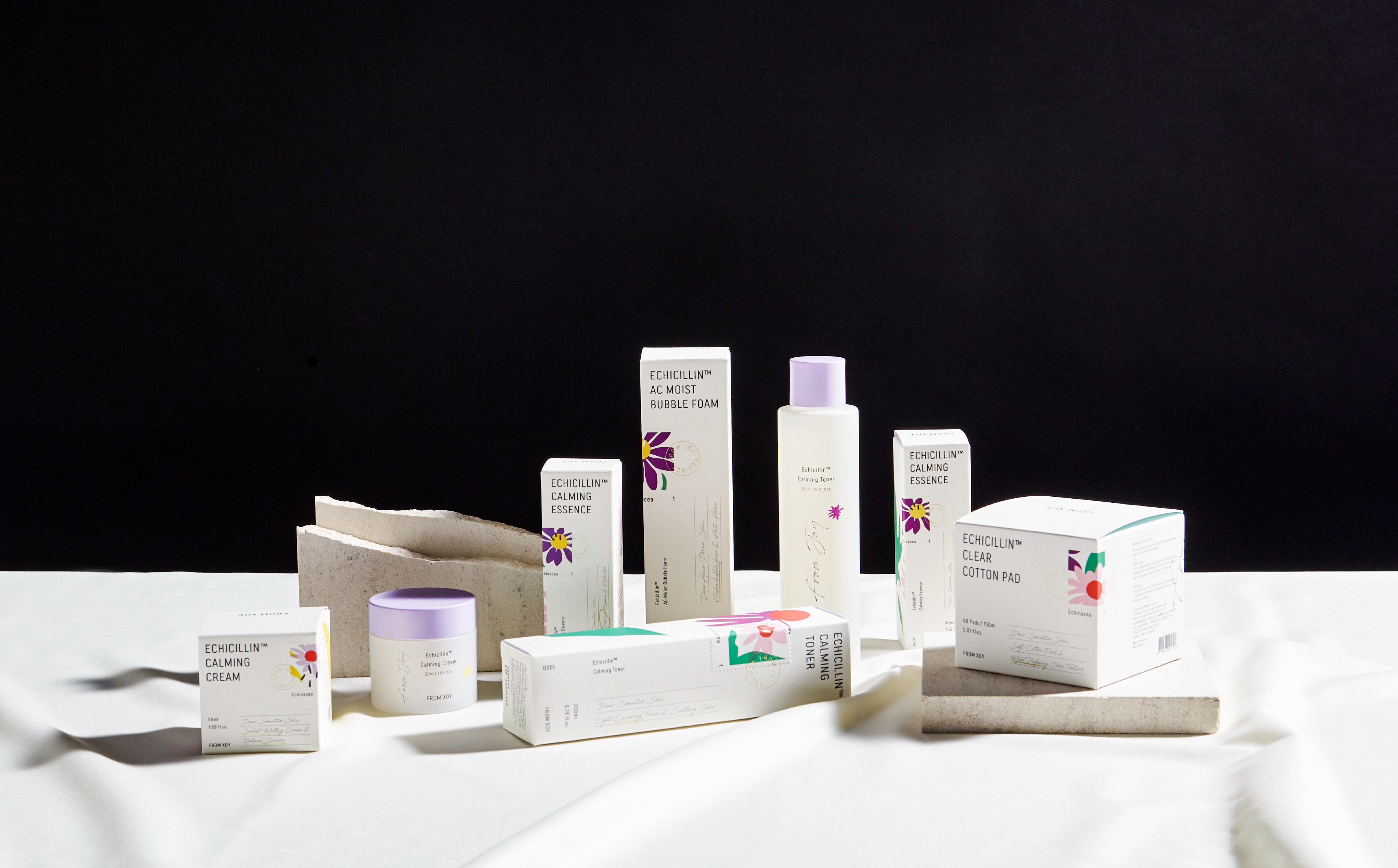
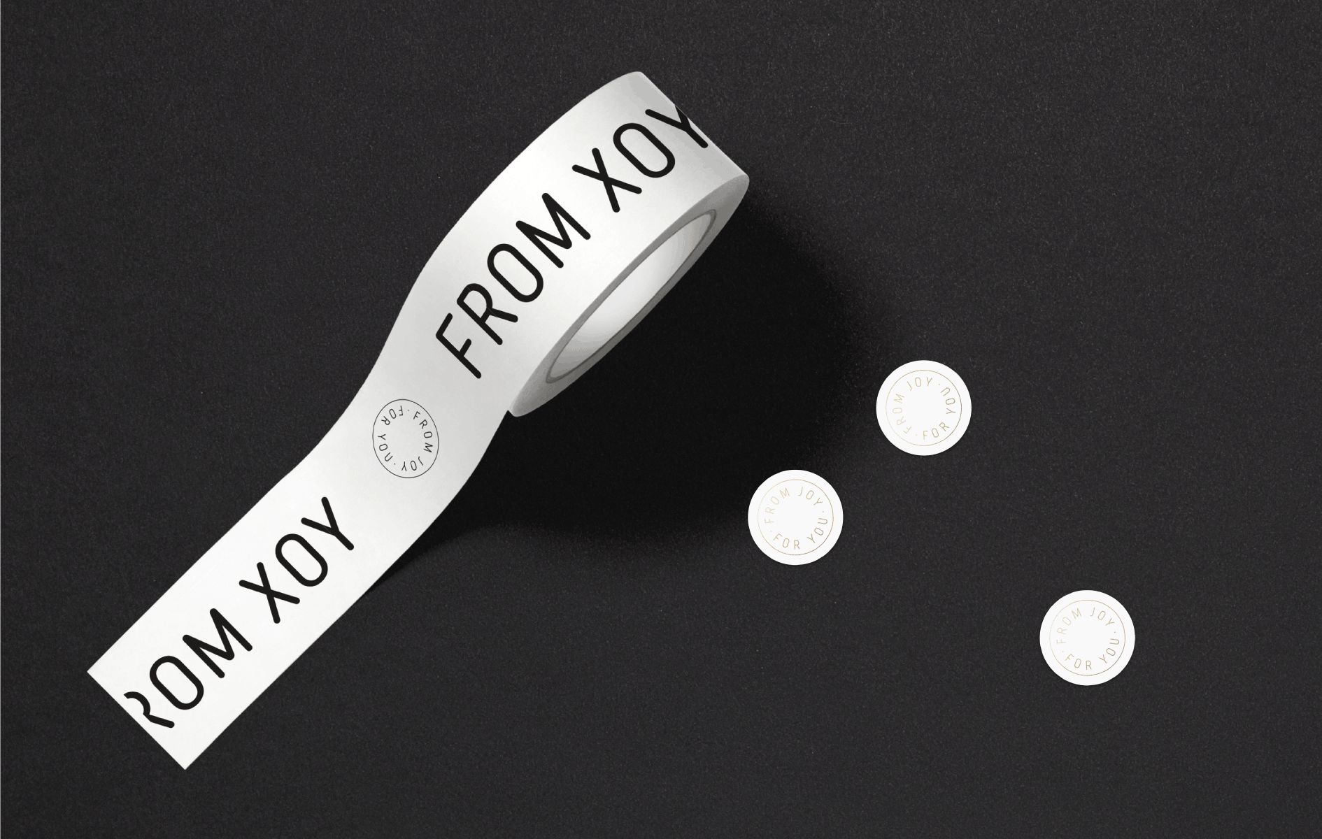
Yes. A letter is our main metaphor, and it is a medium to convey emotional and friendly image. We utilized graphic elements such as lines and written text from a letter. Moreover, we decided to use “postage stamp” as a metaphor because it always comes with a letter; a postage stamp can be interpreted as a platform because each country has a unique postage stamp. Therefore, it can differentiate a product by knowing where ingredients come from. We used postage stamp as a key visual element that can be applied to product lines. We considered how From Xoy will develop product lines with ingredients from different regions. In addition, we made the brand word mark seem like an old letter by blurring the lines. It expressed the emotional and friendly aspects of the brand.


4There are countless brands in the beauty industry, both offline and online. What was the strategy to differentiate From Xoy in the highly competitive market?
When we began the project and studied the market, consumers were concerned about the environment and potential harm that cosmetic product ingredients can have. The so-called “derma” cosmetics became more popular in the market, and the industry focused on safety when designing new cosmetic products.
When a market undergoes growth phase, there are many opportunities and risk factors. When we began the project, From Xoy did not have a strong presence in the market because the design was not coherent and the brand concept was unclear. HOHOHO decided to identify a clear brand identity to differentiate From Xoy from competitors.
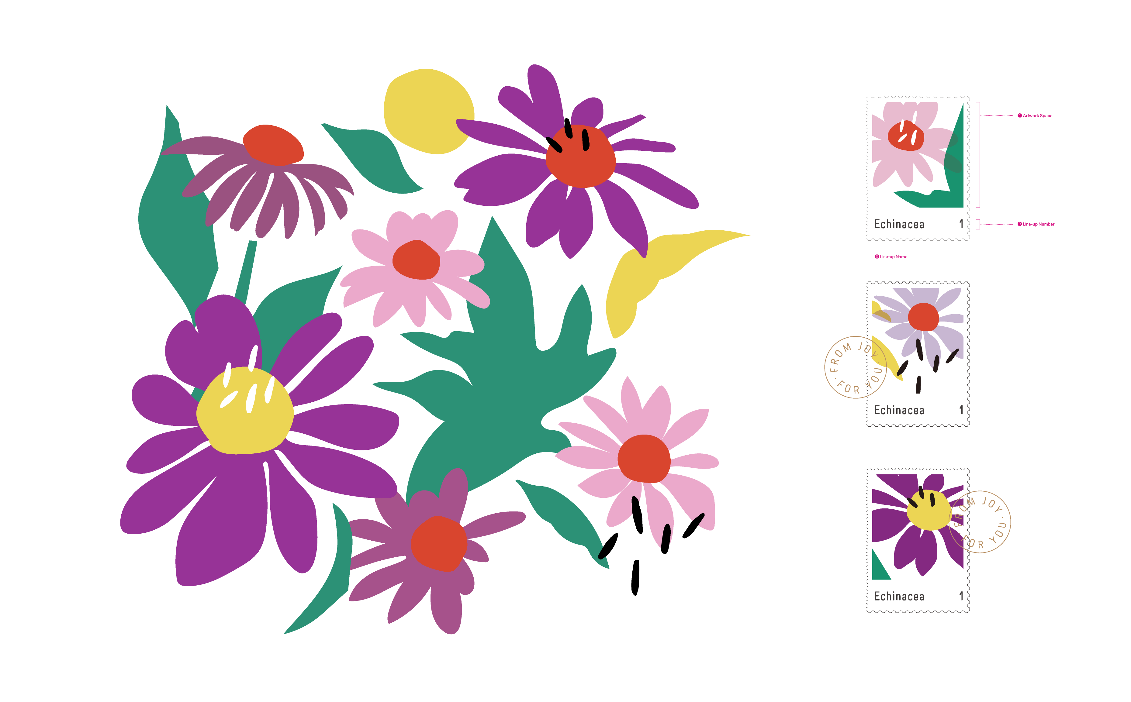
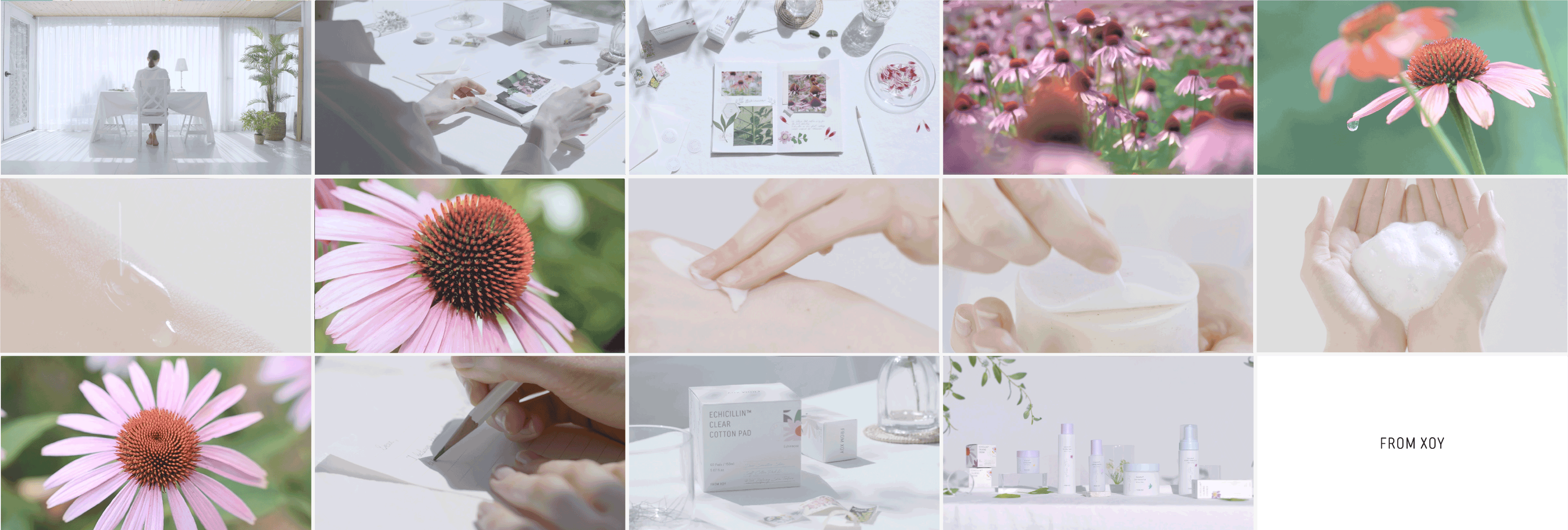
We learned that From Xoy has a skincare product line that consists of an ingredient called “echinacea.” This ingredient is not often used by other cosmetic brands. We added illustrations of echinacea and a letter motif to packaging. It clearly indicates the brand identity and the main ingredient is displayed to differentiate From Xoy from others.
5Was there a specific aspect to consider for a brand in the beauty industry?
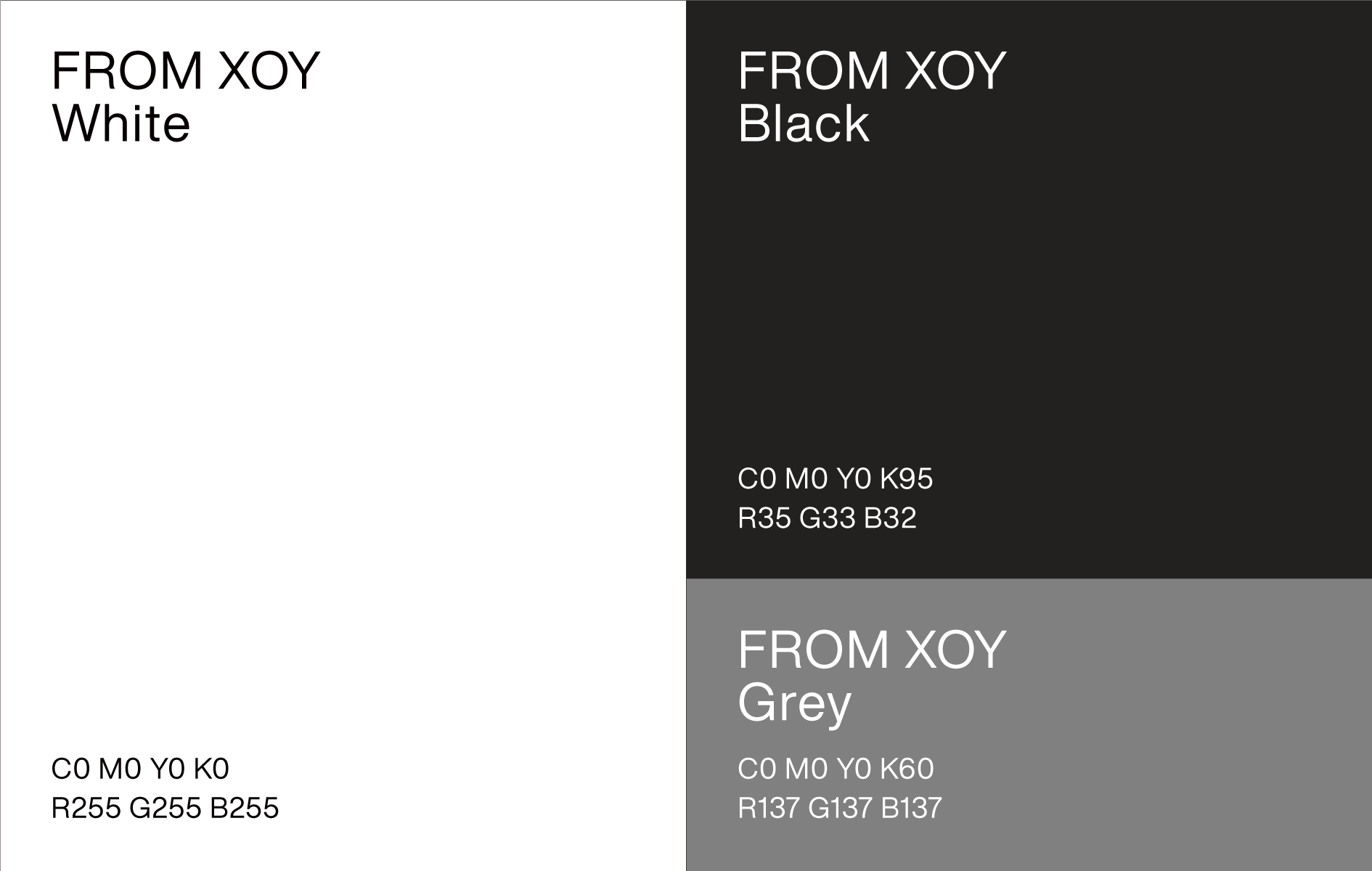
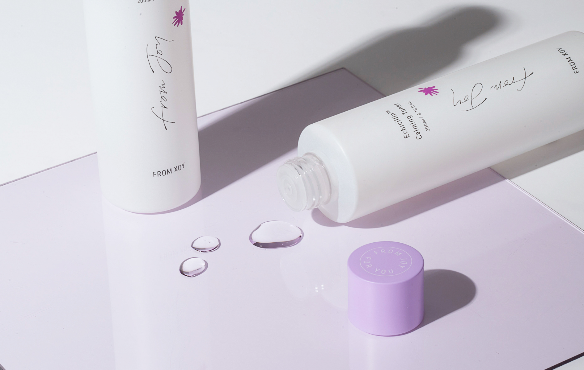
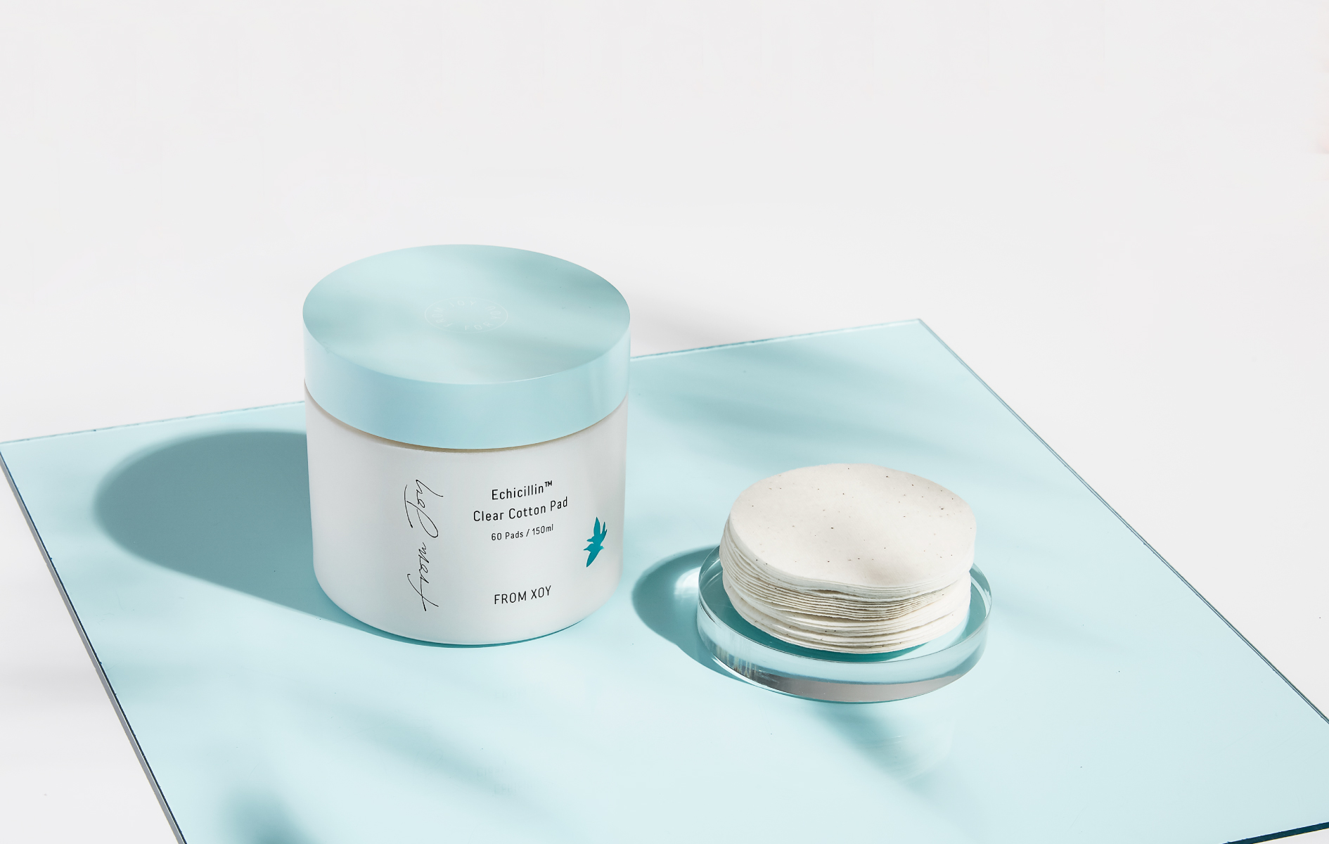
We had to spend time studying package development. Our target audiences are women in the 20s or 30s, and we had to consider the visibility of cosmetic products since they are used in everyday lives. Therefore, we wanted to make the products visually appealing. We chose the main colors first;
violet from the main ingredient (echinacea) and mint green for cleansing products that need to look fresh (they include cleansing pads and cleansing foam). Next, we chose a color palette that goes along with the main colors. We visited the brand shops and purchased cosmetic products to find the right color for packaging as ell.
We even used the bottle cap and content of cosmetic products to determine how transparent a bottle packaging should be. We determined what letters and colors should be used for box packaging as well. In sum, HOHOHO strived to make sure that the From Xoy products are received as a pleasant gift from Xoy.


6The brand name changed from “Xoy” to “From Xoy” during the project, right?
Yes, that is correct. The original name “Xoy” was created by substituting a letter from “Joy” with an X, which means something is undecided. It basically implies that the brand can offer diverse types of beauty and joy.
We wanted to redefine brand value and brand identity, and wanted to make a coherent context with its name as well; the name “Xoy” seemed not strong enough to meet our expectation.
Therefore, we carefully made a counter proposal to switch the brand name to “From Xoy.” When you search “Xoy” in English or Korean on the Internet, what usually pops up is the name of a popular singer or other search results that are not related to the brand. We thought changing the name will resolve this problem.
In the end, our counter-proposal was received positively. It was a bold decision since the past achievements under the name “Xoy” could have been affected by the change. The change was made possible thanks to the members of “From Xoy” who gave positive feedback to our design and plan.
6We heard that HOHOHO was also in charge of product photography and video clips. Wasn’t it difficult to carry out these tasks?
Photos and video clips are as important as how products look in real life. They are displayed on media, and they convey the brand identity and product images. We studied a number of reference images and videos to set the right tone and find which objects to use. The process required a sophisticated planning about which reference and angle to take. In particular, it was challenging to create a storyline and connect the video storyboard.
There were many other factors to consider with a limited budget; we had to purchase props, study the process, find qualified photographer, model, and studio, and of course schedule when to take photography. Fortunately, we had a magazine team with the required experience. Our members worked together tirelessly in Euljiro and Dongdaemun to complete the project.
7Can you share how you feel after completing the project?
We carried out a number of activities in this project, including naming a brand, setting a direction and concept, designing a graphic element and packaging, using applications, and shooting product photography and brand video clip.
I think the project serves as a great portfolio which proves that HOHOHO can cover diverse aspects when designing a brand.