your life into art by making artistic piece with ordinary tissue”
1Can you introduce the rebranding project?
We heard that it involved collaboration between tissue and art, which is not something that happens often.
Hanyeji is famous for its collaborations with artists from home and abroad to develop its product lines. Hanyeji transforms daily lives into art by carrying out artistic projects, and also is a sponsor for an illustrator in Korea.
2Is that why it says, “Life Becomes the Art” in the slogan?
Yes. HOHOHO focused on how Hanyeji continues to collaborate with artists. That is why we came up with a slogan that indicates how Hanyeji makes tissue into artistic piece and transforms daily lives into art; as you know, tissue is one of daily necessities for everyone. We believe Hanyeji will continue to collaborate with more artists.
3How did you design logo and emblem?
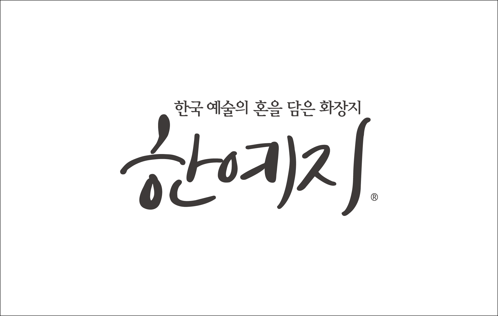
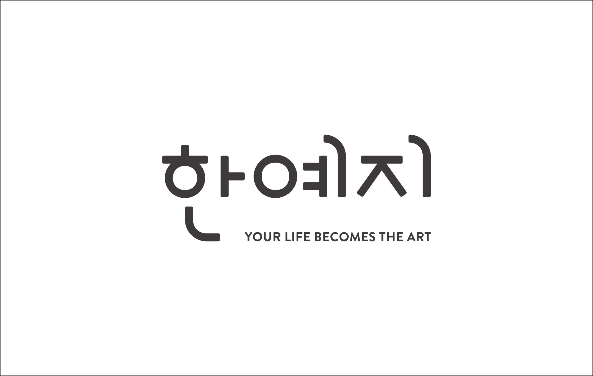
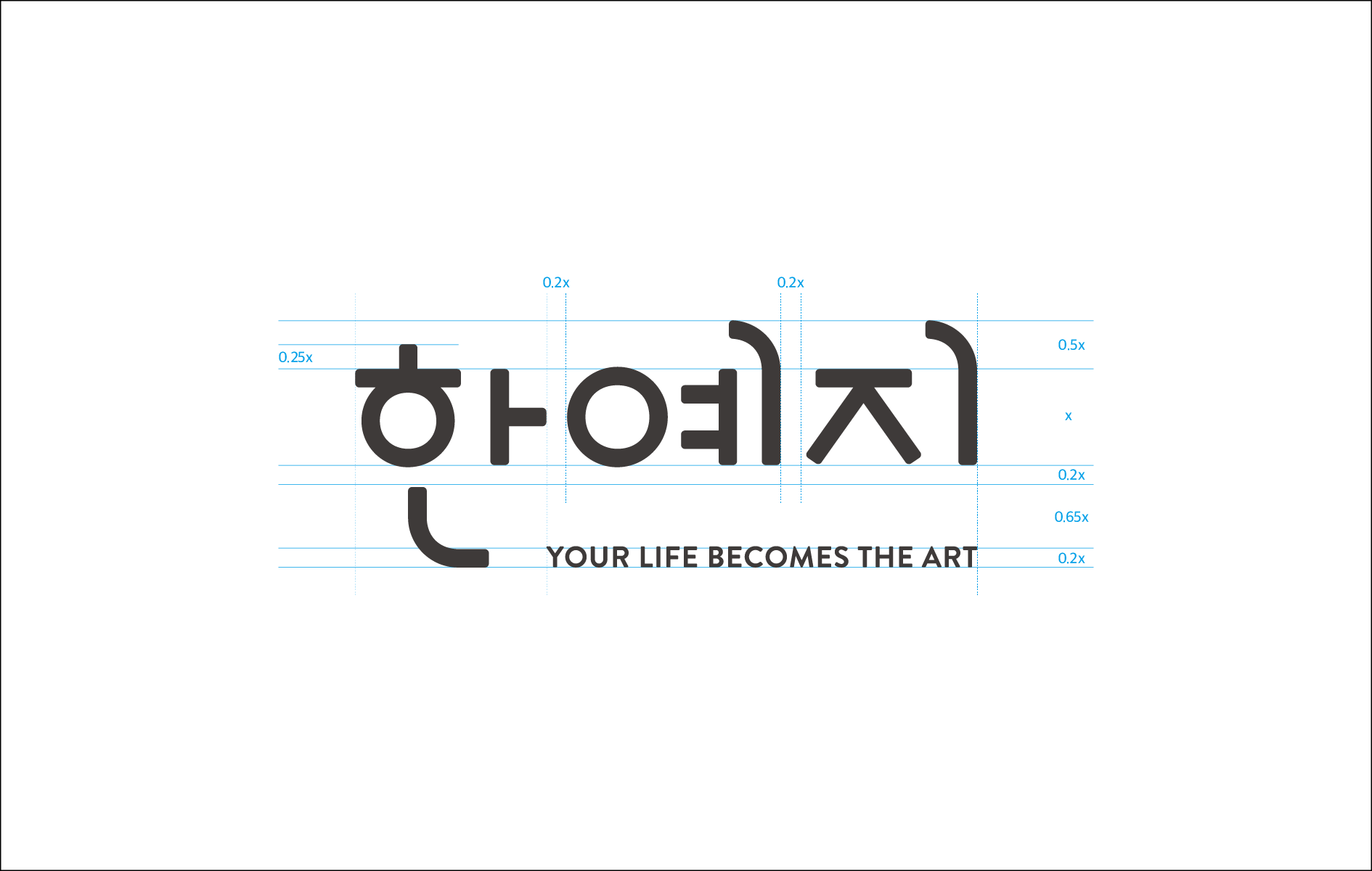
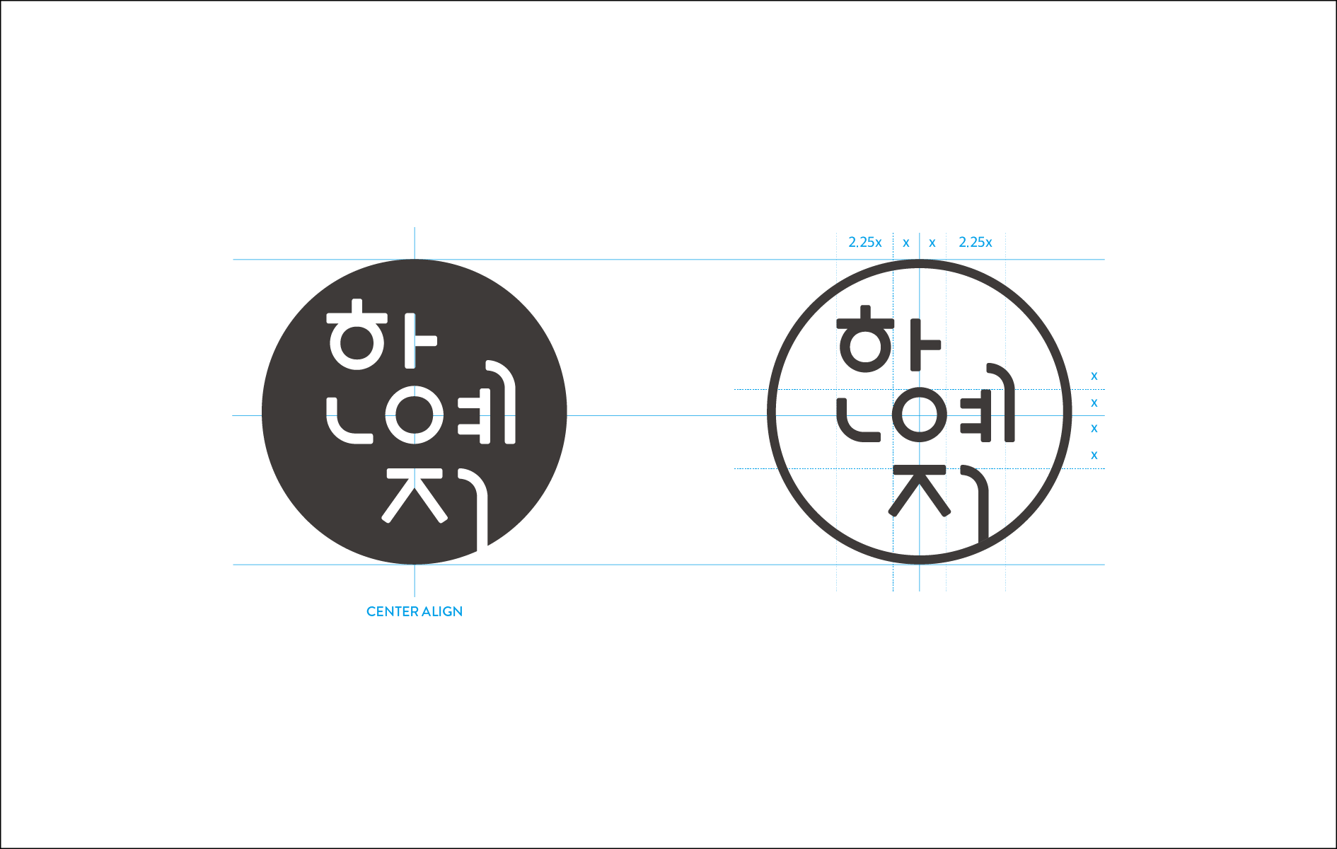
The motif for the Hanyeji logo comes from curved line of folded paper and fabric. Naturally created curves convey a sense of comfort and cordiality. Straight and curved lines in the logo represent unique and simple nature of Hanyeji. The motif for the emblem is artists’ seal (like artists in the West sign their artworks, artists in Korea print seal on their works)
4Each product line has its own color. Is there any special reason?
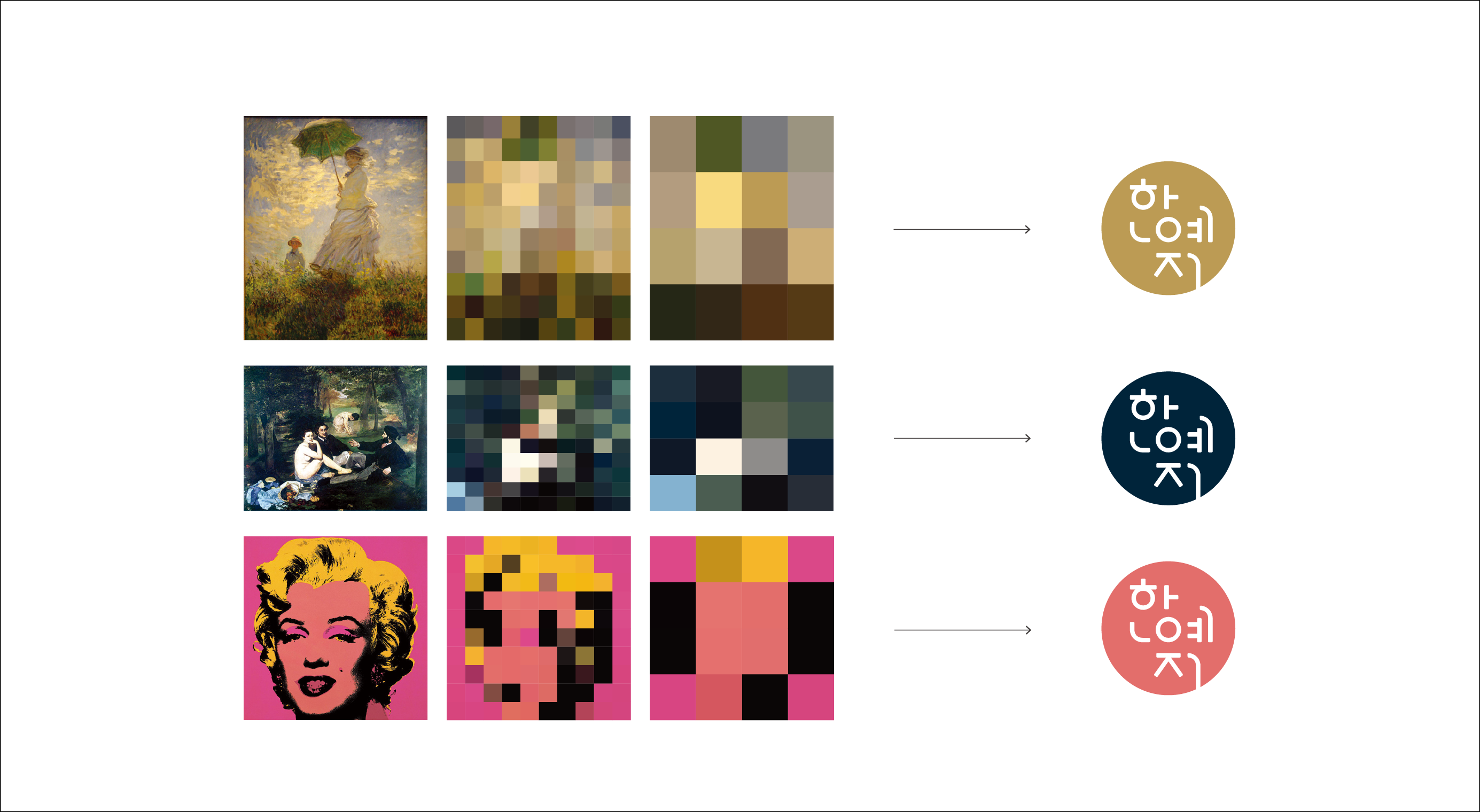
We selected black and white as dominant colors. Hanyeji is linked with art in many ways, so we decided to have a color palette with various options so that we can simplify colors when using them in products. Hanyeji uses different colors in this color palette when it collaborates with more artists. Since each color is chosen from artwork, you can see there are abundant sources to find another shade..
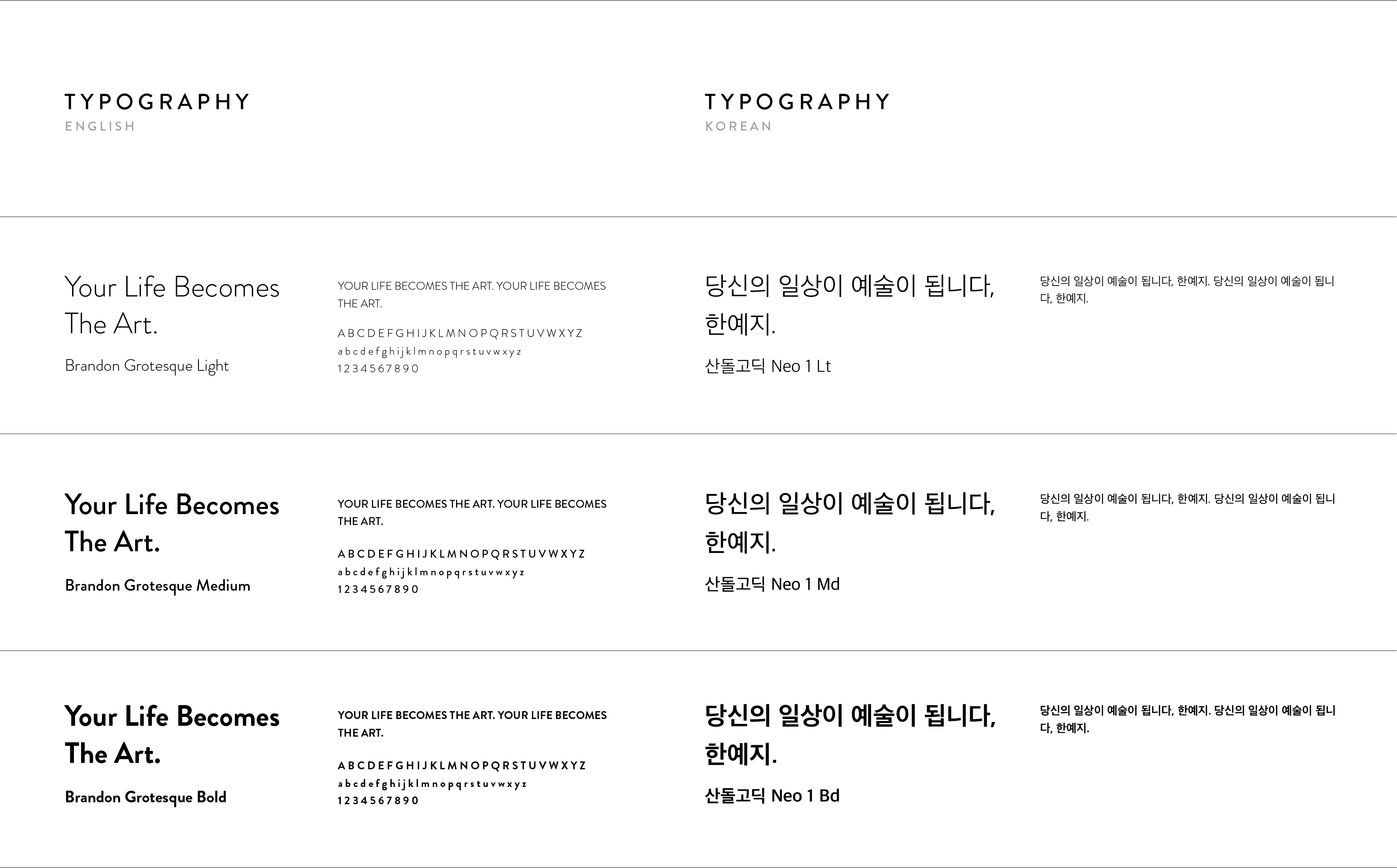
5You chose a neat typeface that makes the brand look reliable. Why did you choose this typeface?
We used straight and curved lines together to make the brand logo look neat and bring a sense of reliability. Each letter has curved edges so that the logo looks softer and the brand seems more familiar to customers. We chose the typeface called “Brandon Grotesque” as a main typeface, and used “Sandoll Neo 1 Family” for Korean text for better legibility and universality.
6We heard that HOHOHO also designed pictogram. Can you tell us about the design process?
We maintained the original DNA of the logo to design pictogram in order to build strong brand identity. The pictogram has curved line, straight line, circular form, and rounded edge. Also, we designed pictogram for each product line and created harmony with the typeface “Brandon Grotesque.”


7Hanyeji has a lot of product lines. Can you also explain about the products?
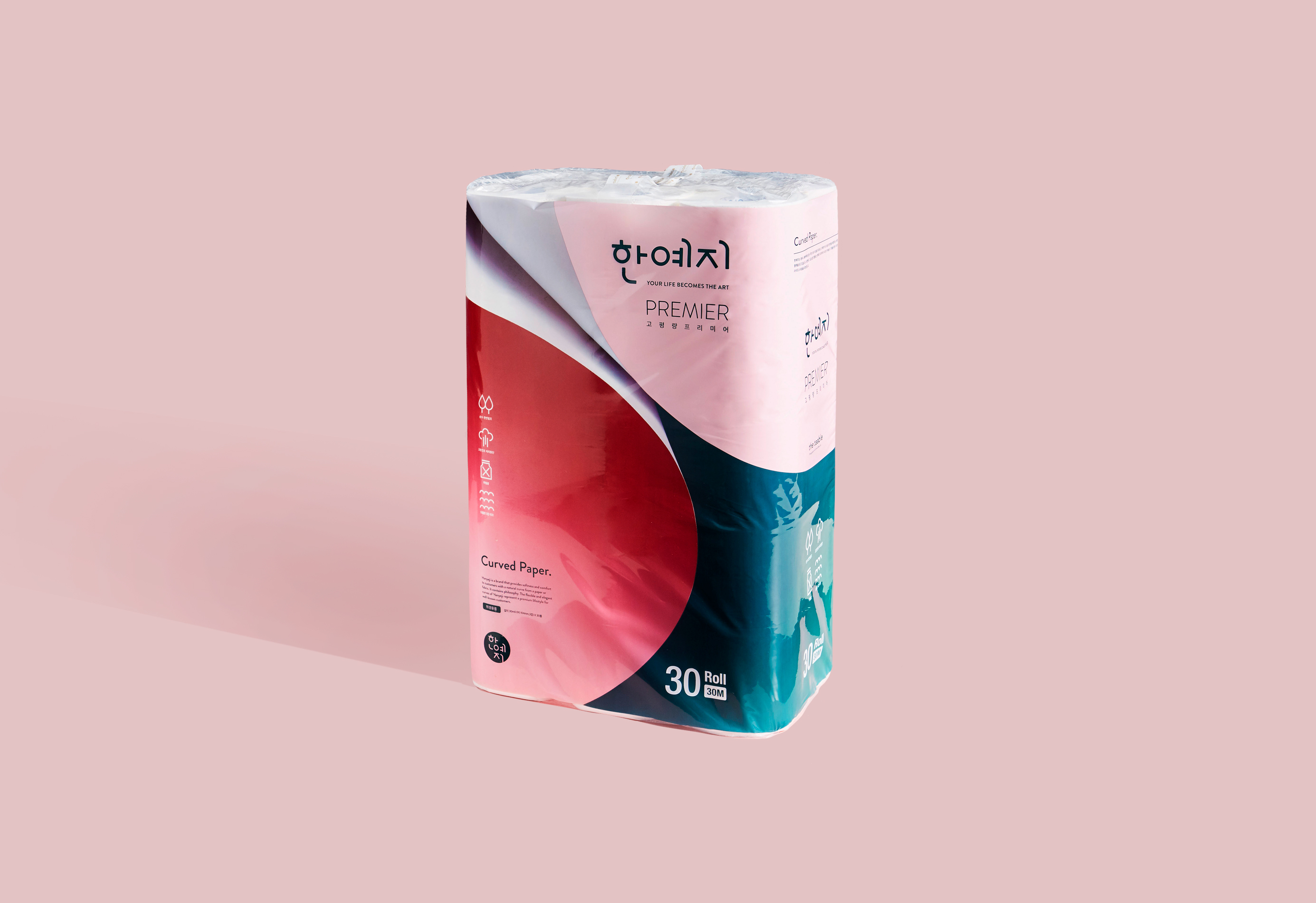
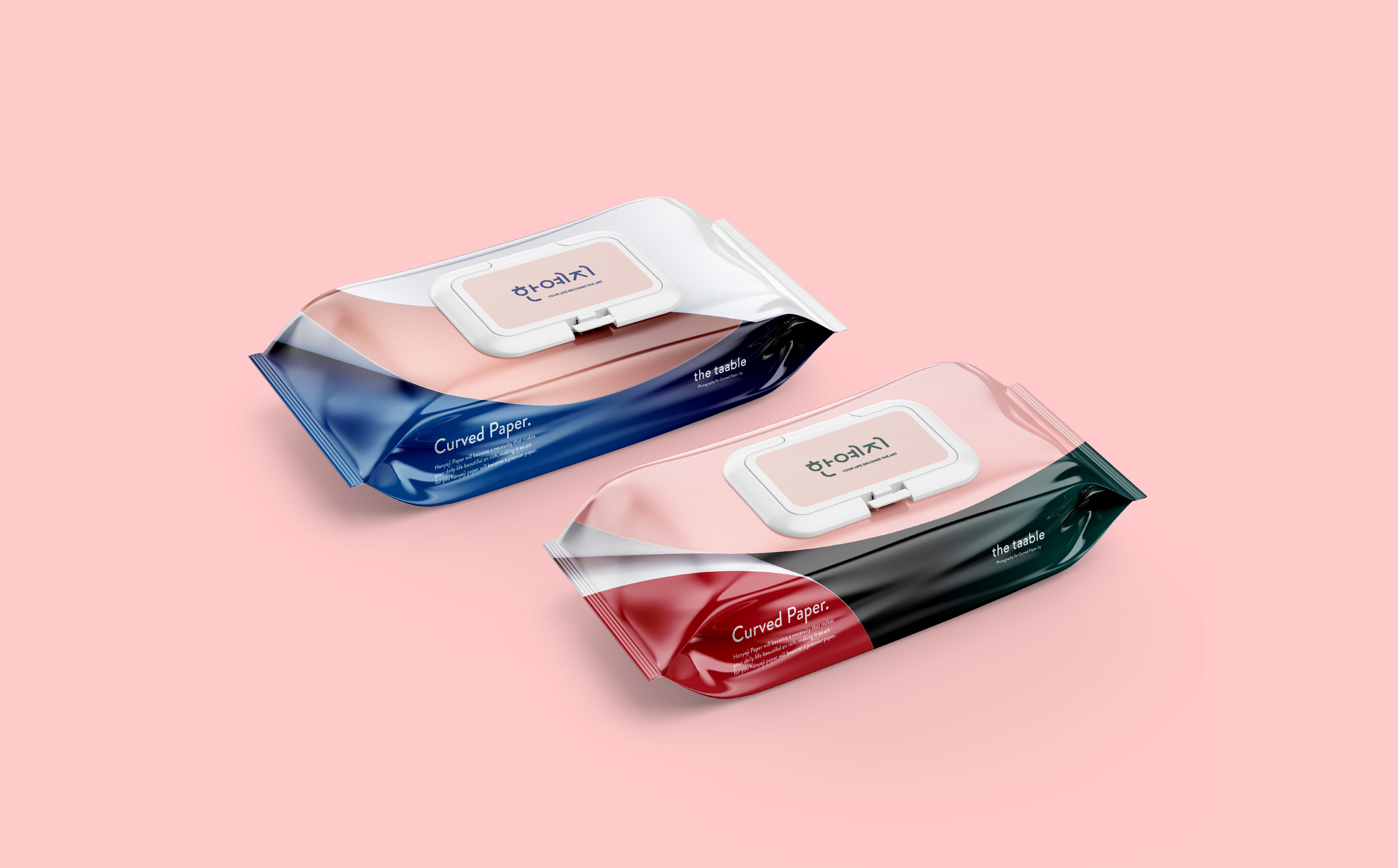
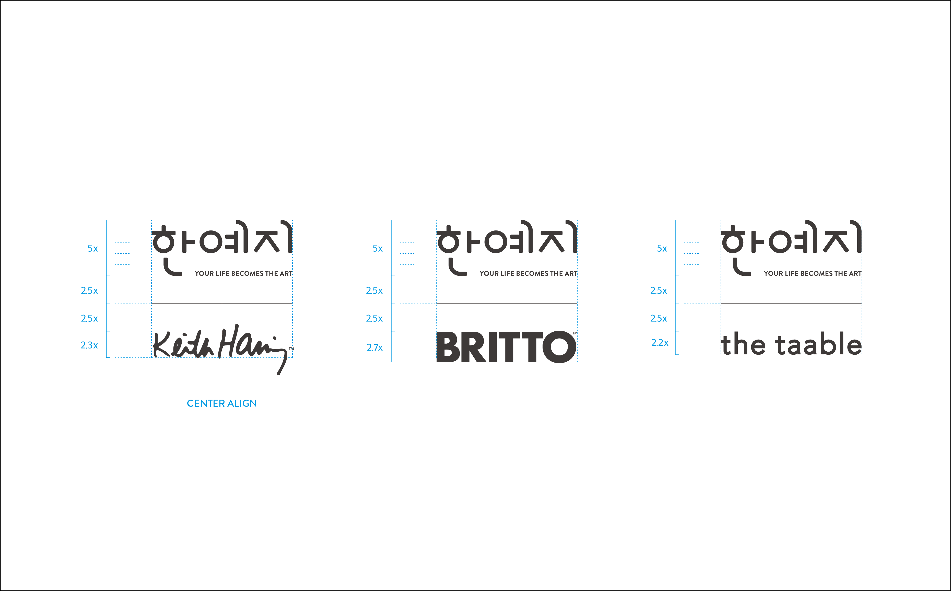
Hanyeji collaborated with many artists. The artists include Keith Haring, who is one of the three major Pop artists, and Romero Britto, who held an exhibition in Korea in 2018. Hanyeji also collaborated with a group called “The Taable” to design premium roll tissue. Lastly, the “HU” product line consists of wet tissue and menstrual pad; since these products directly touch skin, the HU products are mild and soft.
First, Keith Haring was the first artist to collaborate with Hanyeji. Haring is the best artist to represent the brand direction, which states “lift meets art.” Even general public is familiar with the works of Haring, and Haring’s artworks are well received by most audience. In this project, tissue became canvas for Haring’s works.
In fact, this particular product line by Hanyeji has white background because the original works by Haring can be better represented that way. Hanyeji made tissues with vivid colors that are found in Haring’s works as well, which led to more options for customers. The collaboration with Haring led to a highly positive reaction from market, and the Hanyeji brand became even more famous.

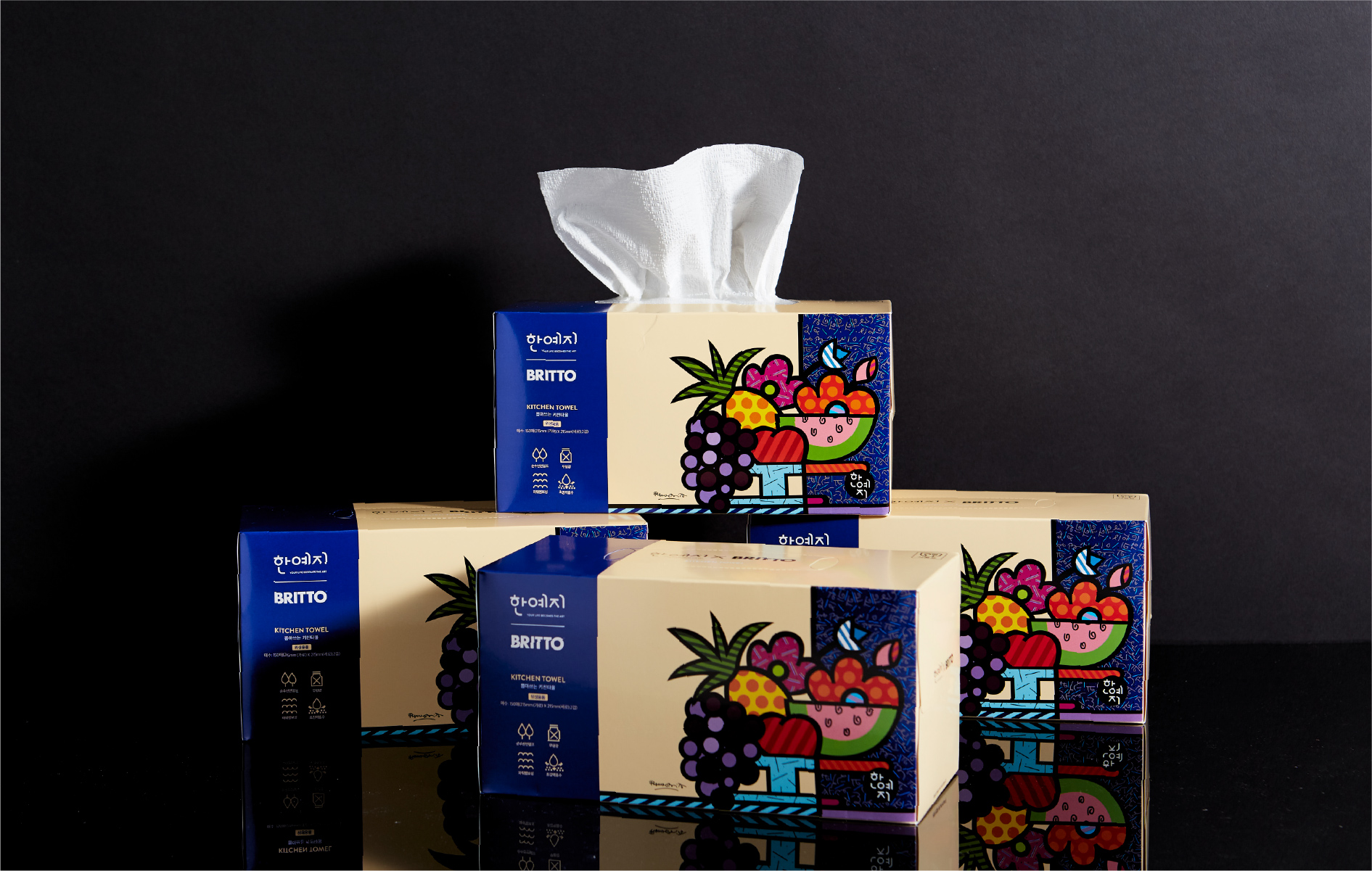
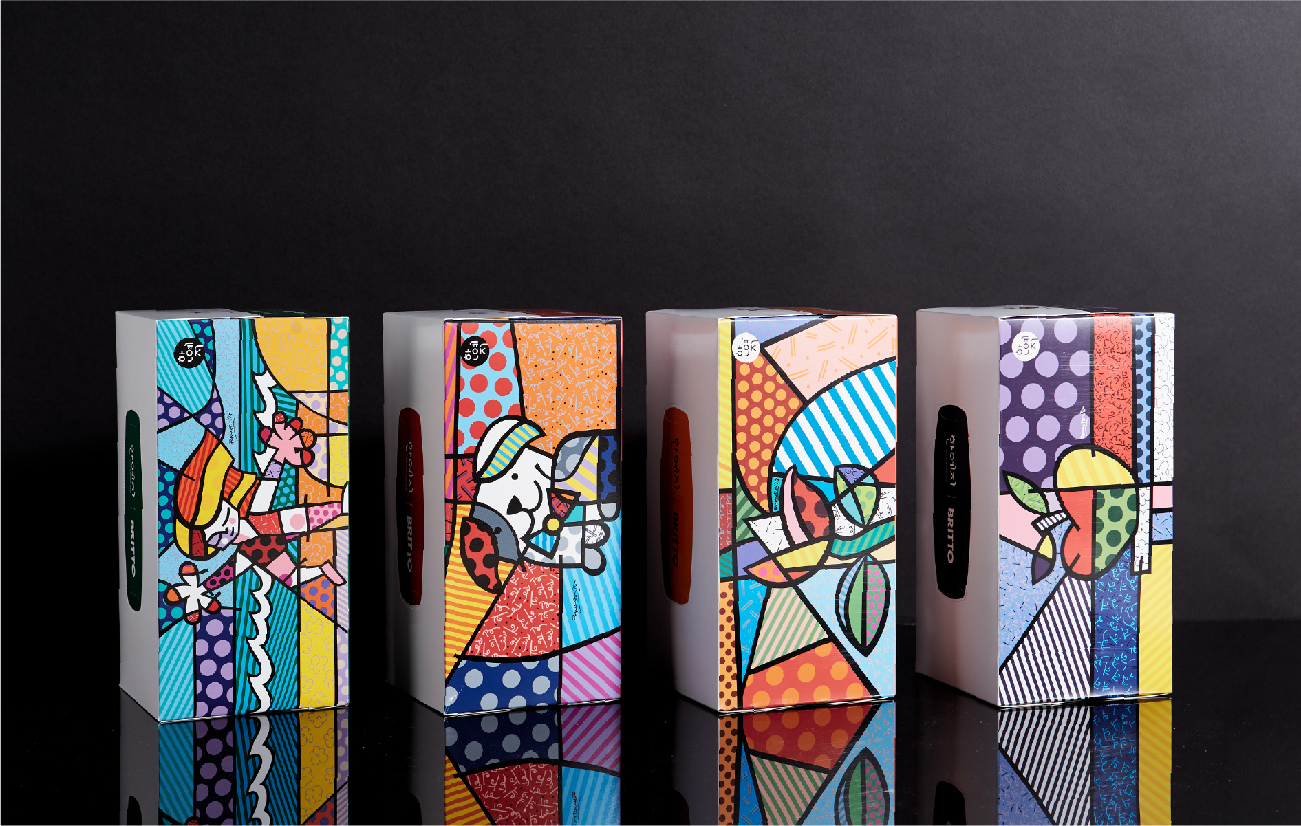
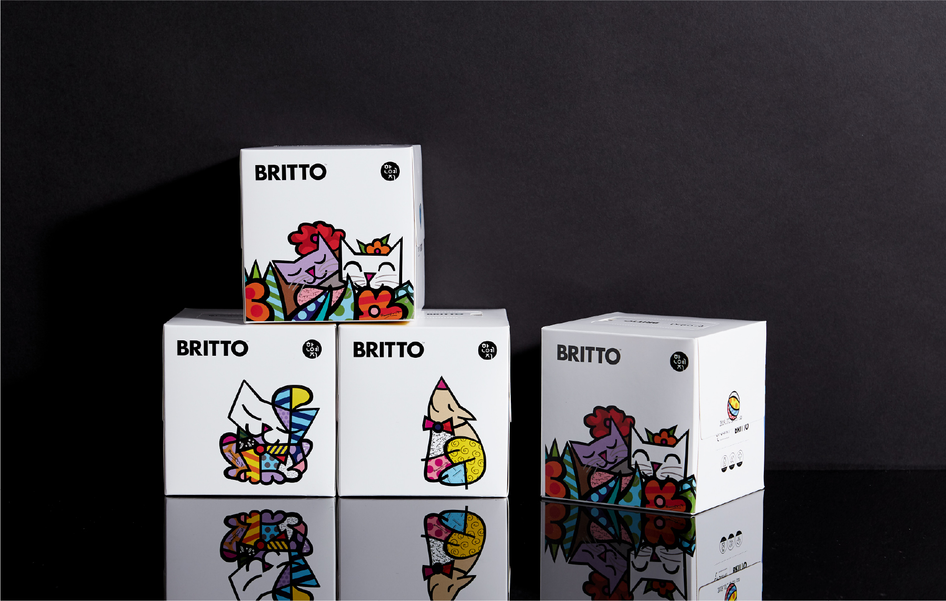
<Romero Britto>
The second artist to work with Hanyeji was Romero Britto. The Neo-pop artist from Brazil is globally renowned with his choice of everyday subject, strong color scheme, and vivid pattern. Britto is famous like Haring, and HOHOHO thought the collaboration can advance his reputation in Korea as well.
We learned that Britto utilizes commonly found subjects such as flower, fruit, people, and animal in his interesting and witty expressions. His artworks are perfect with daily necessities like tissue. In fact, we found the entire process interesting because it was great to match Britto’s artworks with Hanyeji products.
I still remember that there was an artwork with summer fruits, which was perfect to use on paper towel. Britto’s works are something that everyone can enjoy at home because they bring balance and convey a sense of significance at the same time.
<HU>
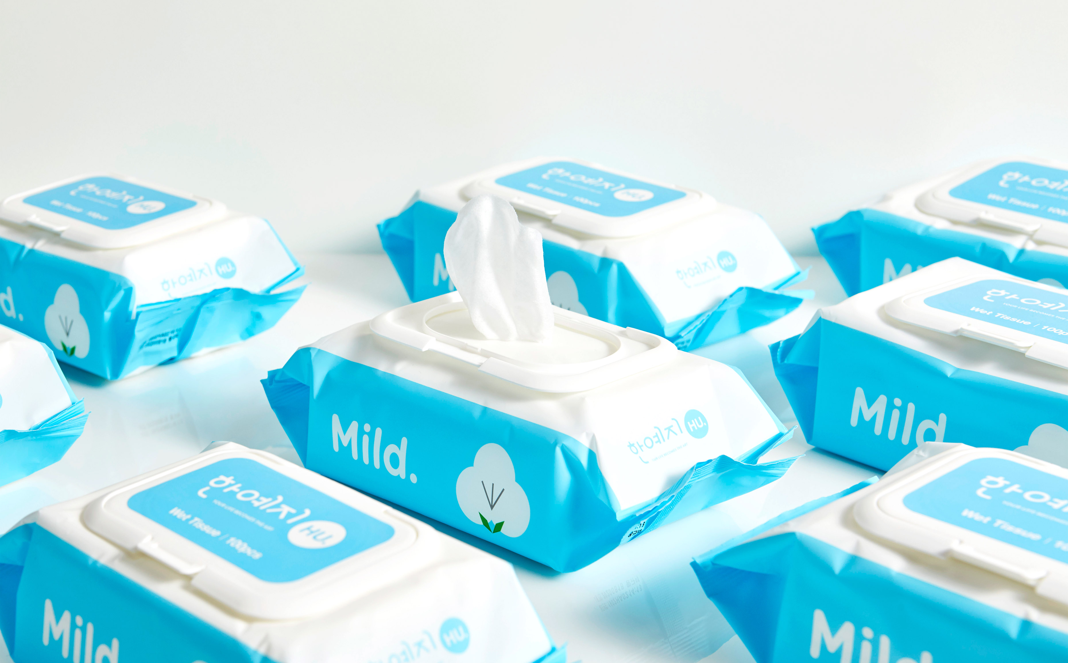
The third project was the HU product line. The two collaboration projects that I mentioned previously involve contemporary art. On the other hand, the HU project is more linked with design. The word “HU” can mean a lot of different things; in the Korean language, “HU” is one letter which comes from the verb “to rest.” The same letter is found in the noun that means “tissue” in Korean.
Therefore, “HU” represents essential properties of tissue. Tissue needs to absorb, should be soft to use, and must be made of good materials. We wanted to express these properties in an intuitive and easy-to-understand way. That is why we chose the names for each product by selecting keywords that describe functionalities.
The products are named “Good,” “Soft,” “Pure,” “Mild,” and “Fresh.” Then we added simple and intuitive images. In my opinion, the company is open minded so we were able to design these products. Many tissue products do not have blank space like this, but Hanyeji made a bold and unprecedented choice.


<Premier>
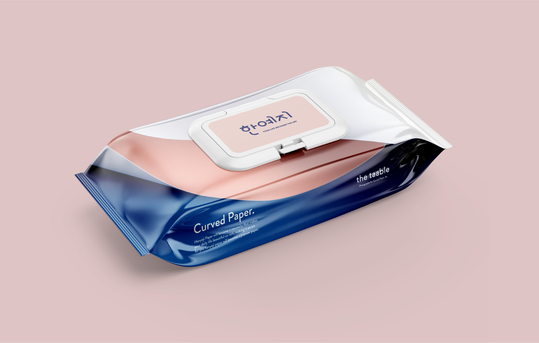
Lastly, HOHOHO worked on the premier product line. The premier product line is slightly different from the artistic collaborations. It is the first product line after the rebranding, and involves flagship products for Hanyeji. We made sure that the premier line embodies Hanyeji’s philosophy and aesthetic value.
First of all, Hanyeji emphasized naturally created curved lines of tissue and fabric in the process. The purpose was to represent its philosophy, which is to offer softness and comfort to people. The same idea was applied to the premier product line. Also, HOHOHO learned that photography was not used even when we worked with artists. Not many tissue brands choose to work with photography, and we utilized this opportunity to tap on a new genre.
We worked with “The Taable” from Jakarta for the premier product line. The design group is known for its unique color palette and minimalistic sense that go with the premier products. The Taable created an amazing wide design for Hanyeji because premier product package has wider front and sides that look open and spacious. It shows how the design group understood our concept and was dedicated to this project. They showed adventurous perspective and right color palette. In the end, the new premier product line eventually became successful, and now it is the best-selling Hanyeji product.
