

1 Hallyu, also known as the Korean Wave, is garnering more attention than before. Can you share when Hallyu began?
Hallyu is characterized with a bigger impact now, and there are globally renowned Hallyu stars such as PSY and BTS. Hallyu has become a bigger cultural phenomenon on the global stage. It is difficult to define when it officially began, but I believe it has been roughly a decade since the keyword “Hallyu (Korean Wave)” was coined.
2 Why is it becoming such a phenomenon? Why have PSY and BTS become so popular on the global stage?
Thanks to the growth of YouTube and social media, people from distant regions can easily find and enjoy Hallyu. In the past, there was limitation in communicating the Hallyu content because there was no suitable communication channel. However, Korea already had highly competitive technology and had quality content. YouTube and social media are a channel to convey the Hallyu content. I think it was only a matter of time for the Hallyu content to garner attention on the global stage. I believe we can also look forward to what will be coming with the Fourth Industrial Revolution.
3 That was about Hallyu. What did you focus on when beginning the rebranding project for KWAVE?
I just gave a brief introduction about the landscape in which this rebranding project took place. KWAVE is led by a CEO who is under 30, and most of the members are relatively young, making the organization dynamic and ambitious. However, their content mainly focused on
the paper magazine, which needed further improvement. We learned that KWAVE needed to shift its paradigm with the keyword “Digital First, Contents Driven.” With this keyword, we initiated the project to expand the scope of business to cover the online domain.
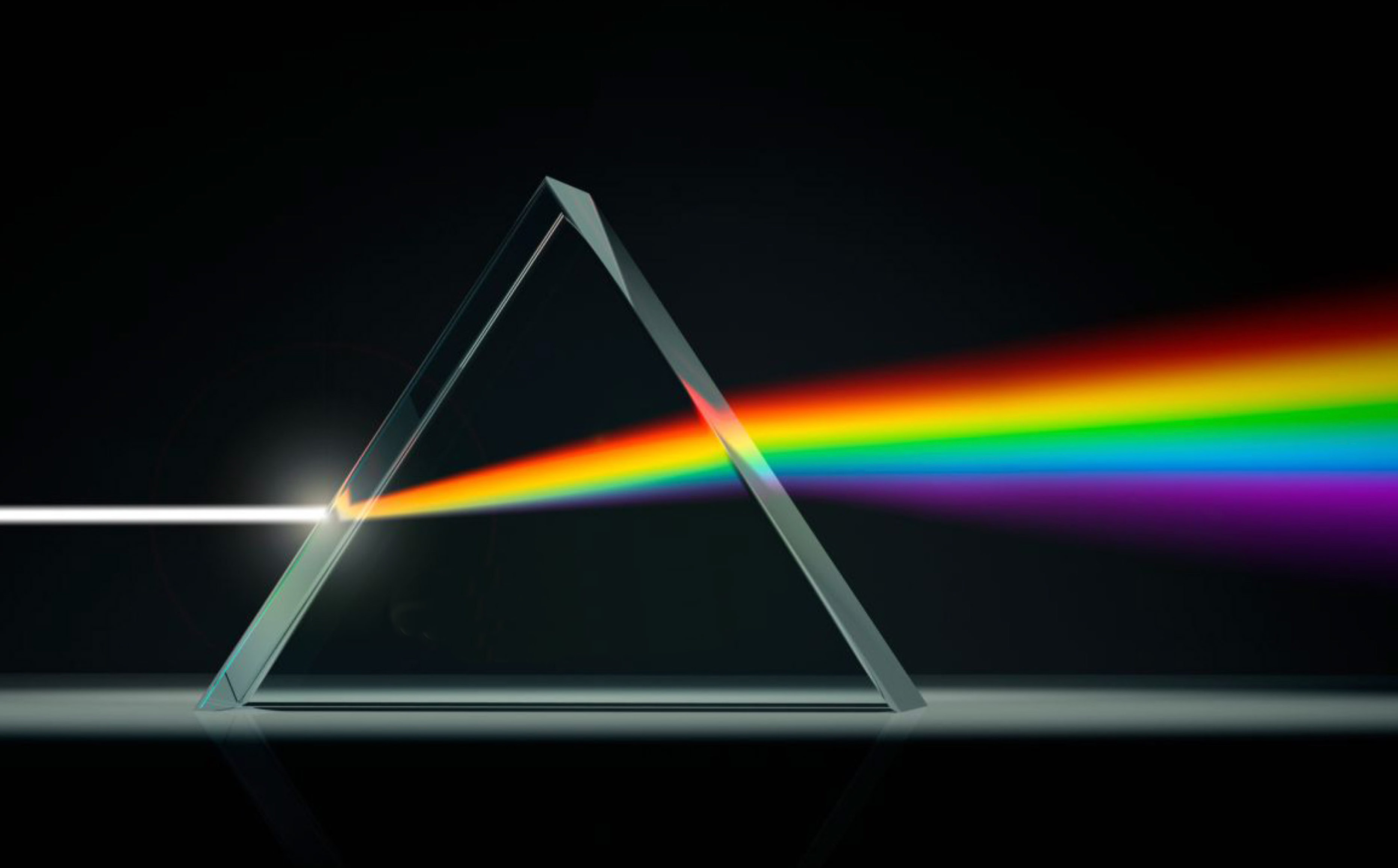
In addition, we set the branding essential called “Korean Light,” not “Korean Wave.” We decided to use light, not wave or trend, in order to imply that the Hallyu content can rapidly spread.
4 Can you tell us why you decided you use prism as a metaphor? It seems unique to me.
As I just said, the core strategy in this rebranding process was to express the rapid power of the repercussions of the Hallyu content. Here, light serves as a crucial metaphor.
Light had led to multiple keywords, and one of them was prism, which can adjust light. If “light” is the Hallyu content, “prism” that can adjust light is KWAVE. We found this analogy interesting.
Also, the prism spectrum colors go well with the KWAVE business strategy. We chose to use prism as the metaphor for these reasons, and set the brand concept as “KWAVE is Prism.”
5 Can you tell us how the logo was designed?
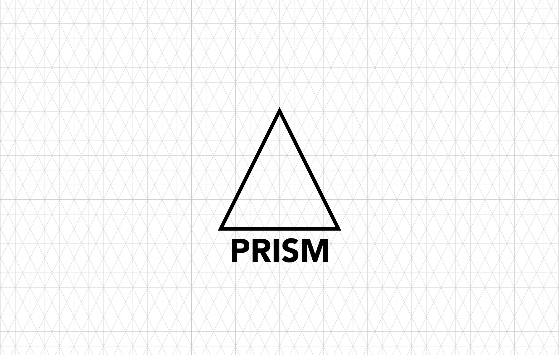
The old KWAVE logo was simple, and it expressed “wave” with modified version of Futura Condensed. We wanted to provide a strong identity to all of the five letters.
That is why we decided to create the typeface for KWAVE to emphasize that KWAVE is prism. First, we simplified the prism shape and made it a triangle.
We expanded the triangle, designed the core grid, and then placed the five letters of “KWAVE” in the core grid. That is how we created the logo with the prism grid.
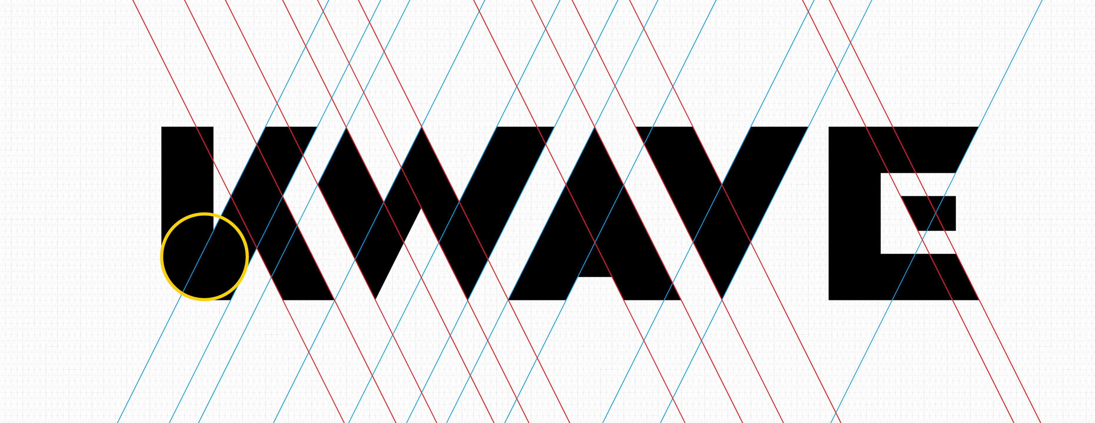
6 What is “prism core grid” in this context?
Prism core grid allowed us to align visual elements. The triangle that symbolizes prism was used to build the core grid. The core grid became the basis to design the basic system elements and the applications such as logo, typeface, pictograms, and stationaries.
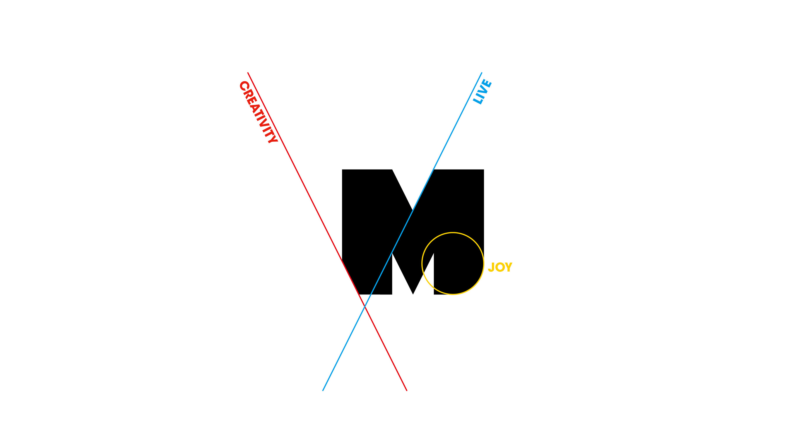
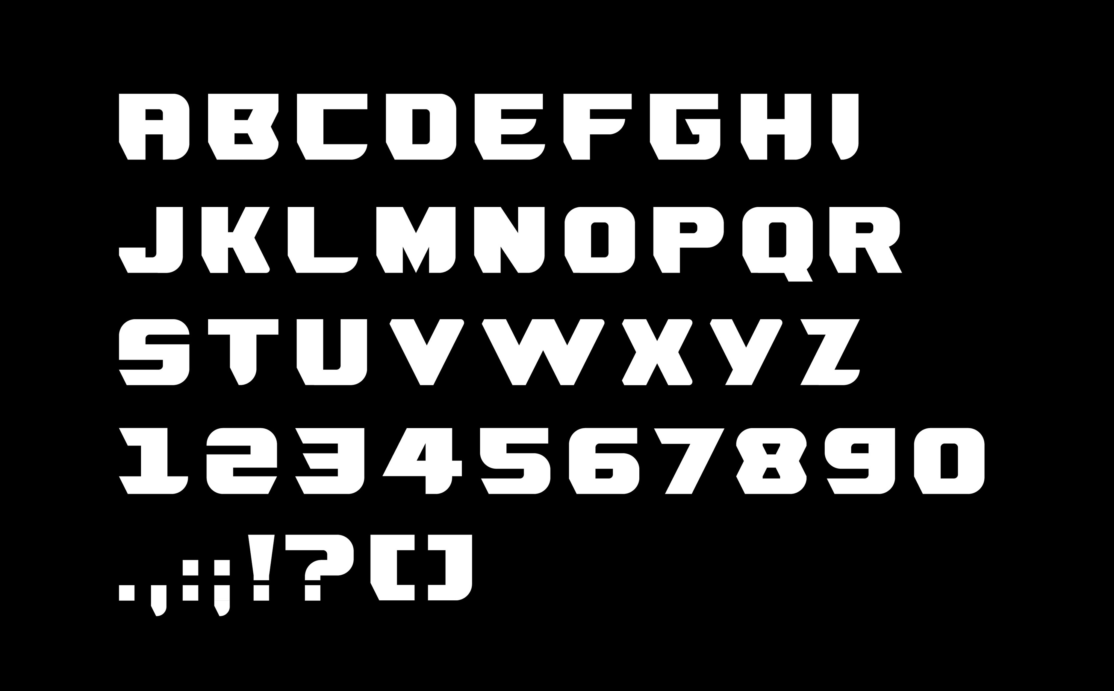
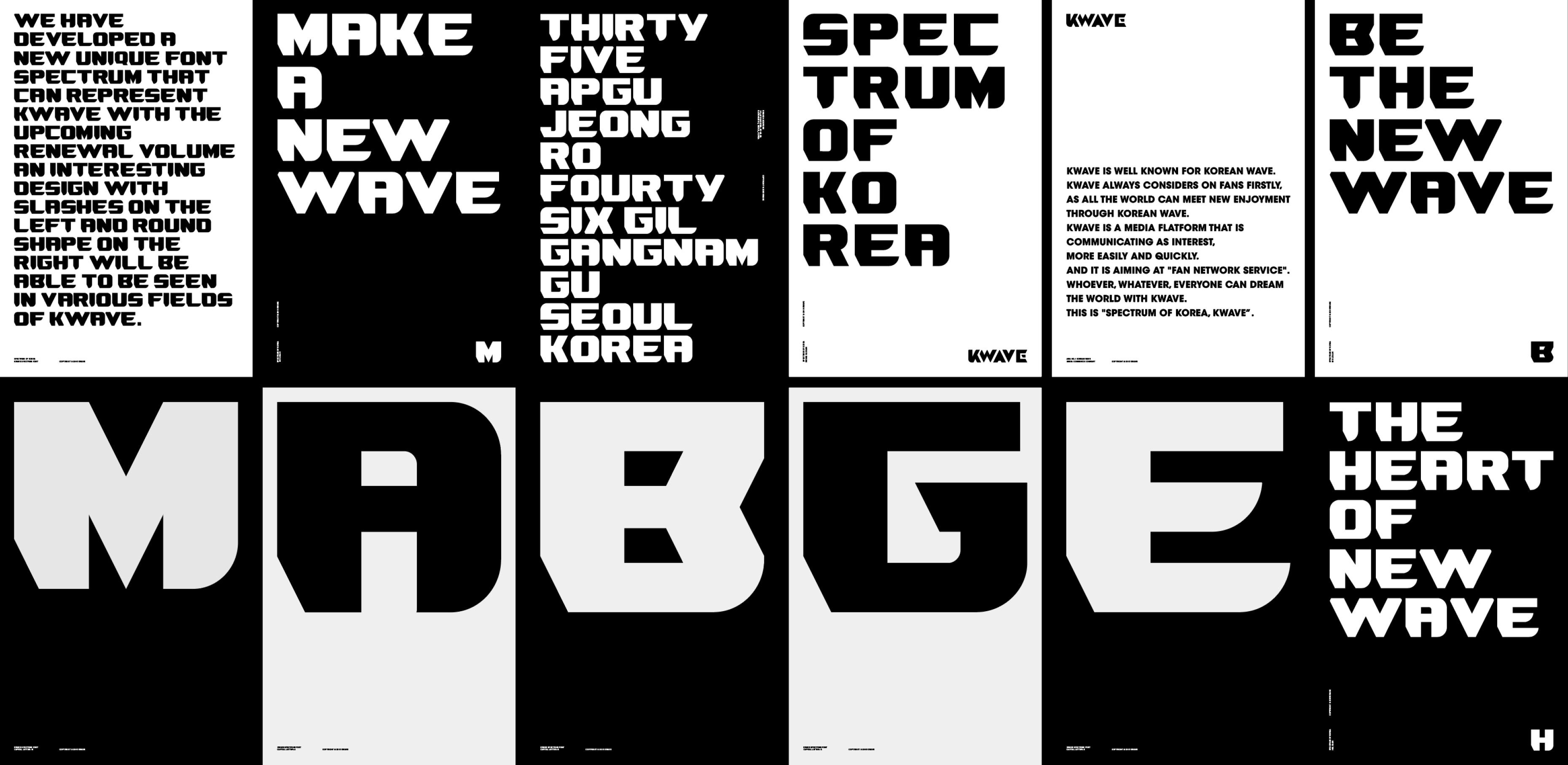
7 We want to hear about how the spectrum font was designed.
Among multiple rebranding strategies, there was the KWAVE alphabet business strategy. It obviously required a specific typeface. We wanted to represent three major keywords in the spectrum font, which are “creativity,” “live,” and “joy.” Based on the three keywords, we designed the spectrum font with lines, curves, and diagonals.
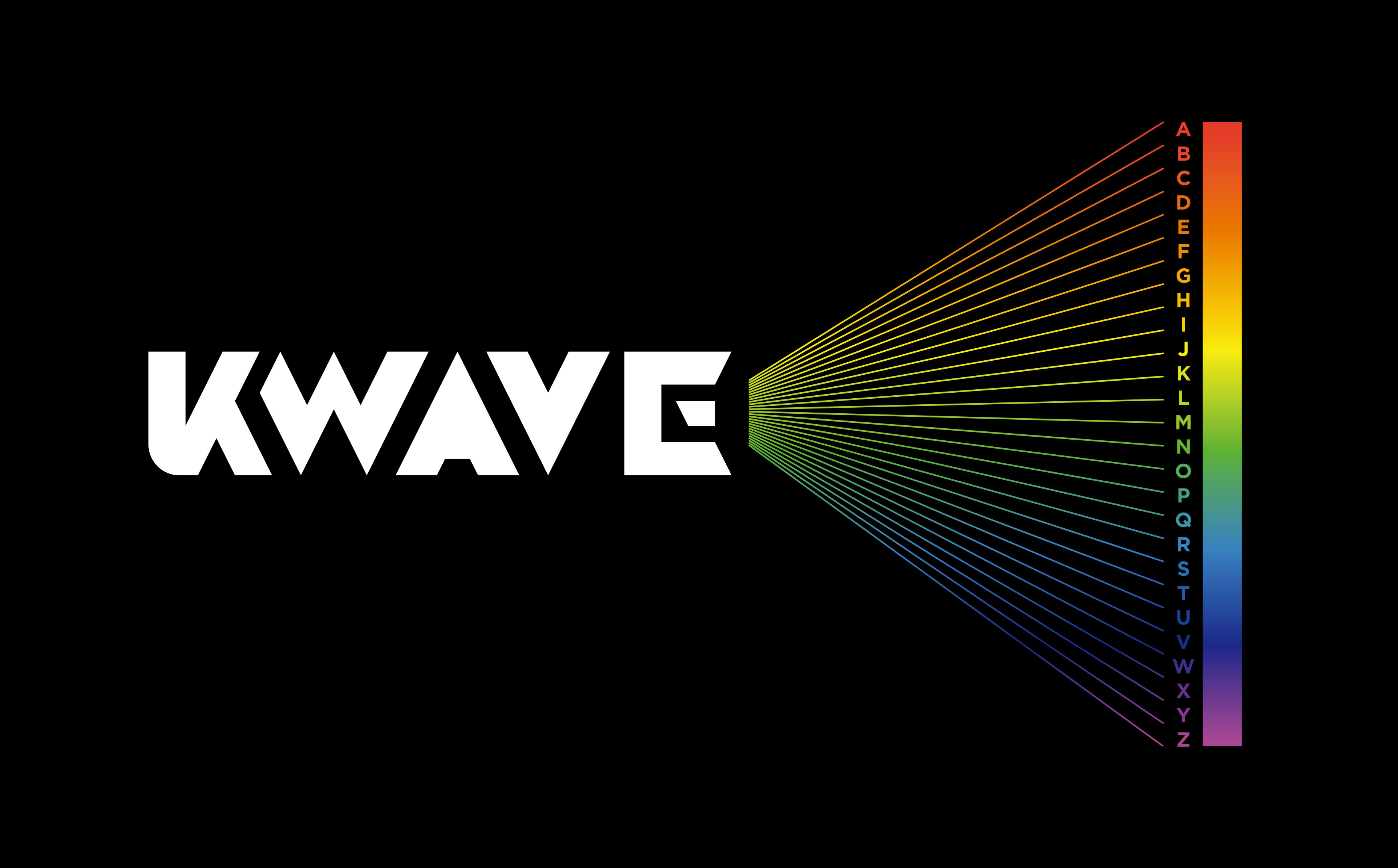
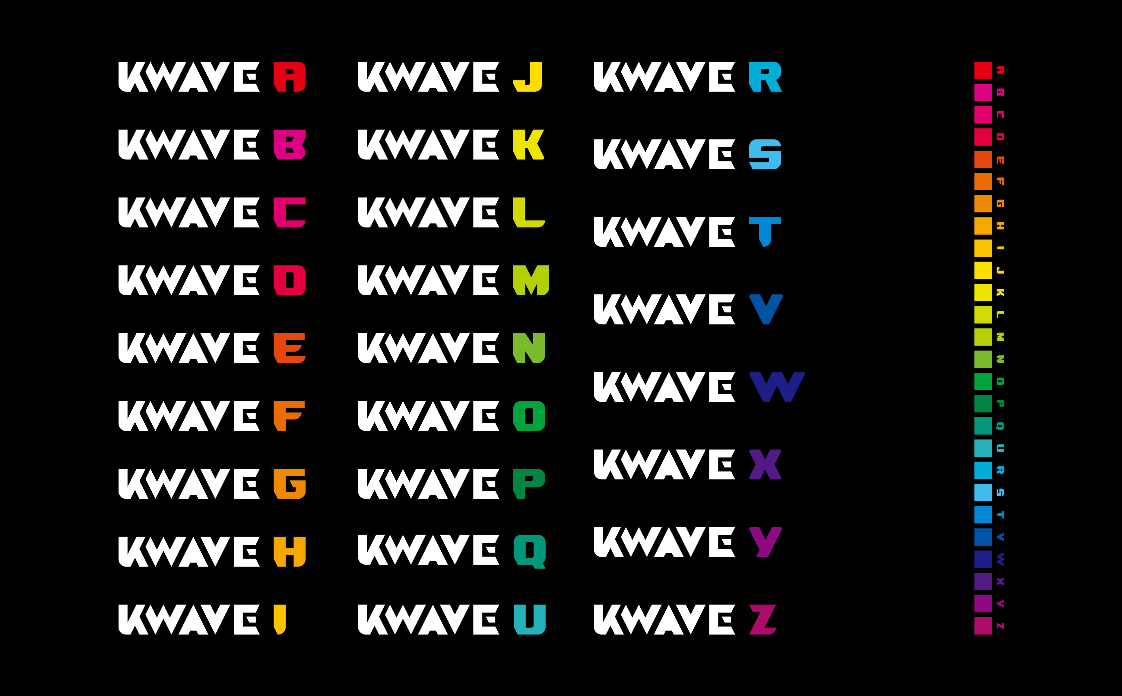
8 We found the KWAVE alphabet business strategy impressive. Can you share how you designed the strategy?
KWAVE had a plan to build subsidiary brands literally from a to z. For instance, KWAVE A for award, KWAVE B for boutique, and KWAVE C for commerce.
We picked the spectrum colors from red to purple for all of the alphabet letters, and designated color identity for each letter.
This process led to the 27 subsidiary brands right away, which also proves that speed is the key to the alphabet business strategy.
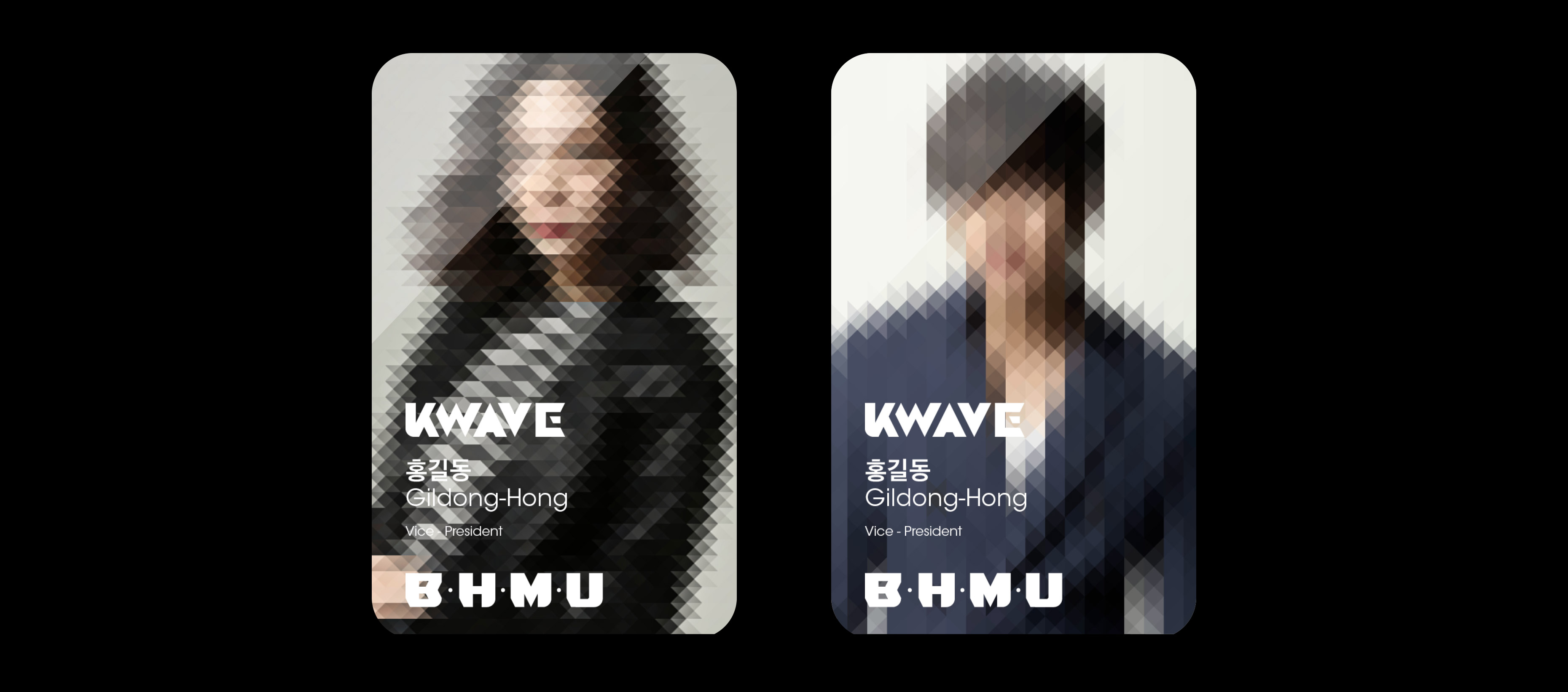
9 The KWAVE application seems unique. Can you tell us about the application?
The application was also designed based on the prism core grid and the spectrum font. First, the three keywords from
the spectrum font were used to design the shape of business card. Each alphabet color is displayed on the business card. For the employee ID cards,
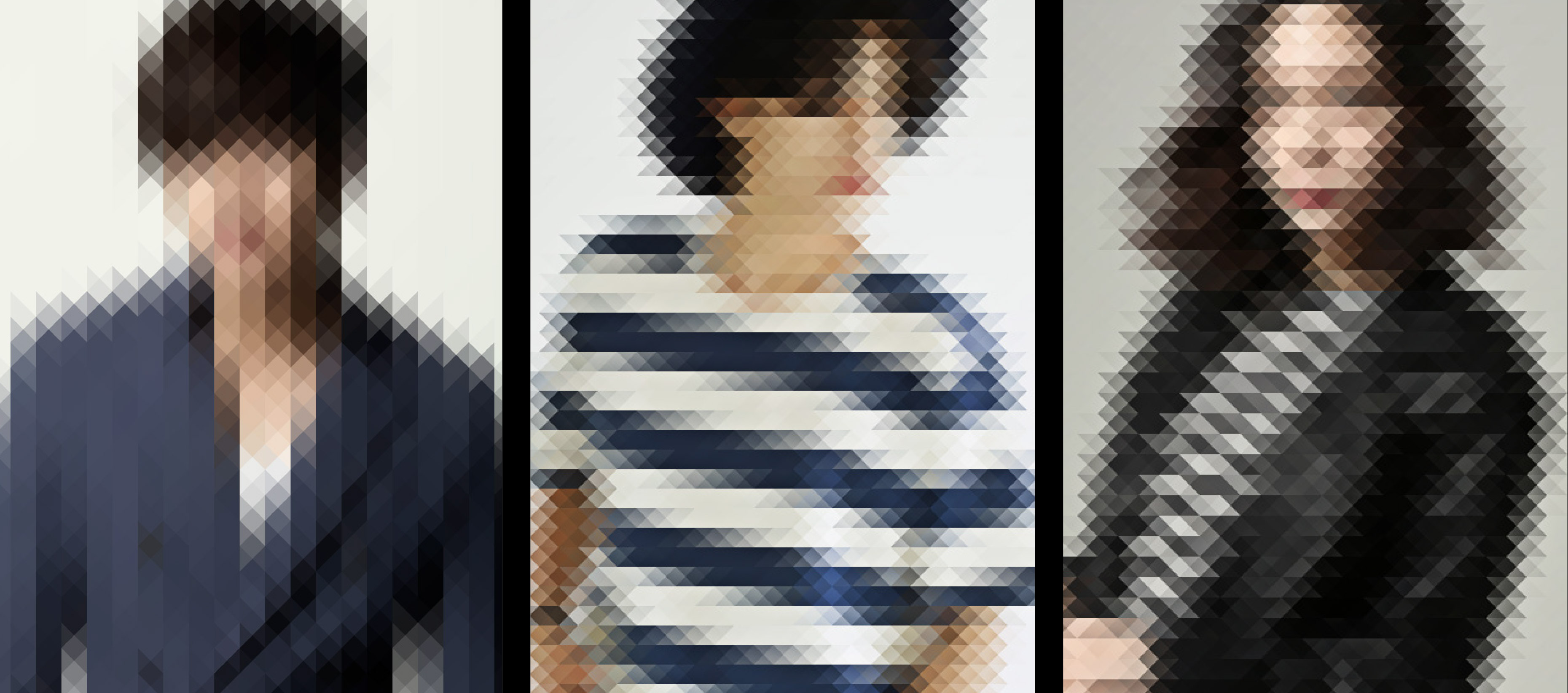
we adjusted each employee’s picture through the prism filter. The envelop was made with the same idea from the prism and the spectrum.
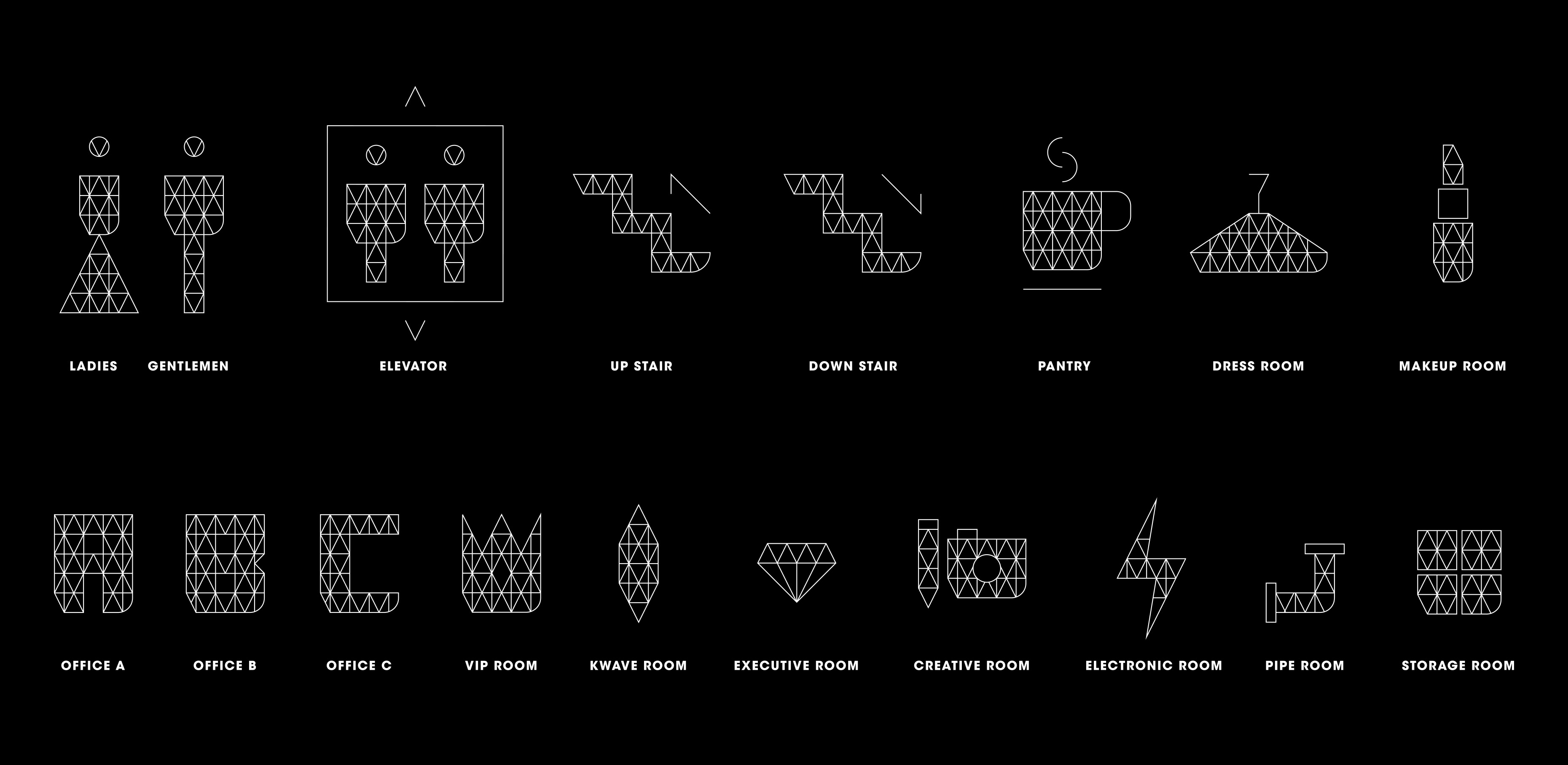
10 The pictogram resembles the triangular prism.
You are right. The same triangle was used here as well. The pictograms enrich the prism identity in the space.
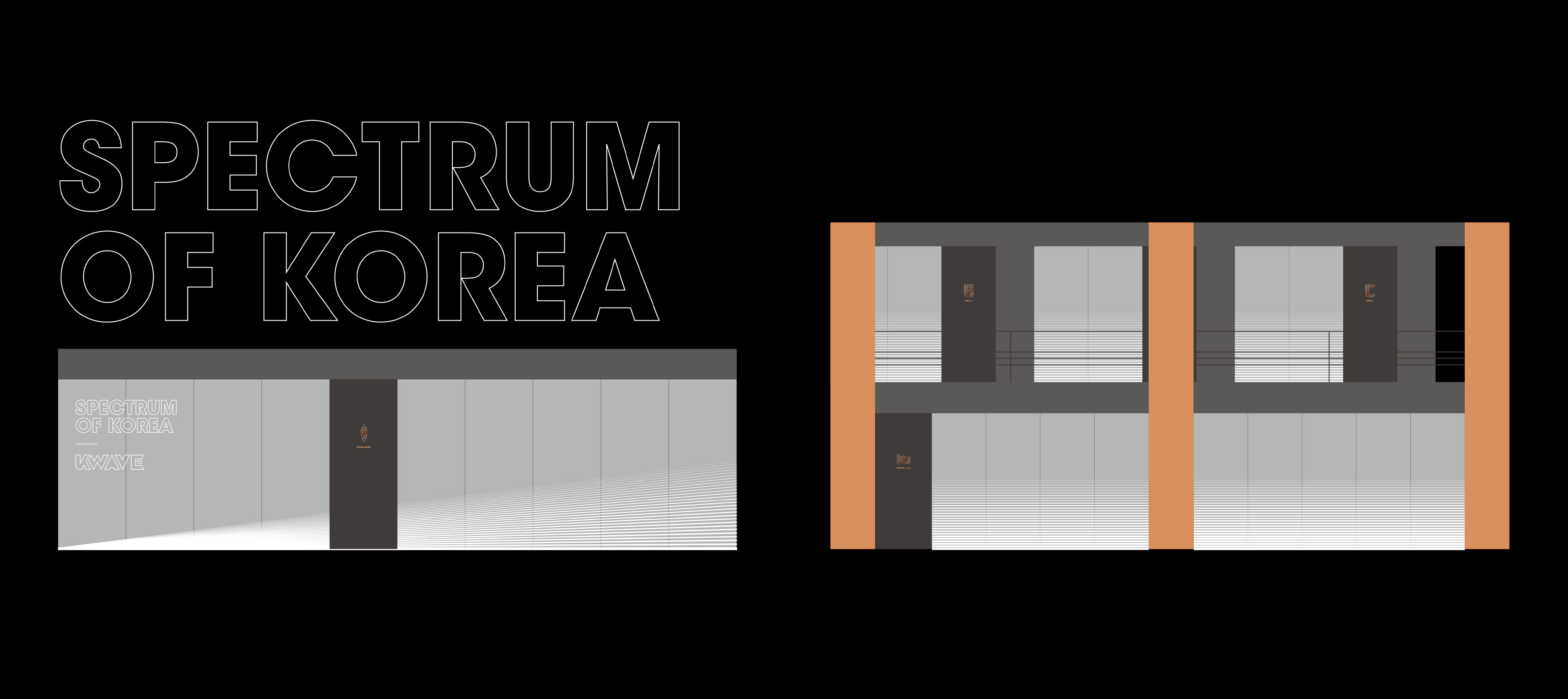
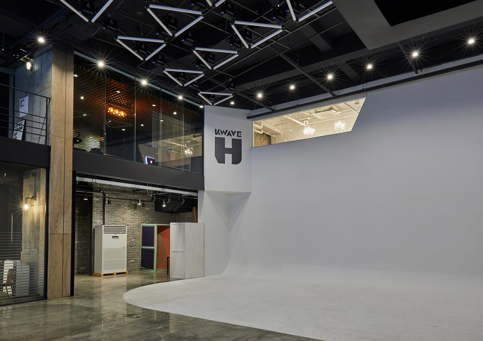
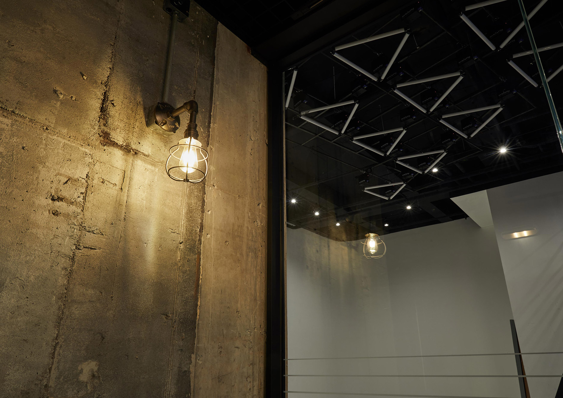
11 We want to hear more about the spatial design.
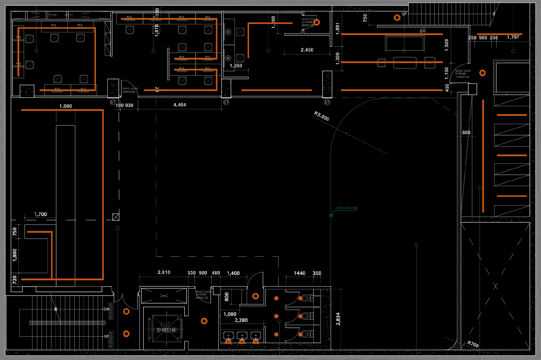
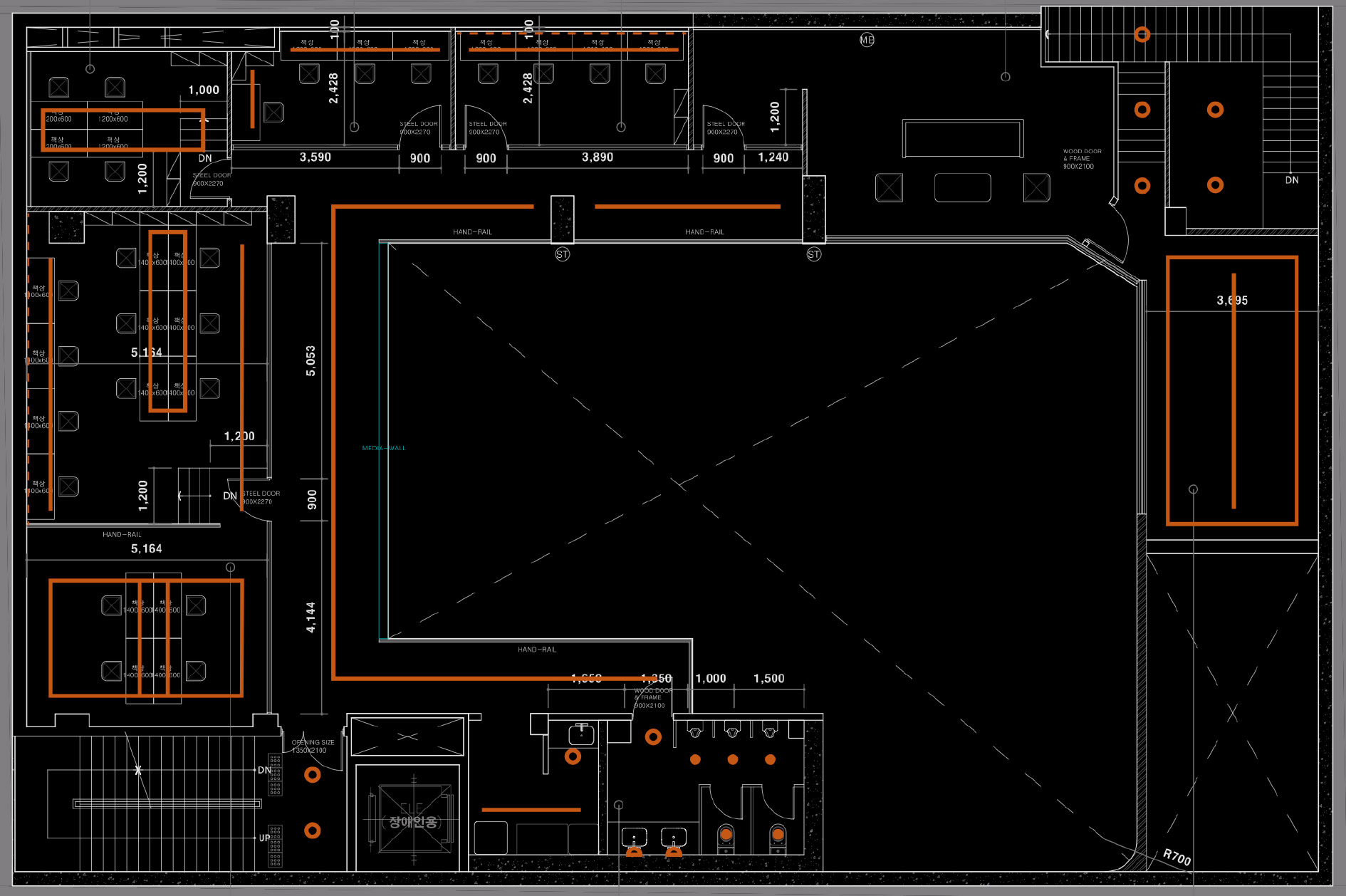
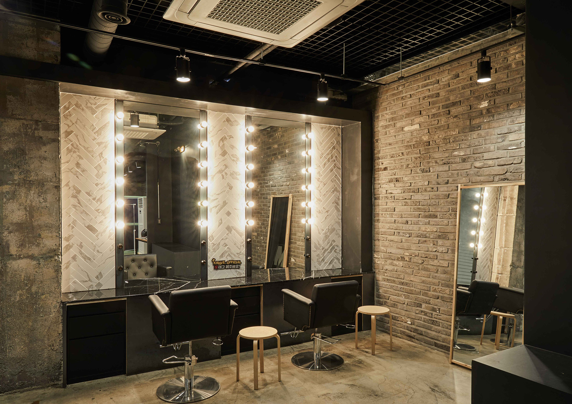
The spatial design process is very meaningful to HOHOHO. It was the first time for us to execute spatial design for a space larger than 990m2. Our mission in the process was to build an entertainment-based space with multiple purposes.
We needed to add a horizon for photography and filming, makeup room, dressing room, and waiting room. In this process, we also had to merge an office space and a retail shop to promote the retail brands in a single space.
12 Did you experience any challenge while working on underground double-height structure?
Above all, the scorching weather was a challenge. I think it is consuming to work on underground construction especially in summer.
Moreover, it was difficult to transport the construction materials to the underground space, which also made it challenging to select finishing materials.
In addition, we had to resolve some legal issues. We took necessary steps to proceed with the spatial design process.
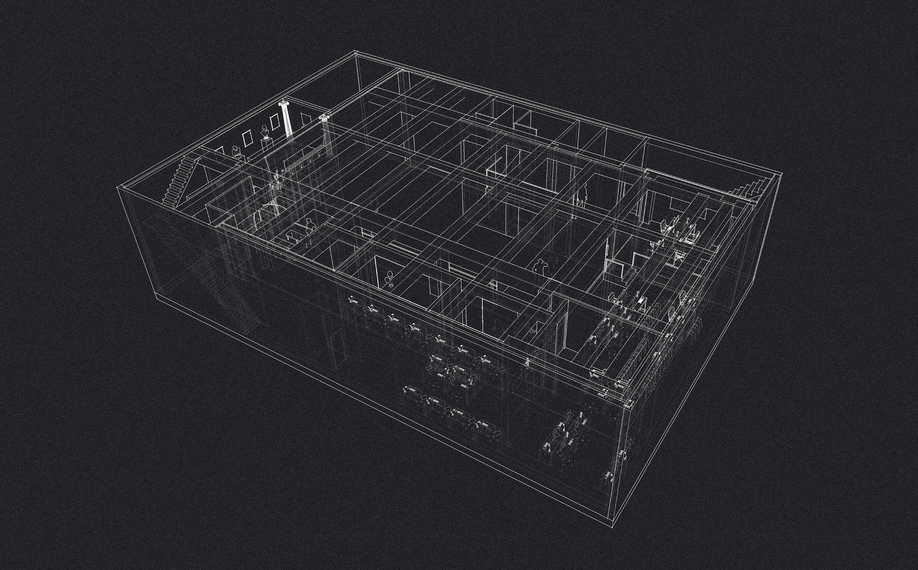
13 What did you focus on during the spatial design process?
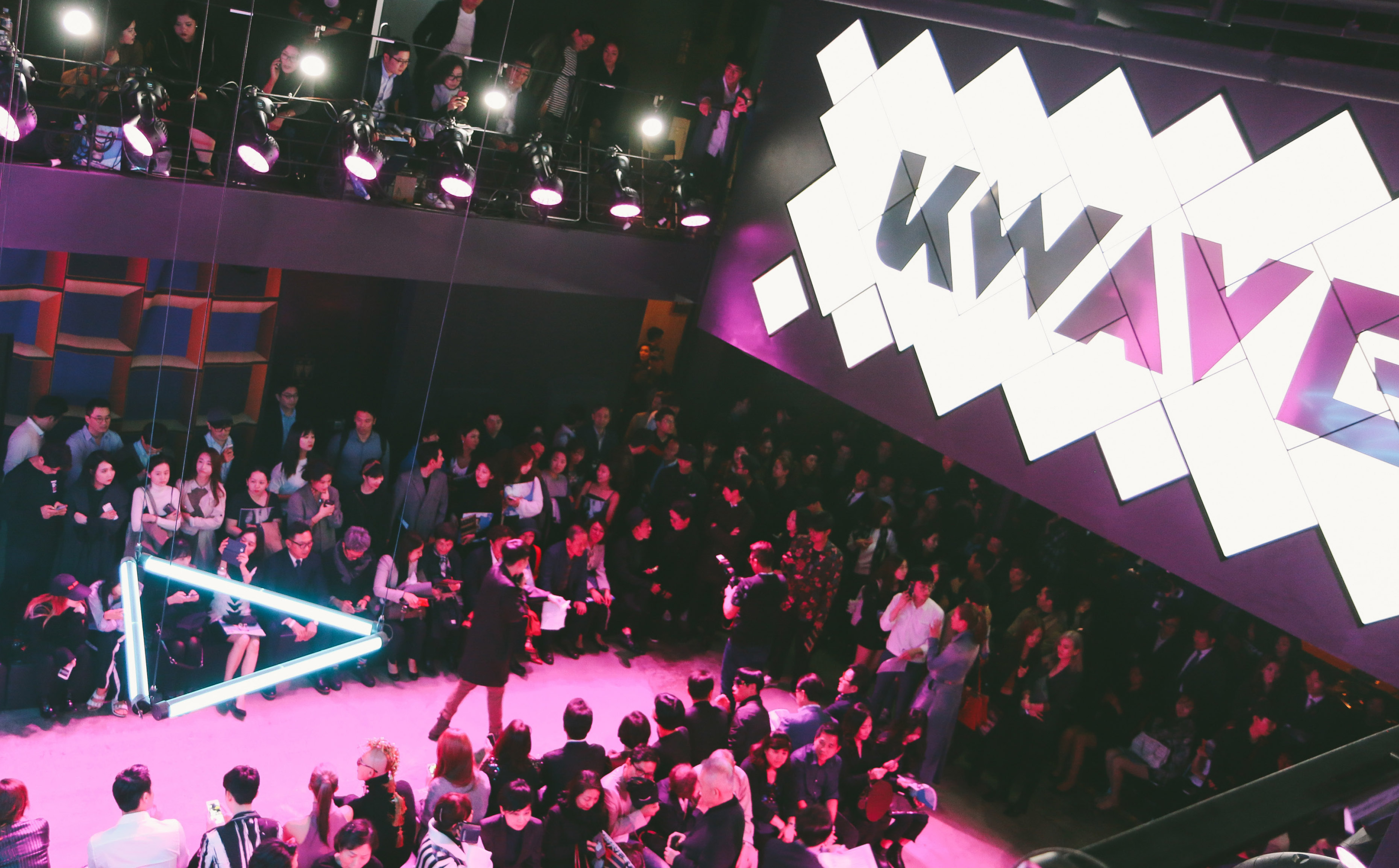
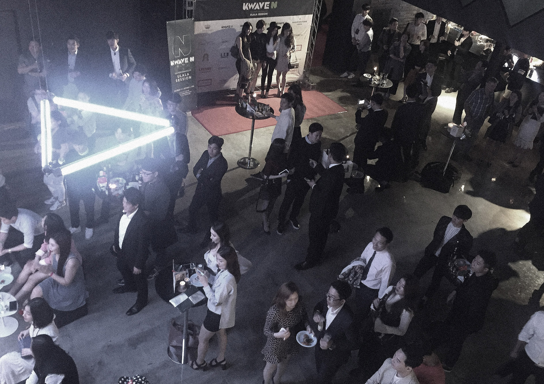
We mainly focused on the horizon, which is located at the center. We designed a horizon that is over five meters, which is much larger than the ones used in Korea.
Then, we built a space that resembles a town square in front of the horizon so that various events can take place here. Another item to consider was how people will walk around the space. We had to consider that many of the KWAVE clients are celebrities,
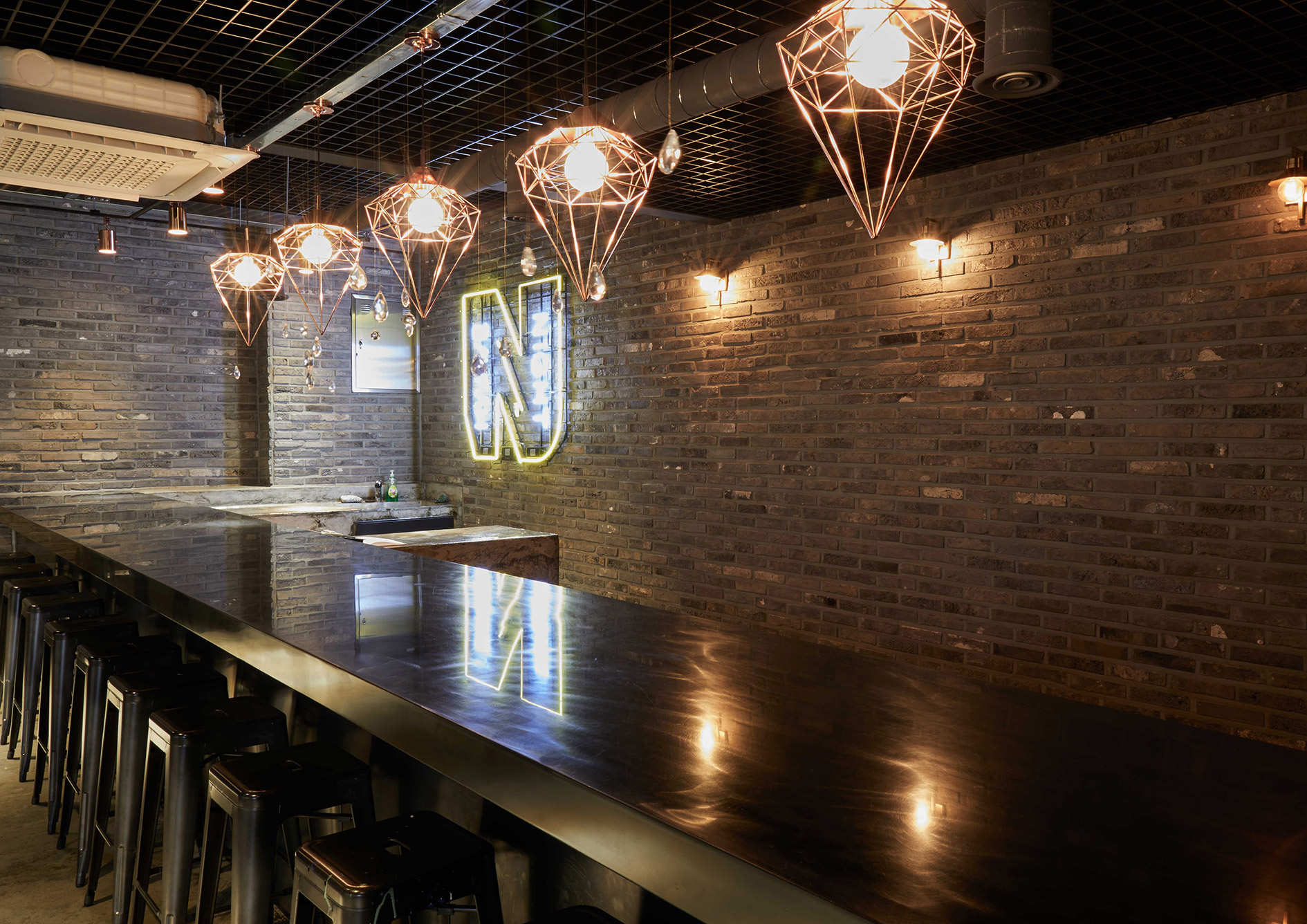
and the space should allow many people to walk around at the same time. For the finishing materials, we selected exposed concrete as the main material and decided to use copper, glass, and broken bricks as well.
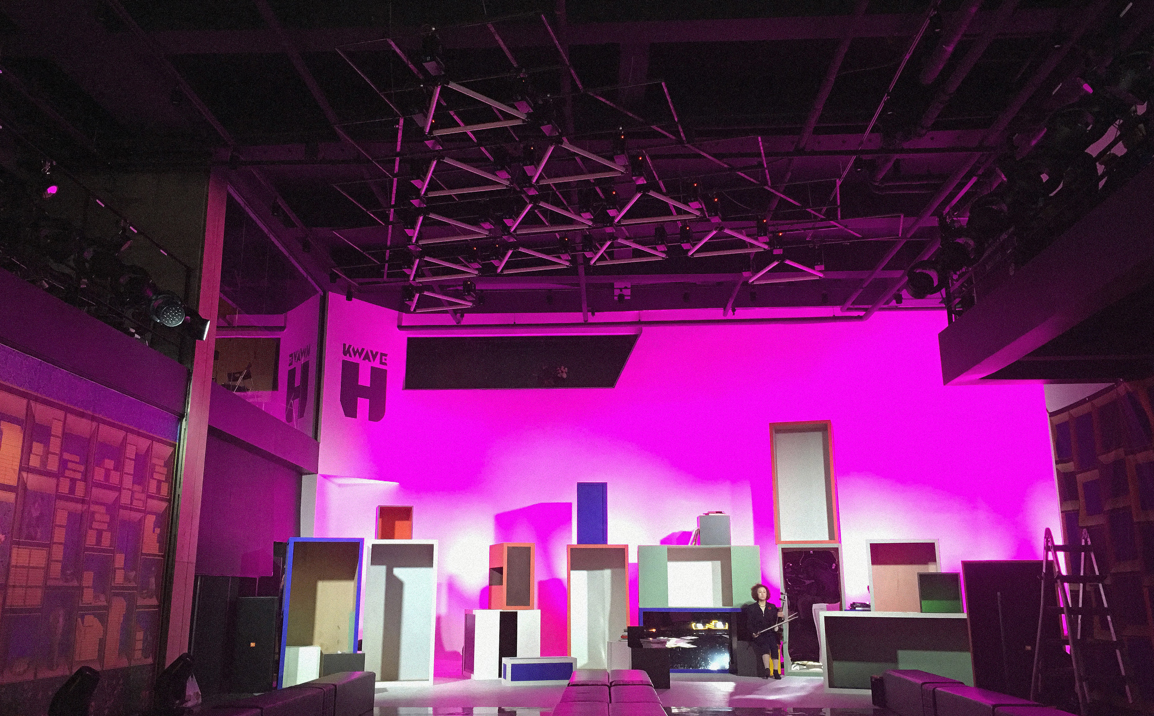
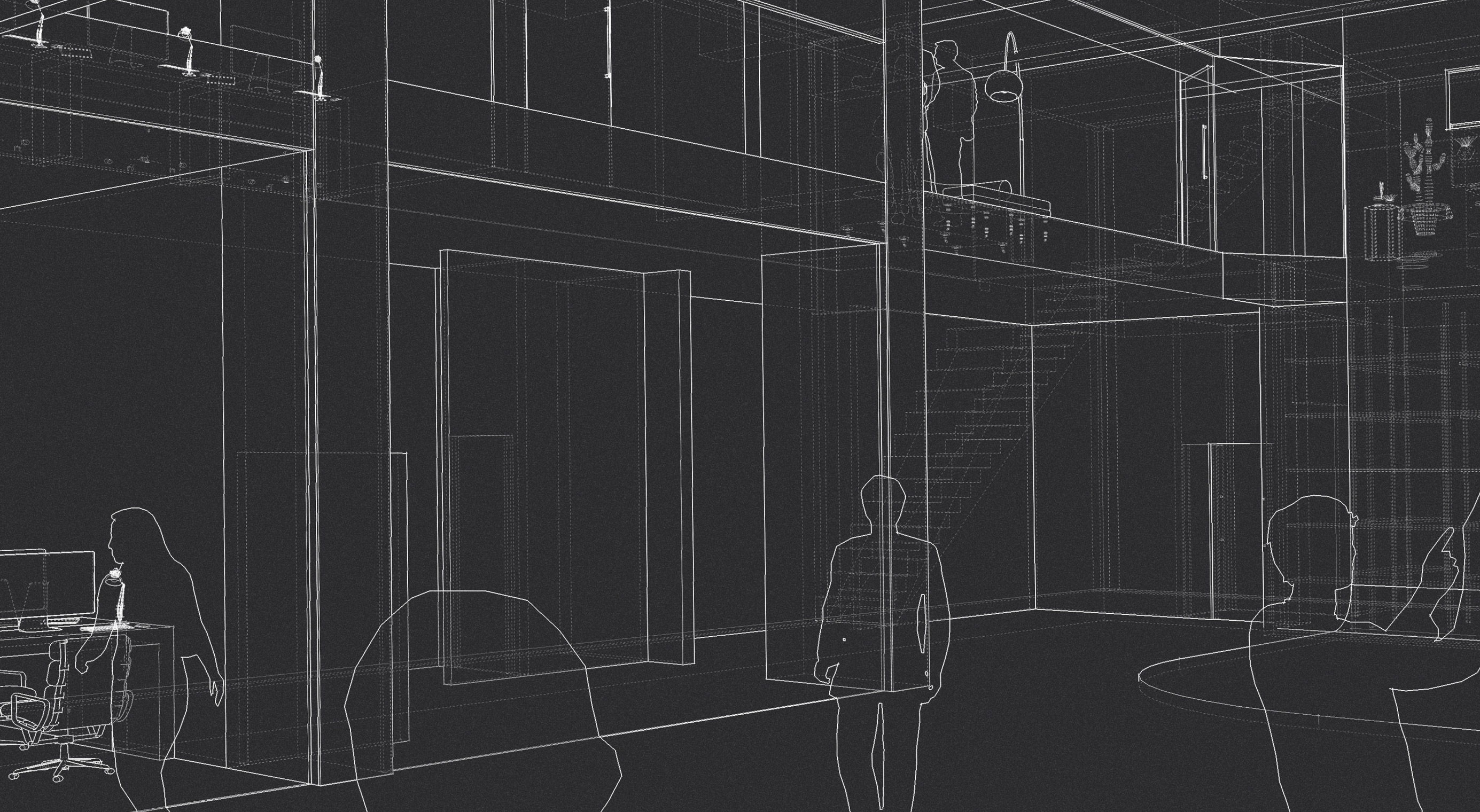
14 The moving light in triangular shape and the large display look impressive.
We designed the triangular light and the display with the prism metaphor. The triangular light has a motor on each end and moves vertically.
There is a controller to designate how each light will move; we can use the light with music for each event so that they will create a hero-like mood.
We took a special approach to design the display. The square and rectangular screens are installed diagonally to build a prism together.
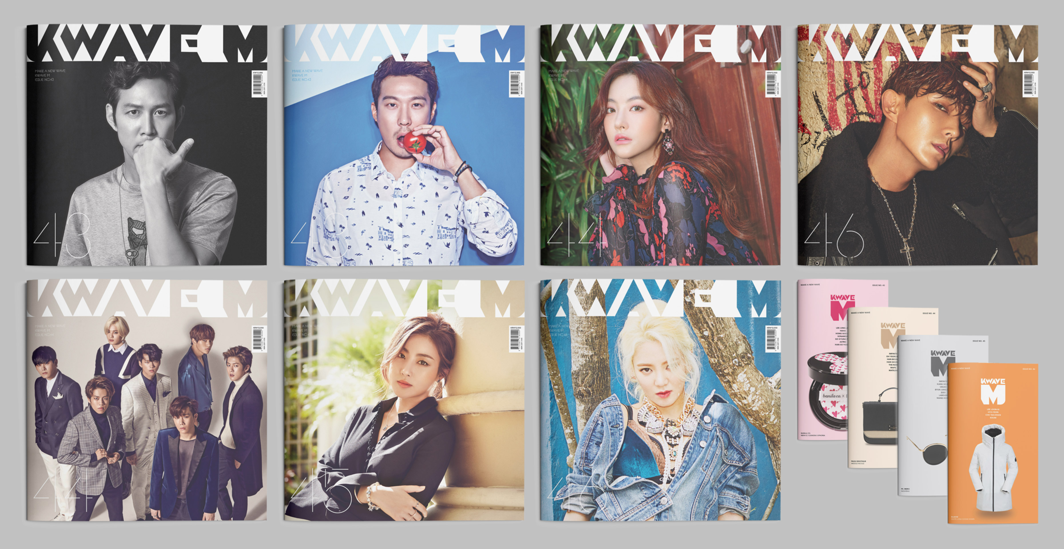
15 Can you tell us more about the renewal process of the magazine?
The biggest change for the KWAVE magazine is that its title has changed to correspond to the alphabet strategy.
In the past, the magazine title was “KWAVE.” After the renewal process, KWAVE serves as the brand name, and the magazine title has changed to “KWAVE M.”
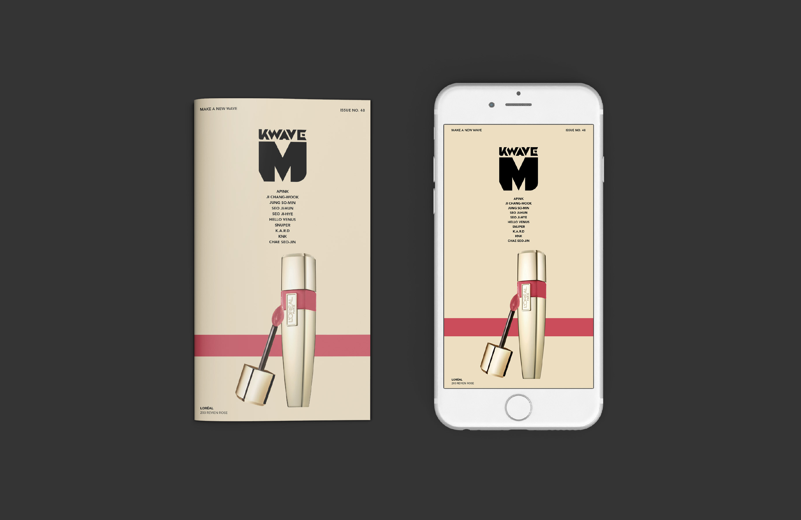
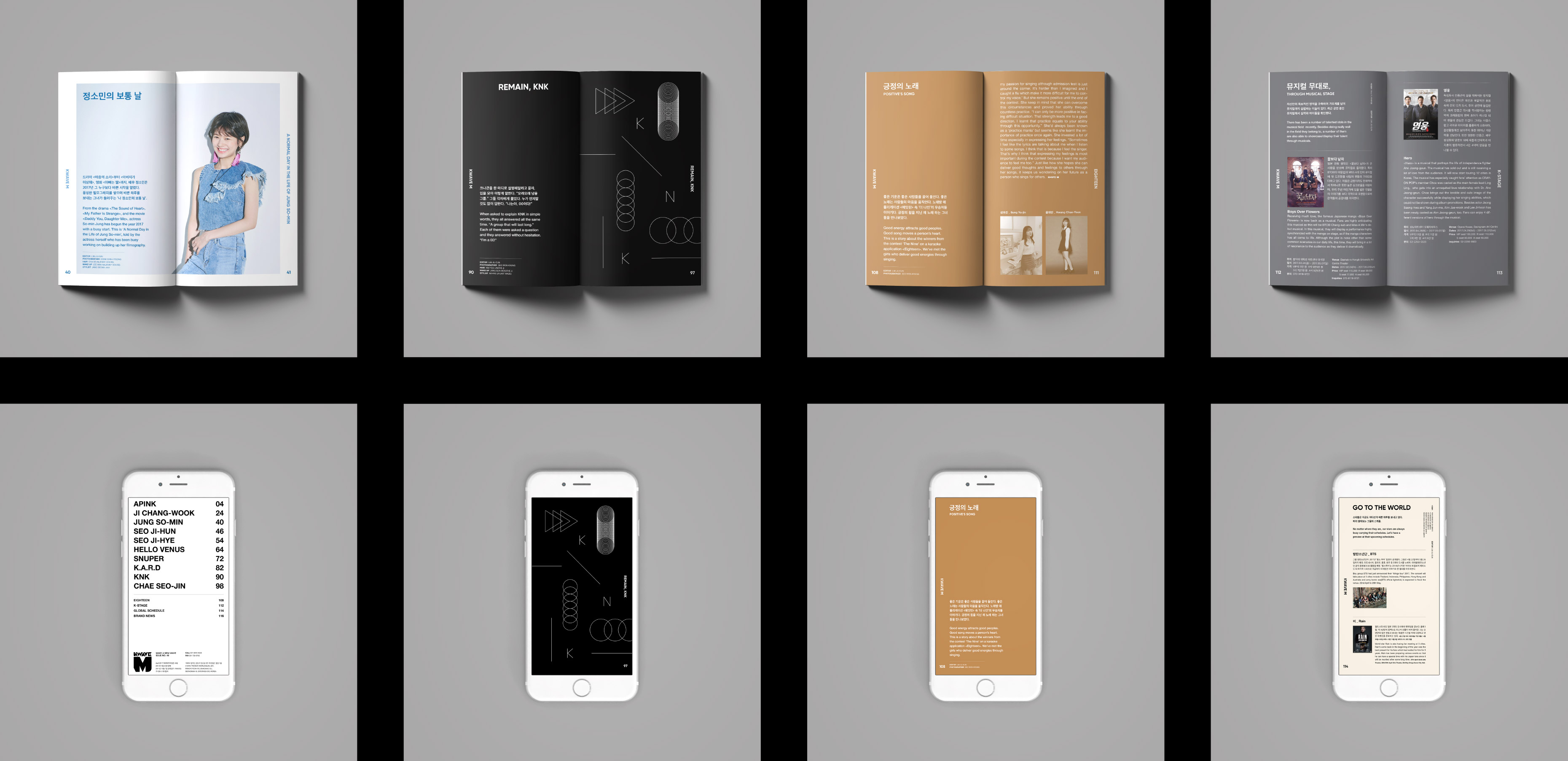
We also built a visual strategy and a design strategy for each content and size in order to expedite the publication process after filming.
16 We want to learn more about the visual strategy.
In each KWAVE M, there are two booklets; there is one square booklet and a rectangular media booklet with the 9:16 aspect ratio. The square booklet is for social media such as Instagram or Facebook. Only pictures are included in the square layout, and the final data are uploaded on social media right after printing out. The media booklet is for the 9:16 mobile phone display. This booklet is text-based webzine, or online magazine, and the final data is printed out and uploaded as a webzine at the same time. With the renewal process, KWAVE M is now equipped with an innovative system to expand its online and offline presence.
17 What happened after the rebranding process?
The alphabet business strategy and a more efficient space have become basis for business expansion. After the rebranding,
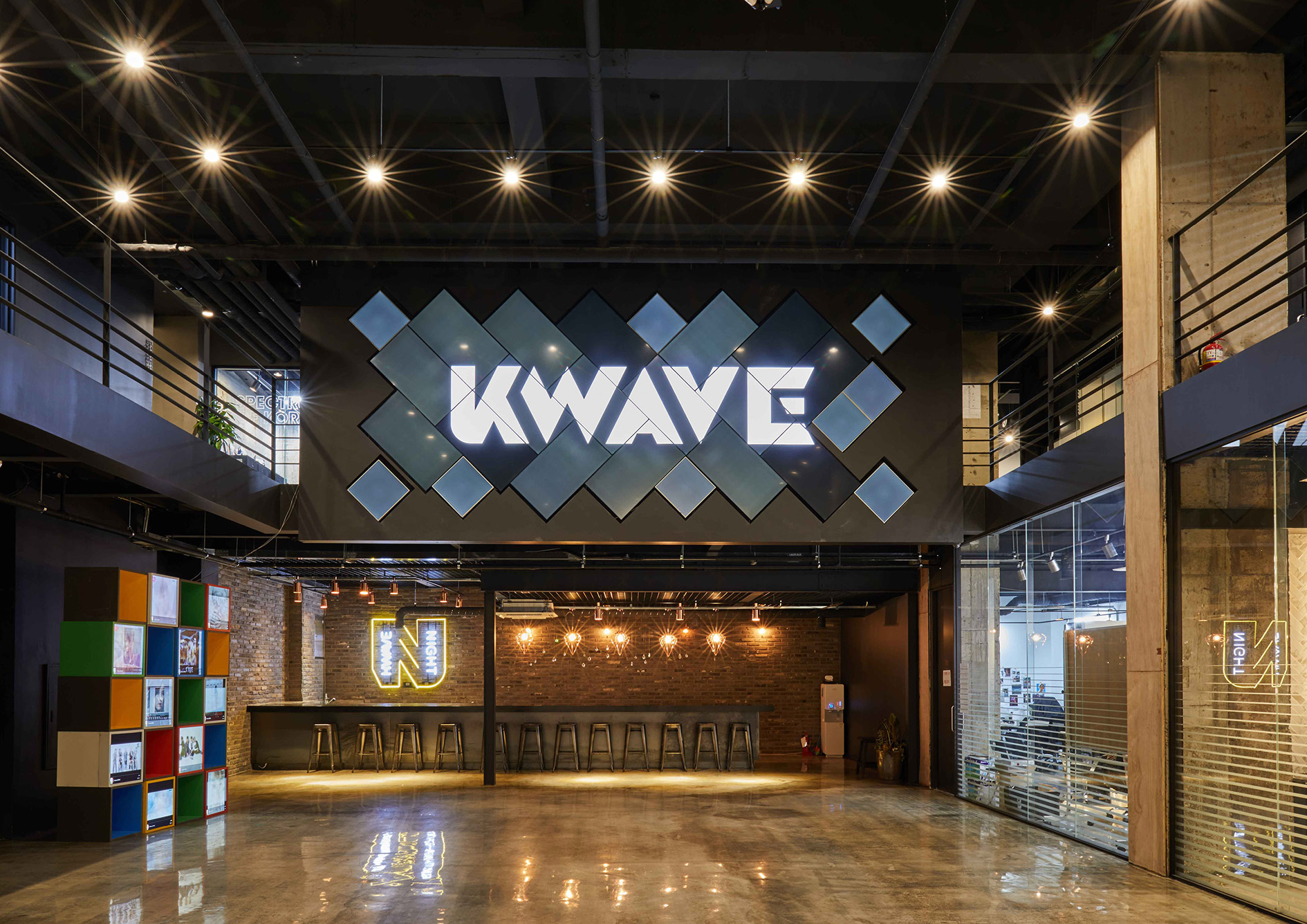
KWAVE has continued the alphabet business projects along with its strategy. KWAVE H has served as a hub to engage in promotion and marketing activities.
The overall project can be characterized with a great harmony among branding, business strategy, and physical space.