1What was the source of inspiration in the branding process?
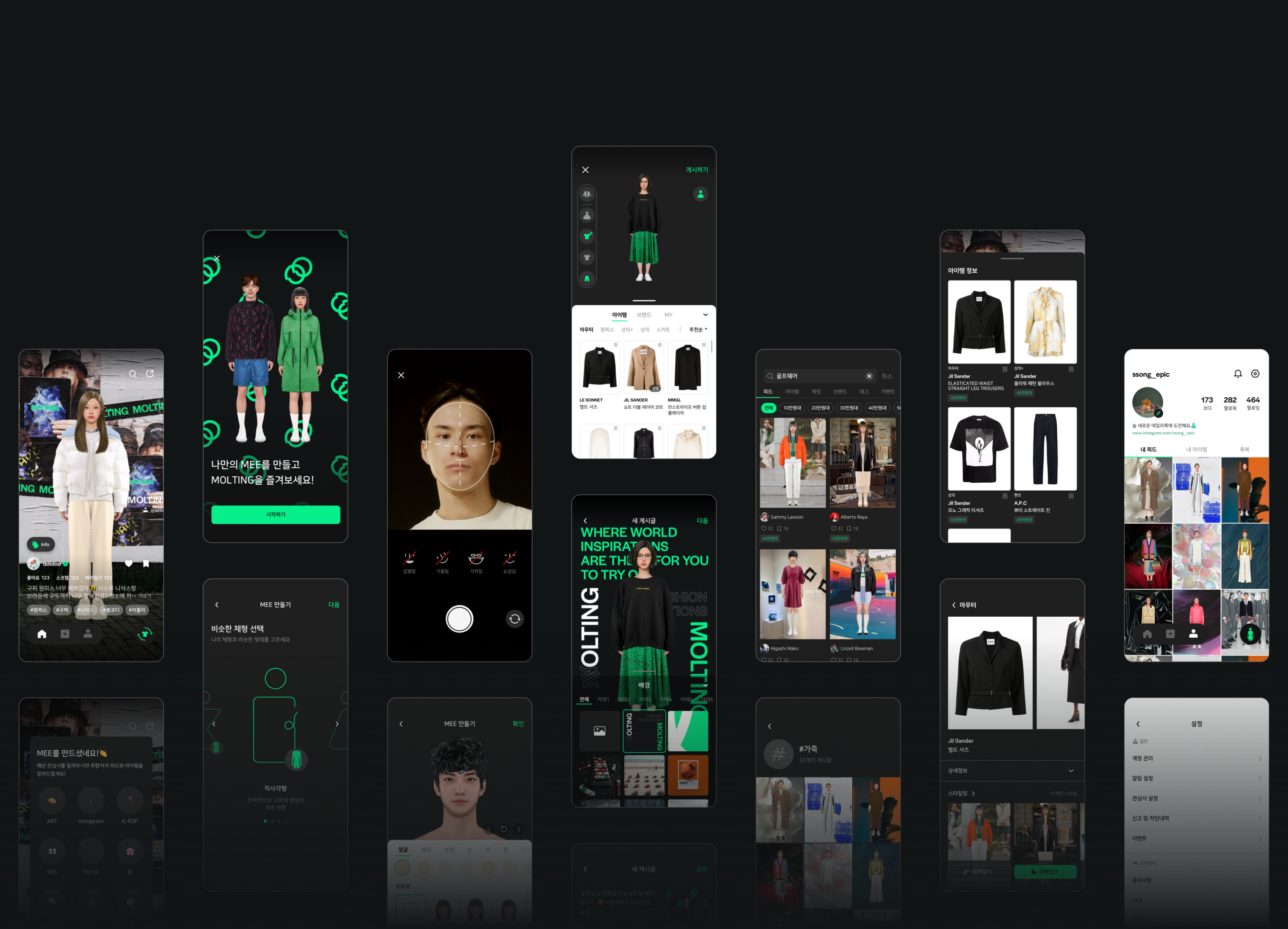
MOLTING is an app that provides virtual space where you can try on clothes. You can create your own avatar to try different styles. The inspiration came from a comic book story; in the comic book, a main character creates its clones with a single hair. This was a special source of inspiration. With MOLTING, you can create your own avatar called “MEE.” You can see various fashion brands, and try on clothes that you have hesitated to try before. We linked the graphic identity of Molting with the materials used in clothing. This is also linked with the name of this brand; with Molting, you can try on different clothes like “MOLTING.”
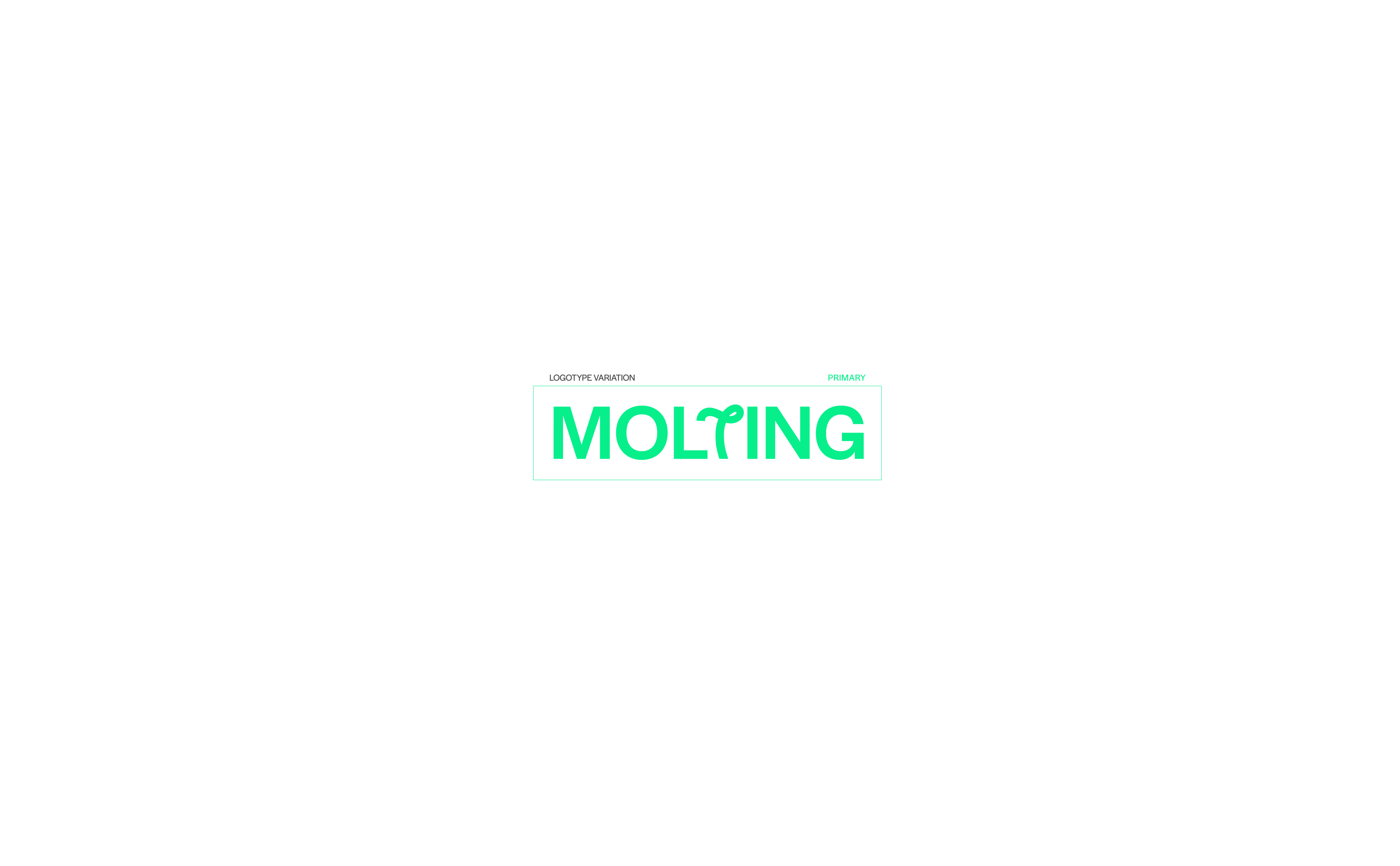
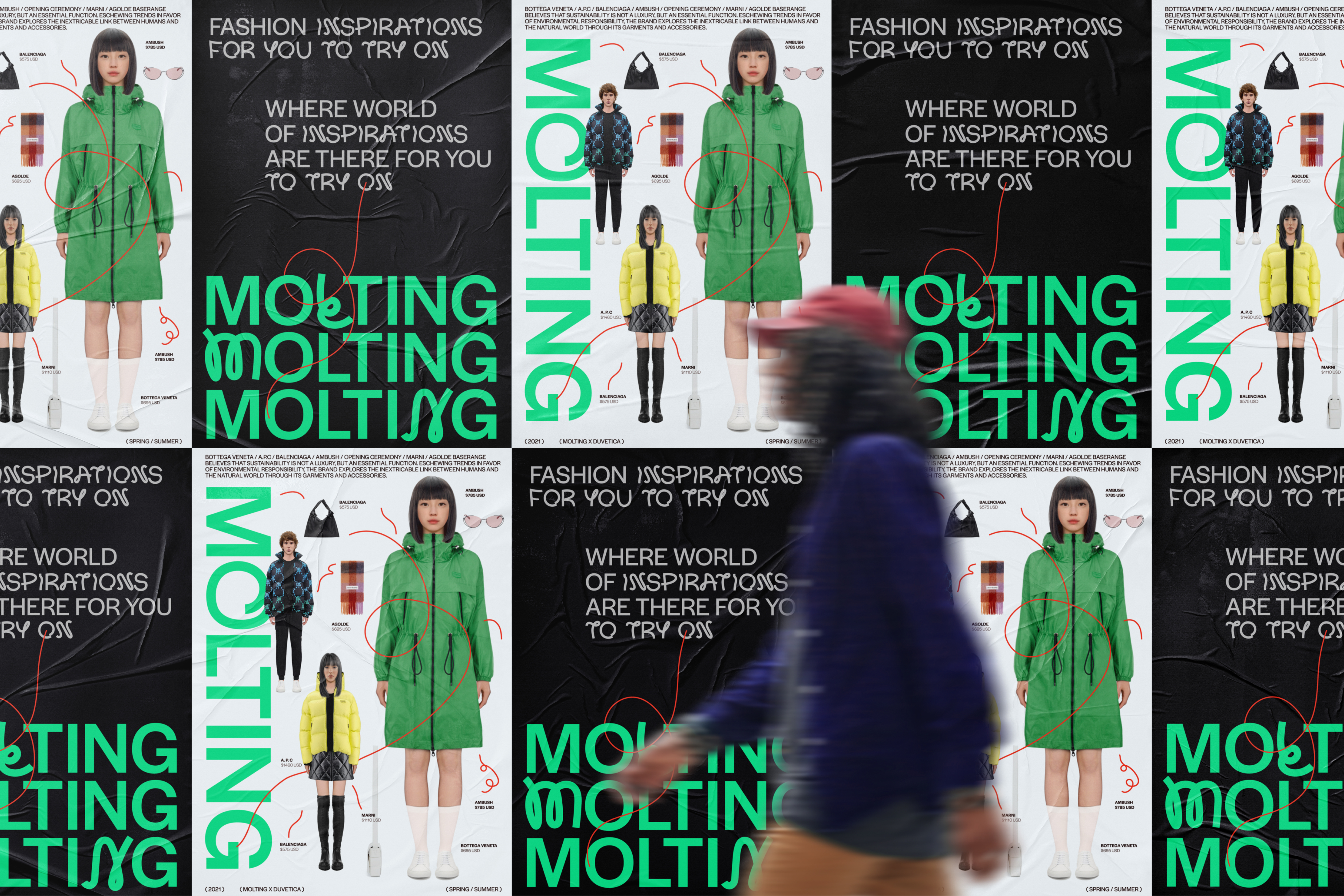
2The logo looks dynamic and interesting. Can you tell us about its design process?
We made this logo look more dynamic to communicate that fashion has diversity and energy. Also, there is a “thread” metaphor, which makes this design more interesting. The logo is simple yet grabs attention.
There are six letters but only one letter is slightly modified, which is a metaphor for each person’s unique character. Halyard is chosen as the basic typeface because it is a neutral font that can embrace different shapes of letters.
Also, we changed the form of the letter “t” in the official logo. The official logo is used more often than others since it represents the brand image. This logo looks balanced and unconfined, and there is wit in its design.
3How did you select the key colors?
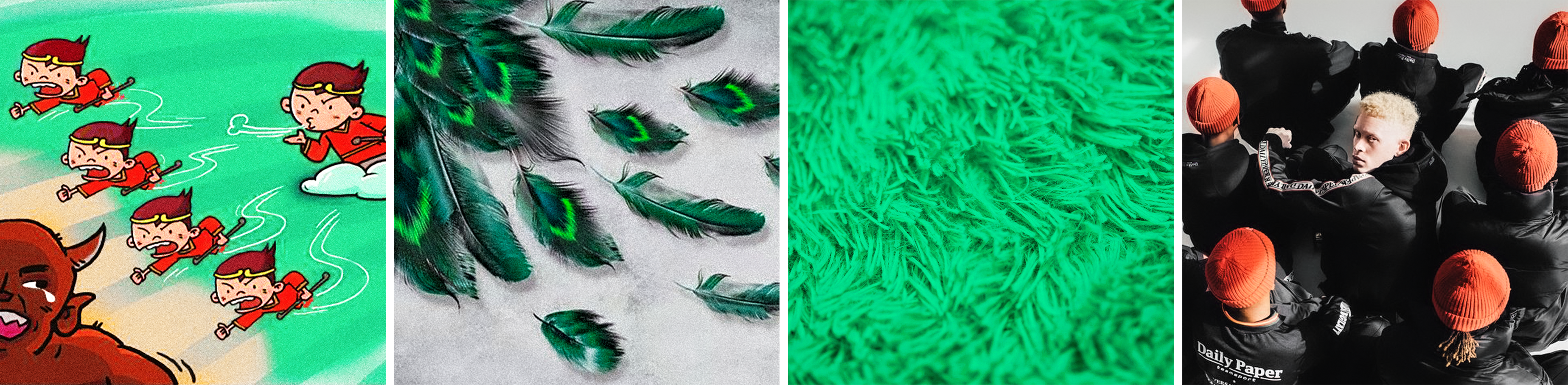
Before selecting the colors, we selected four keywords from the list of characteristics of MOLTING. The keywords are Futuristic, Confident, Playful, and Stylish. The green color might look synthetic instead of natural. This shade indicates that MOLTING offers a “futuristic” virtual service to try on clothes.
Meanwhile, the strong red color represents confidence that you need to try unfamiliar styles. The red color also embodies playful energy created by MEEs in the world of Molting as the users search for their own style.
The black & white colors highlight that MOLTING is stylish and sophisticated.
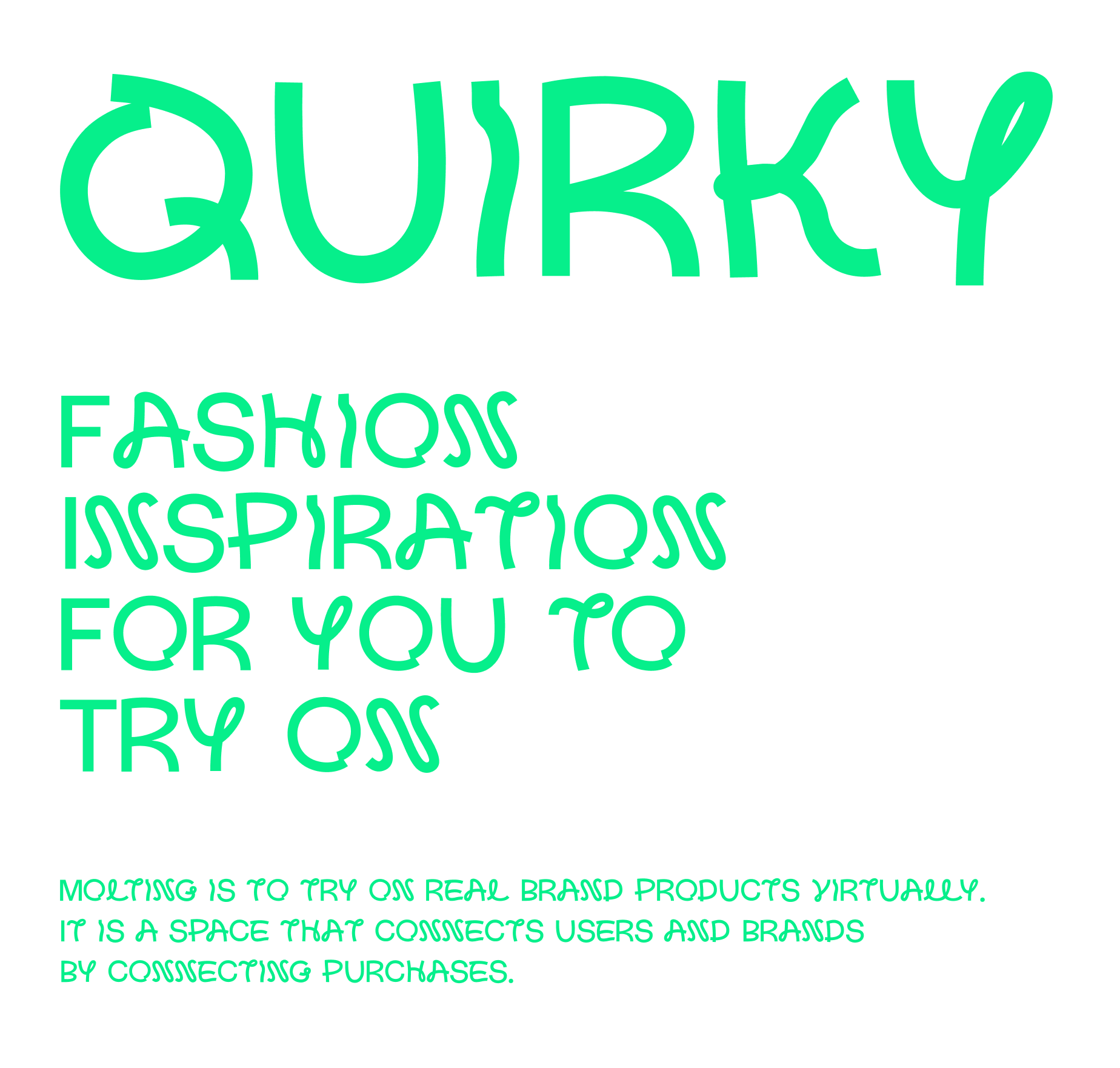
4We heard that MOLTING’s typeface is called “Quirky.”
Can you explain more about this? The font name is interesting.
“Quirky” is the word we would choose to explain the identity of MOLTING. With this application, you can find your unique style that others do not have. Molting is creative, and unpredictable too. This idea is visible in its random typographic system.
With this typeface, you can use both uppercase and lowercase letters, and you can find dynamic, coincidental, and quirky expressions as they are entered. We decided to call the typeface “Quirky” because it is strange but visually appealing.
5Is there a MOLTING’s only function designed for the user experience?
There are four types of graphic materials, and they can be applied in various settings without being confined to specific conditions. These materials can create harmony in images with bold designs and key colors.
They can be presented on a piece of paper, or in a space to add cheerful energy. The vibrant lines can make the space look more balanced, and show dynamic nature of the MOLTING brand.
In graphics, these lines are a solid foundation for MOLTINGs identity.
6Can you tell us more about the application?
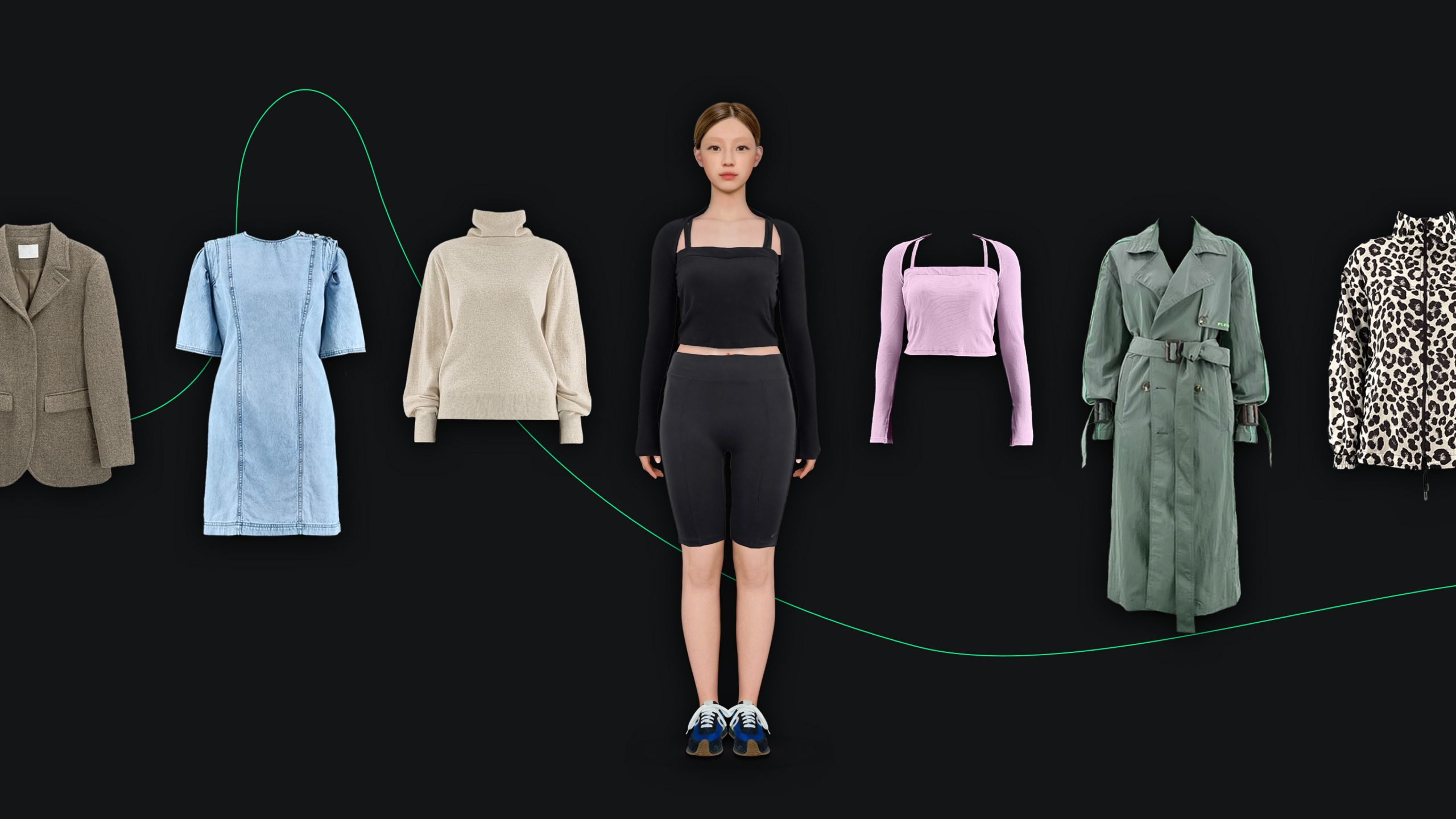
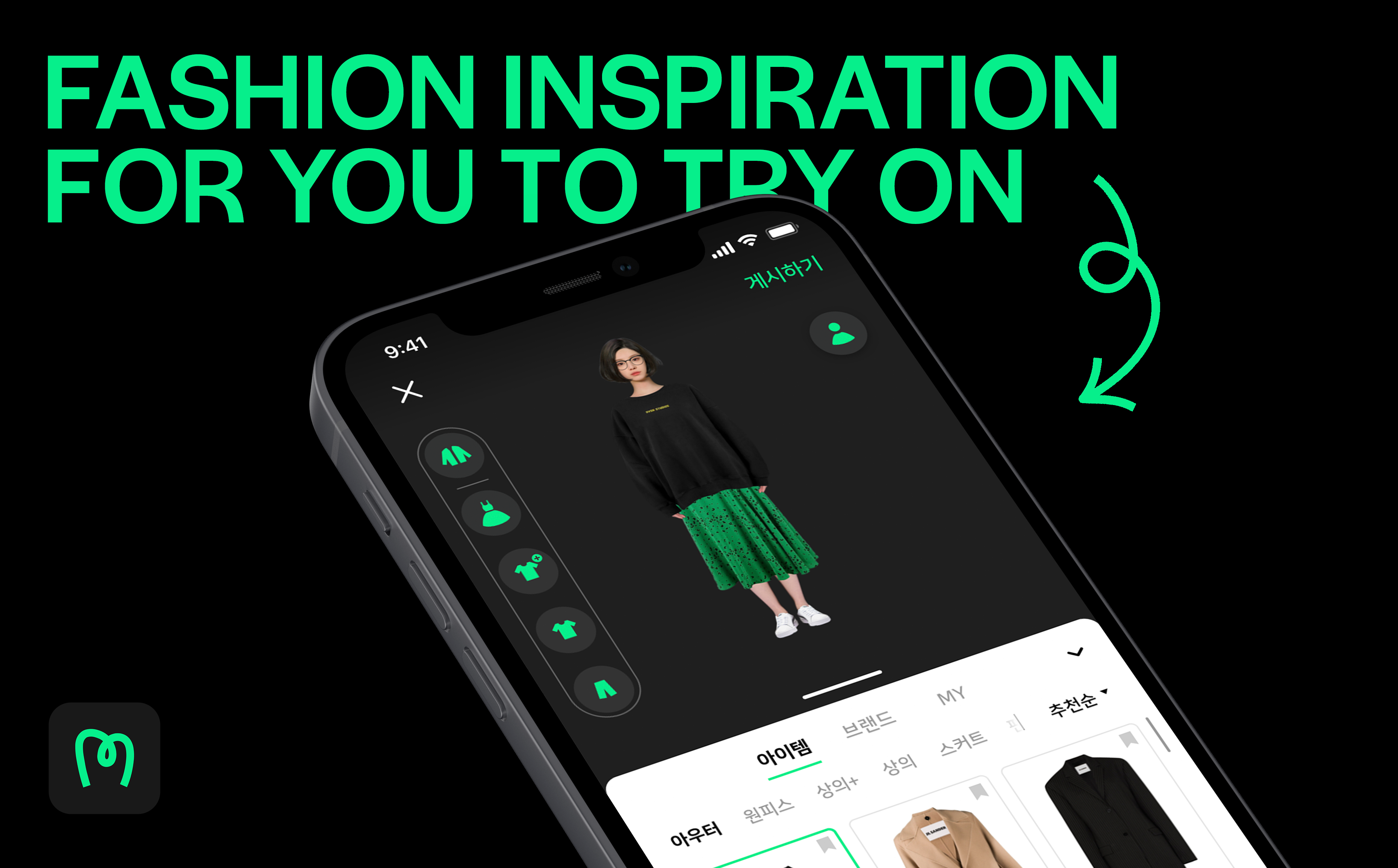
The MOLTING app enables you to try on clothes. Our users are fashion-savvy individuals who want to create an avatar and try on trendy outfits in the virtual space. Plus, these clothes are actually in the market; you can buy them. The app lets you wear the clothes, and see how they fit your body type (size, shape, etc.). You don’t need to actually try them on because you can see how they look within this application. There is a feed page in the home screen. Here, you can share your style with other users. You can communicate with other people and find fashion inspiration in the feed.
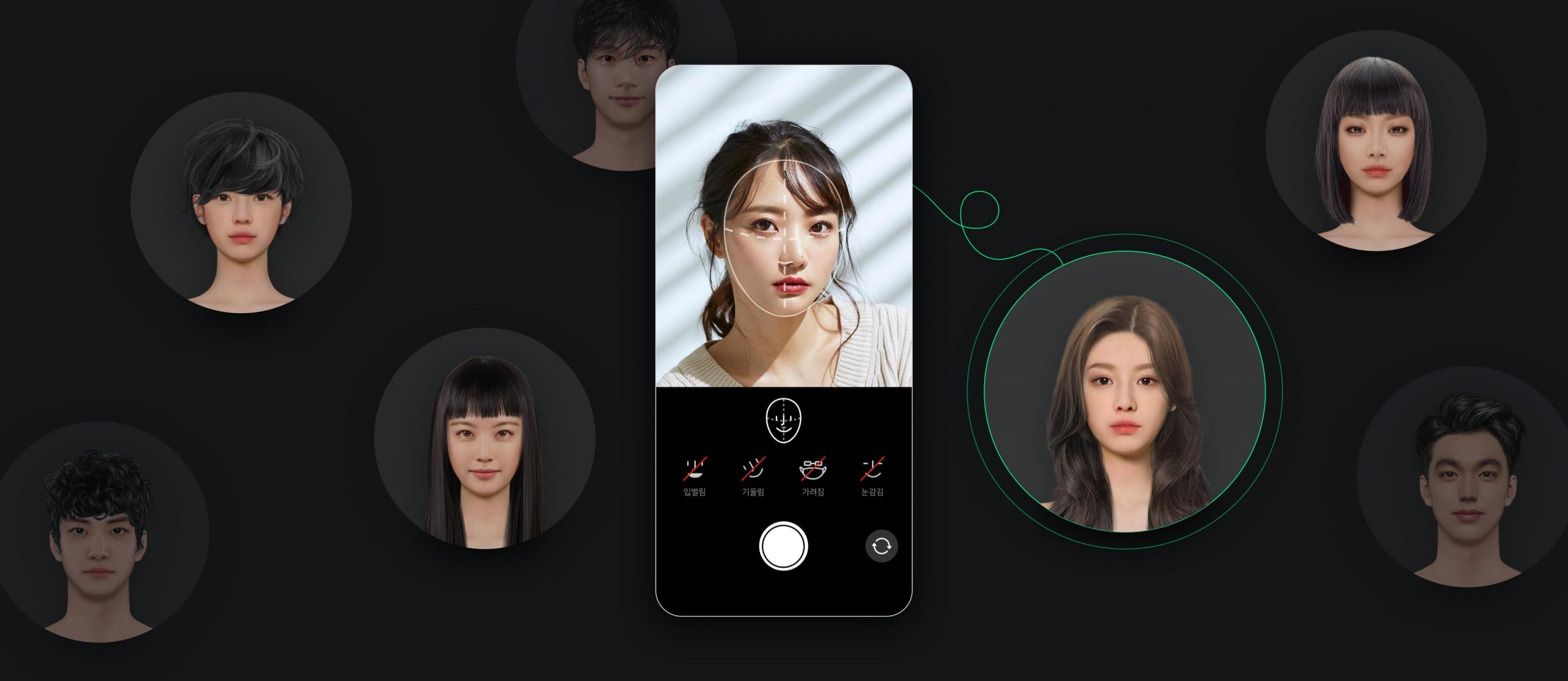
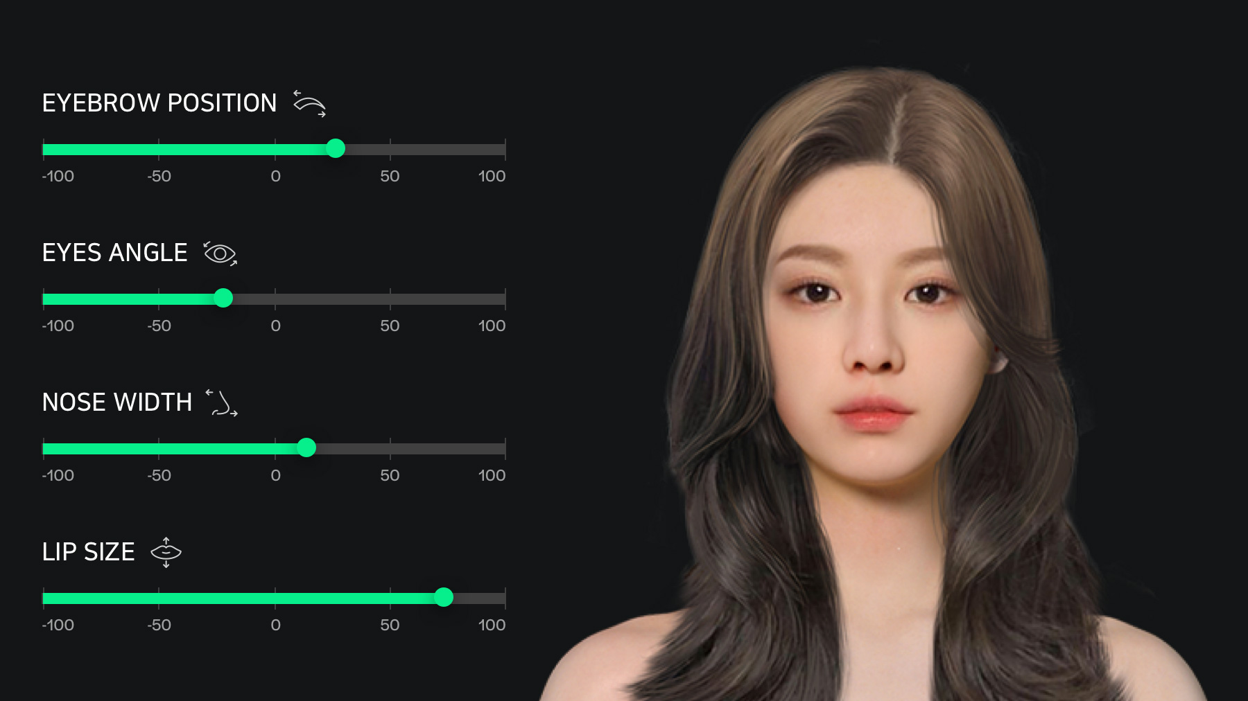
7How do you create your avatar?
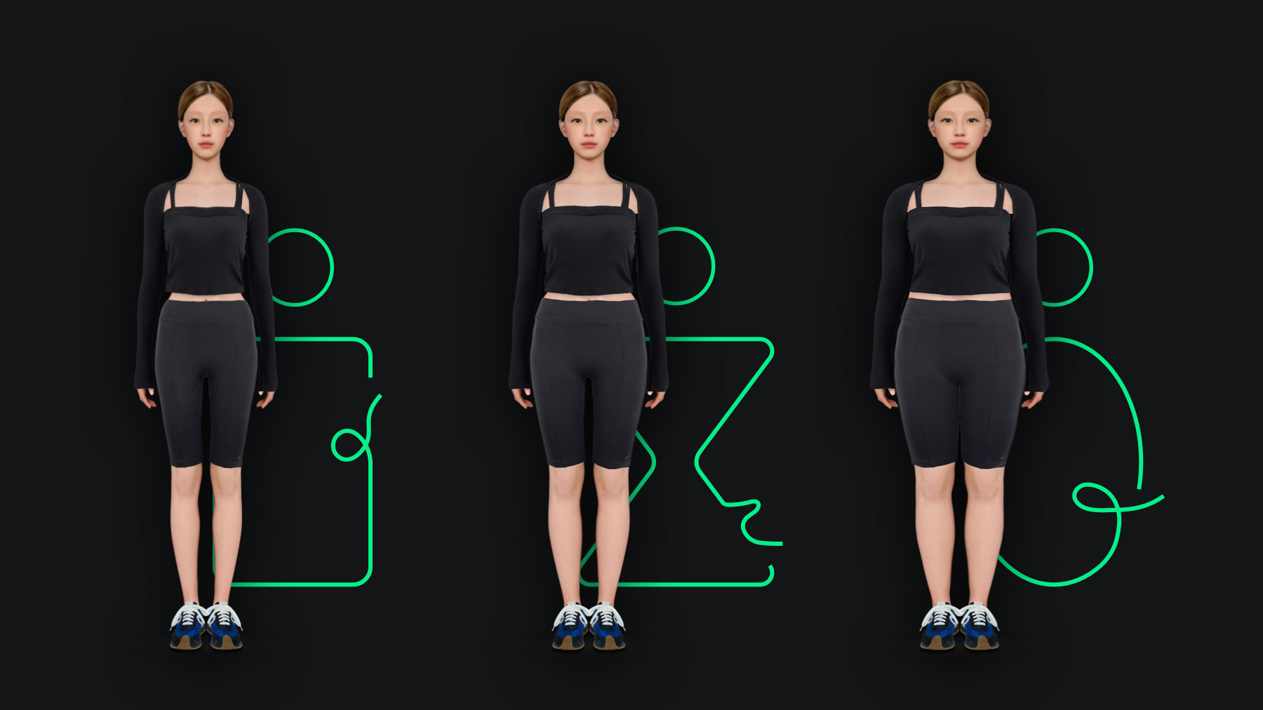
First, select your avatar’s gender, height, and weight. Second, choose the body shape (for you or for the avatar). There are four options of body shape for women, and three for men.
Next, you can use face recognition feature to create your avatar’s face. If you don’t want to use this feature, you can pick from the existing options. And then, you can select hairstyle, face shape, brows, eyes, nose, mouth, and/or glasses to add more details and customize.
When your avatar is ready, you can try on 2,000 or more items.
8Is there a feature that is designed for MOLTING’s unique user experience?
Newly released fashion items are constantly updated. You can see what’s trending, and purchase what you like. You can try on multiple clothes, and they will look realistic on your avatar. This is the key point that differentiates MOLTING from others.
In addition, there is a “multi-view” feature. This feature includes multiple views for a single item, which is indicated by the number attached to each item. Let me explain more about this feature. When you select an item and click more than once, you can see how the style changes. For instance, you can click twice to see how a shirt looks like when its sleeves are rolled up. You can click more to see how it looks when buttoned up.
In the upper left corner, there is feature for “layering.” You can drag and drop to layer the clothes including outerwear, top, skirt, and trousers. For instance, you can tuck in a t-shirt with pants. As mentioned, this app provides a virtual space. We wanted the users to be brave when they try different styles. We wanted to give another level of freedom.
9While designing the application, is there something that required more attention?
There are two components that received more attention. One is the sign-in flow, which had to be streamlined. The other is harmony between Light Theme and Dark Theme.
At first, the app required multiple steps to sign in. The intention was to receive as much user data as possible. Also, we wanted to enter one type of information in each page to follow the UX policy. But we received feedback that the sign-in process is too heavy.
That’s why we created another sign-up pathway. Now, you can also use your mobile number instead of your email address. At first, you had to use your email address. Additional information can be entered in the last step, and it is optional. When you sign in with your social media account, optional information can be pre-filled. It has reduced the time taken to sign in by half, and reduced burden on users as well.
Second, the fashion items should receive the spotlight since this is a fashion app. However, the Molting brand identity looks better in Dark Theme. We have to use Light Theme to emphasize clothes, and create a balance with Dark Theme for brand identity. For instance, when the item images are included, you can see that Light Theme is used. Other than that, you will see Dark theme. The two themes are used in combination.
Users can find out that Light Theme indicates the presence of fashion items, and different themes indicate different pages.

8We want to know more about the process from planning to launching the app.
In the initial stage, we only had a broad idea. The theme was to create “a fashion try-on app that creates an avatar that looks like you.” The brand team worked on user research, brand identity, and brand name. The UX team analyzed how competitors are doing, and used agile methodology for ideation of core functions. This was done each week for wireframing.
We received regular feedback from the client to complete information architecture and wireframe. At the same time, the brand identity was ready to proceed with smooth graphical user interface (GUI) process.
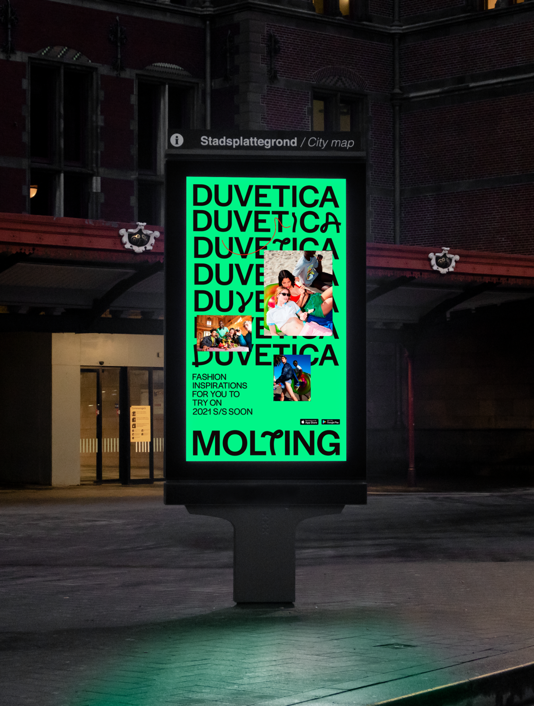
After the design process, we made many revisions during the development phase. We worked with a tight timeline because there was a decision to work with Duvetica (Italian premium lifestyle brand). Only key features were included in order to meet the deadline, and it was memorable project for us