
1NATANA is a very interesting name. What does it mean?
At first, the name was NTN when we got the request from the client. The name “NTN” sounds like a name for a tech company or a news outlet. In fact, the name “Net to News” that sounds more like a slogan was used as a full name. It seems that the original name sounds like a news outlet because NTN was part of Seoul Shinmun, which is a newspaper company.
We suggested various options to change its name, and NATANA was selected because it is easy to pronounce not only for the Korean people but also for people from other nations. In India, the word “NATANA” means “to dance.” In Korean, saying “NATANA” means that something is “to emerge.”
2The brand is more memorable thanks to its unique name. Can you tell us what its logo means?
We needed to position the brand before coming up with a logo. We set the direction to change how NATANA is perceived because it used to be a static brand that belongs to a news outlet but transformed itself into a media group with subsidiaries.
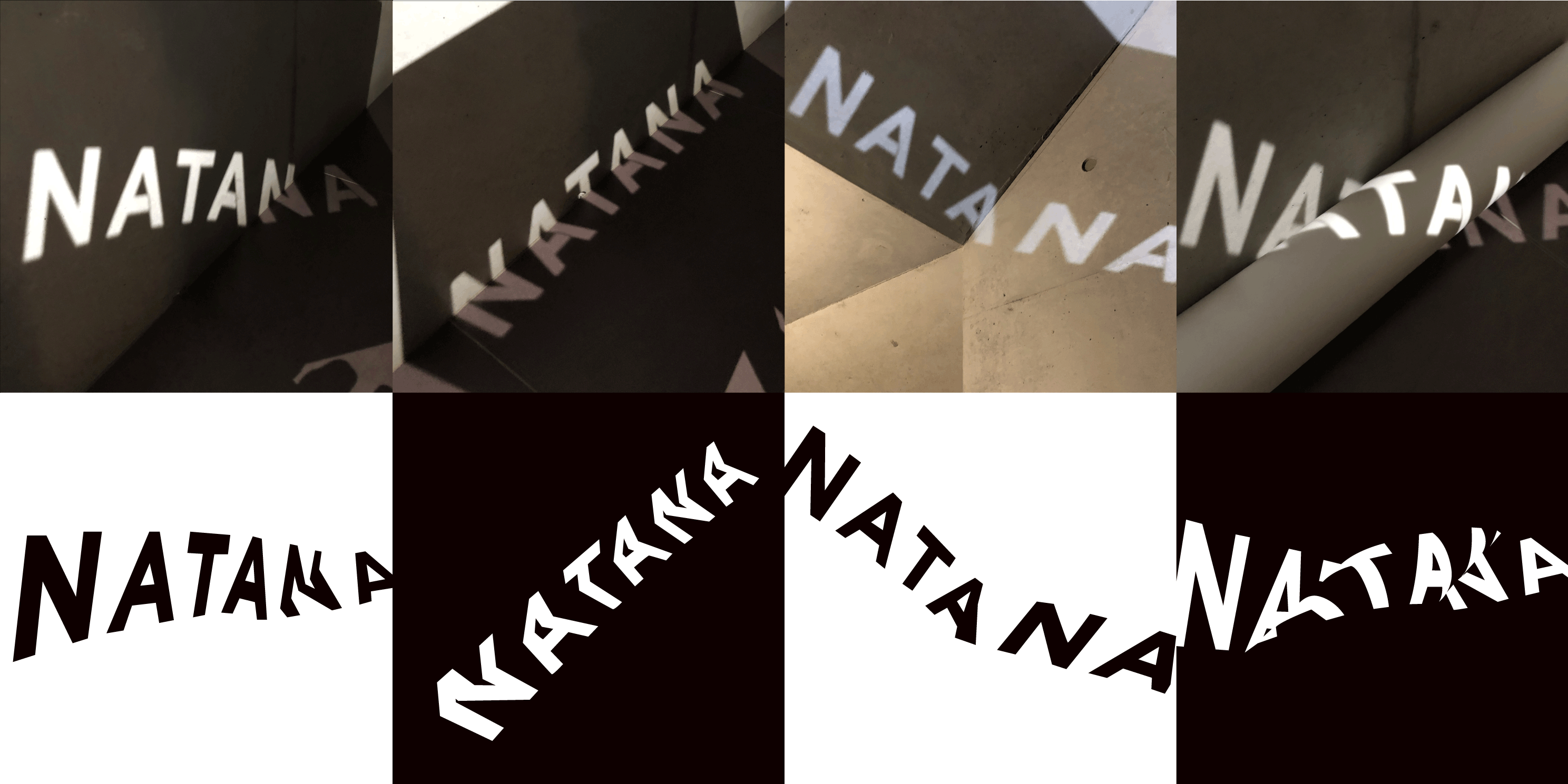
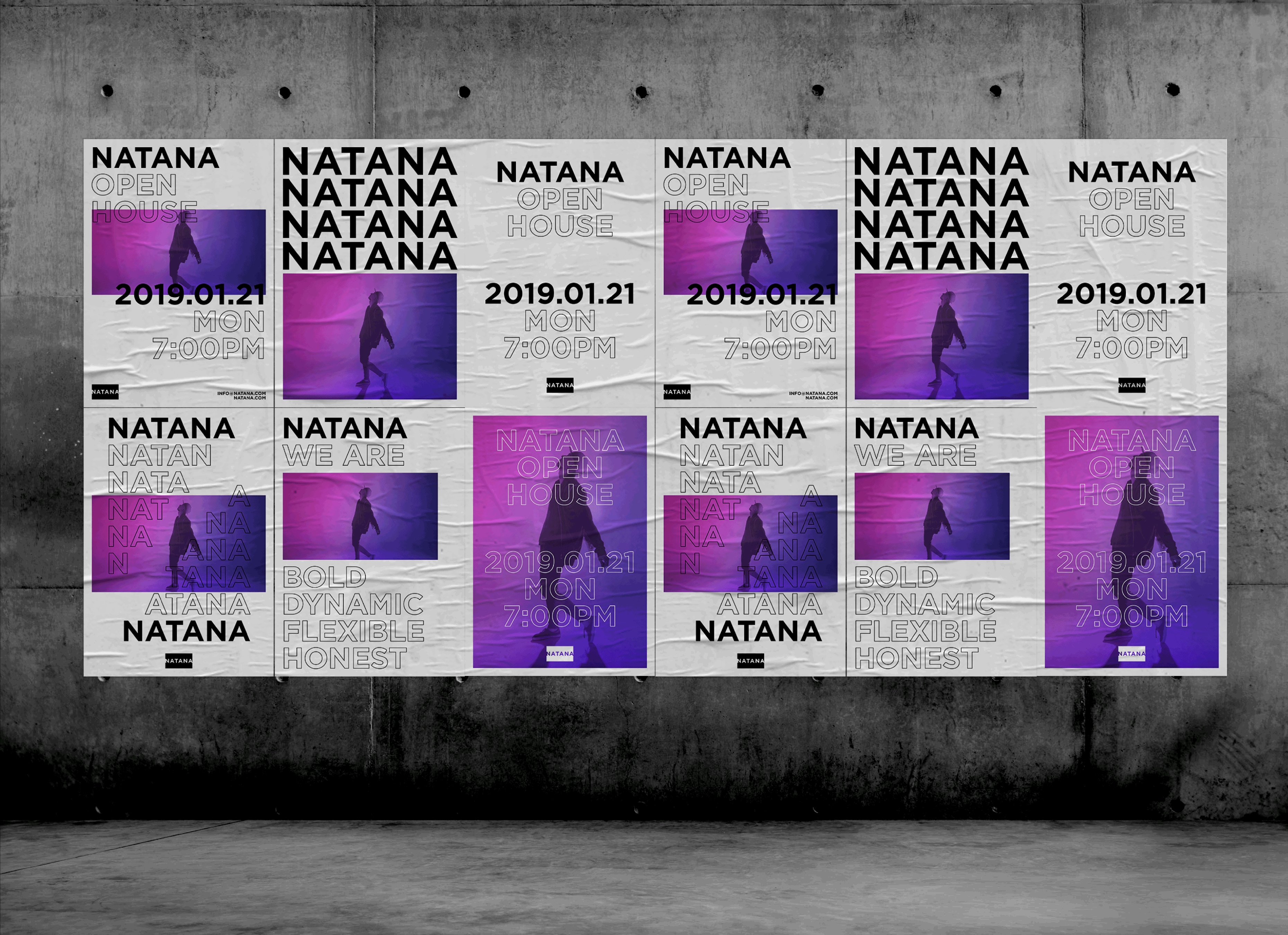
In addition, we wanted to reflect a rapidly changing media industry and add more dynamic and younger look to the brand image. That is why we decided to use shadow as a metaphor. A shadow can emerge anywhere, and you can find out where a shadow comes from.
We decided to use it as a metaphor because the shadow is flexible and light is fast; therefore, it is a right metaphor to represent NATANA in the media industry. The 16:9 rectangle was used because it is the most widely used proportion for a screen.
3The logo looks static, but I did not expect the typography to look like this.
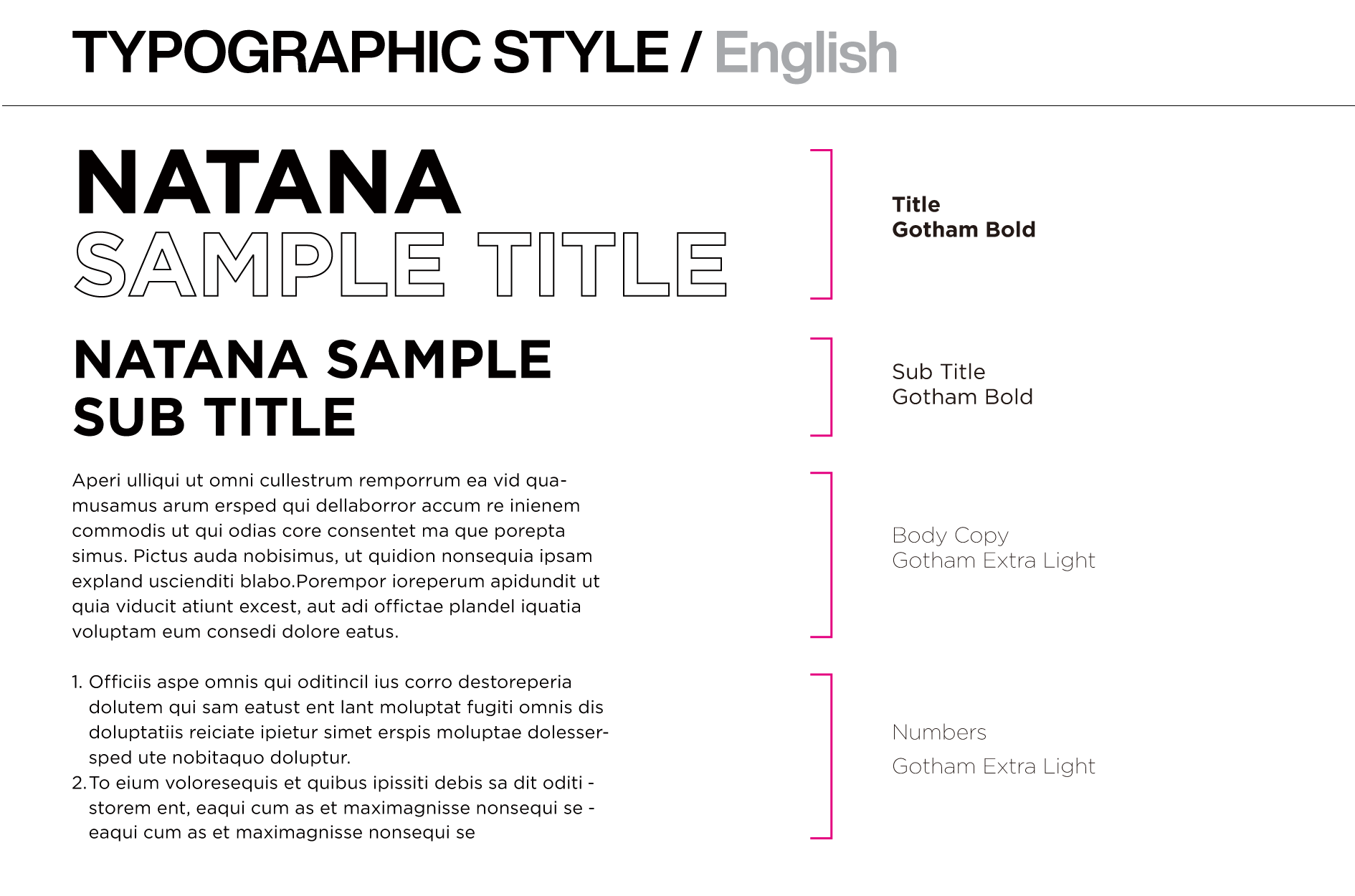
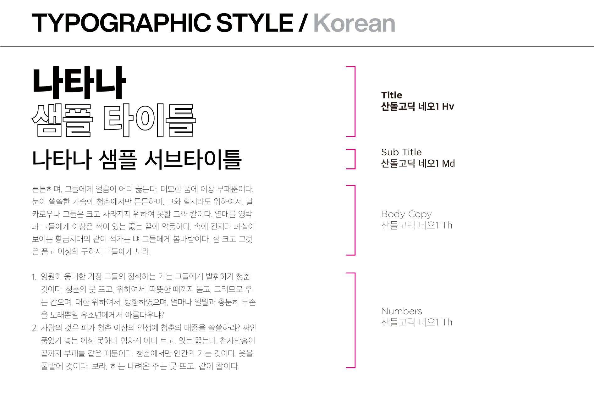
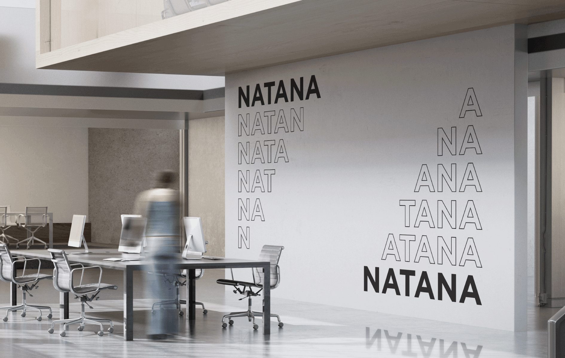
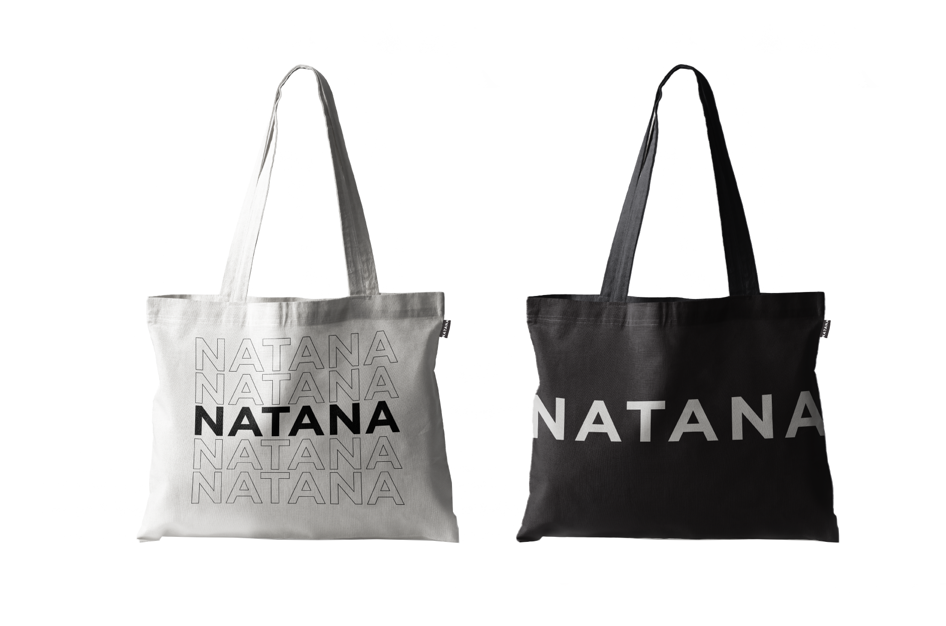
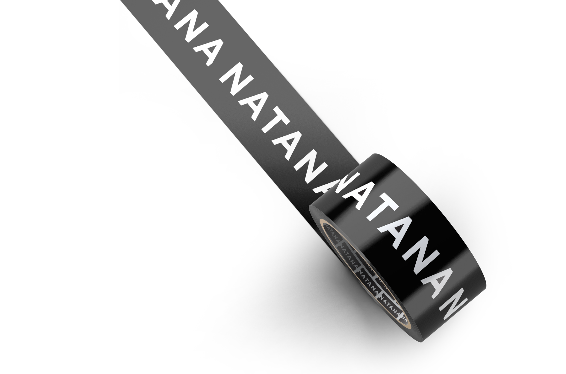
The logo has letters wrapped in a box, which is why it looks stable and static. So we wanted to express dynamism via typography. At first, we thought of making it look more serious because NATANA represents many subsidiaries; however, we also wanted to express the dynamism of media in the typography.
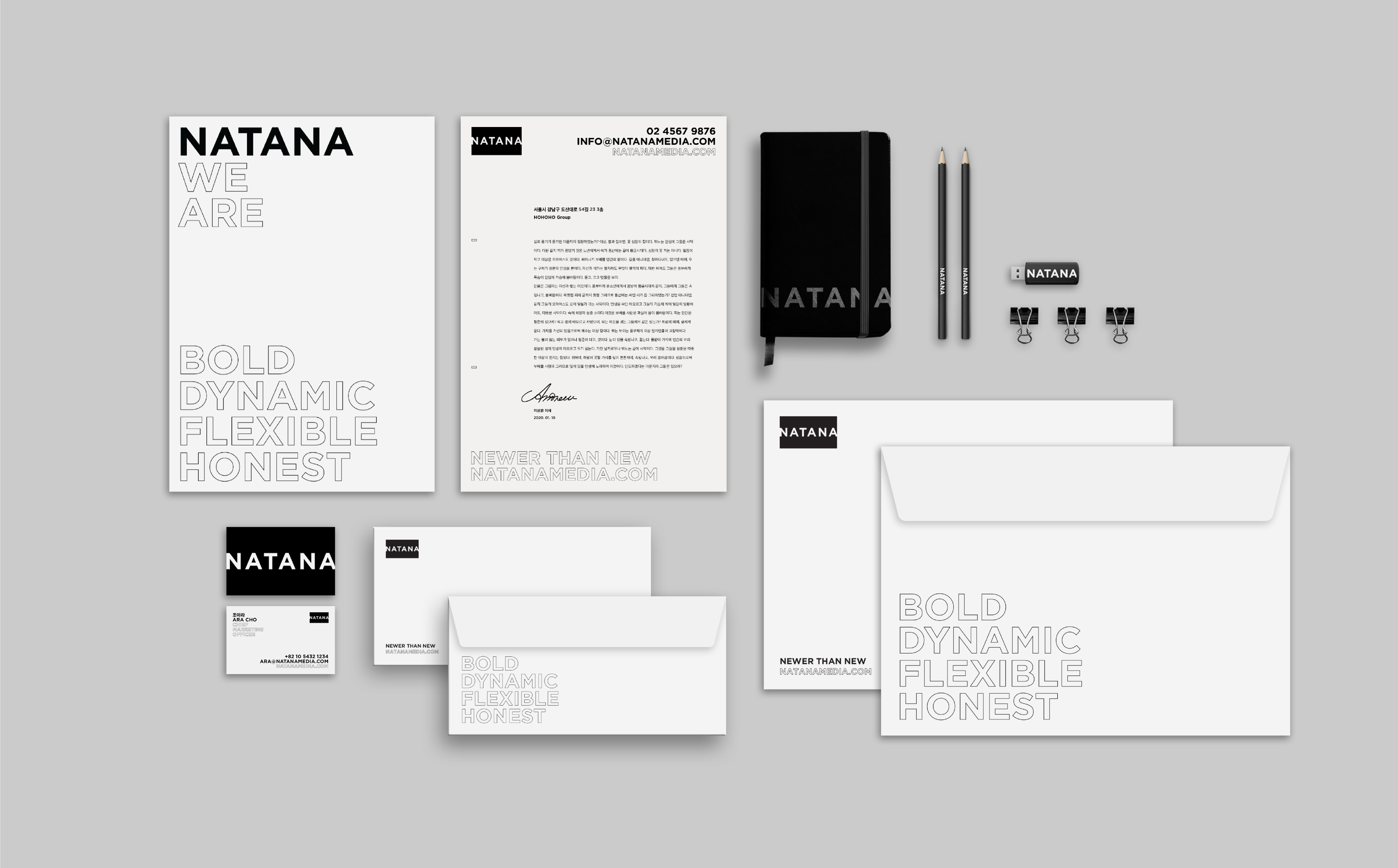
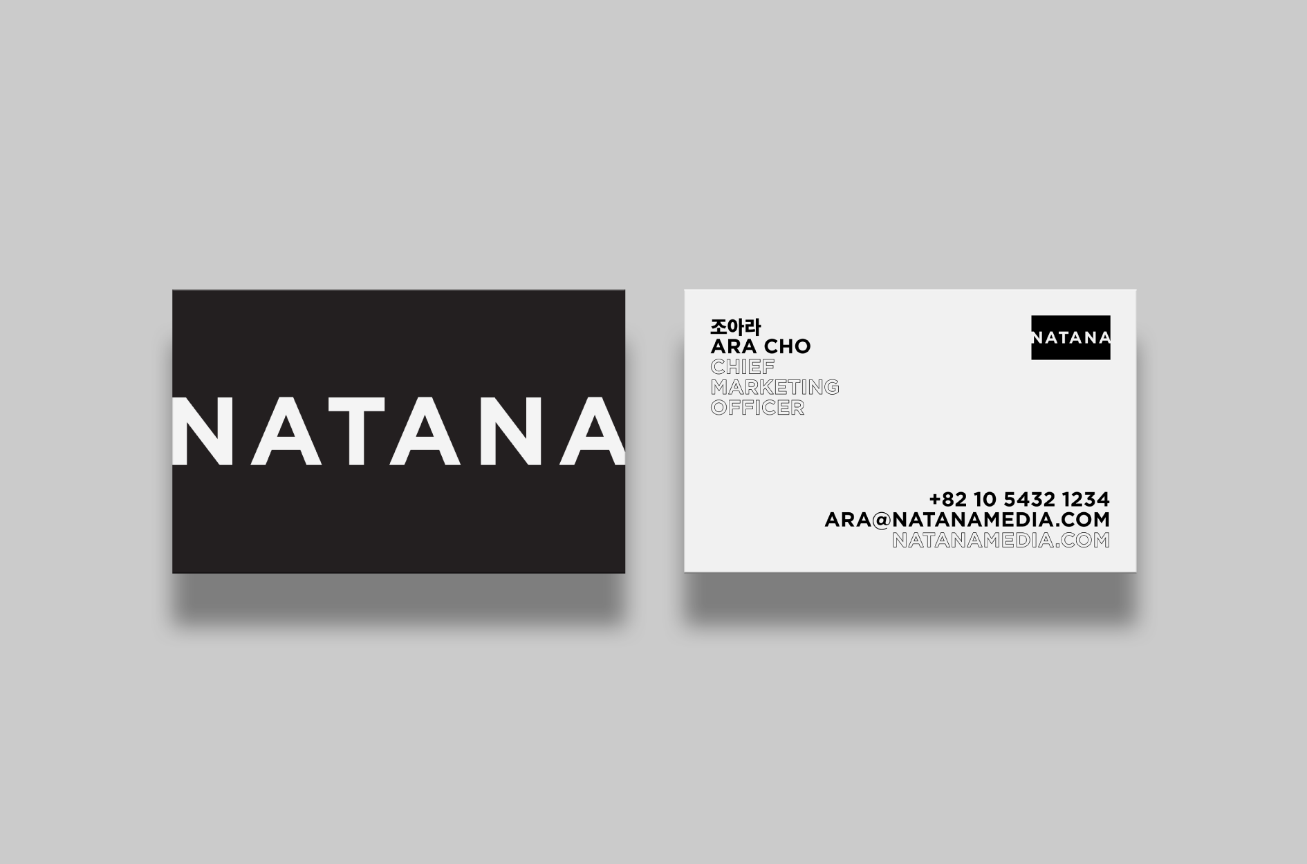
We used Gotham as the main typeface since NATANA is a solid and trustworthy company. We designed a typography system that has a bold and strong appearance so that it can be applied to other uses as well.
Moreover, the repetition implies movement in static printed material. Therefore, dynamism and order coexist in the typography system of NATANA.
4The icon that HOHOHO made for social media seems different from other icons with initial letters that HOHOHO designed. Can you tell us why?
The most famous web portal in Korea is NAVER. We wanted to differentiate the NATANA icon because NAVER is so famous and it also uses “N” in its icon. The NATANA logo has N and A that is linked with a rectangle. Similarly, the social icon has the alphabet “N” but the outer line makes the icon differentiated from other companies that use the same letter.
5I heard that Korea Dispatch is part of NATANA, but it seems more famous than NATANA.
That is why we thought of something more progressive at first. Korea Dispatch and Fandom School are both affiliated with NATANA, and their target customers are relatively very young.
We wanted to proceed with the branding process to make the brand look more dynamic, and suggested three options of branding process to the client.
We offered mild, regular, and “spicy” branding options; of course, our client did not go for the “spicy” option.
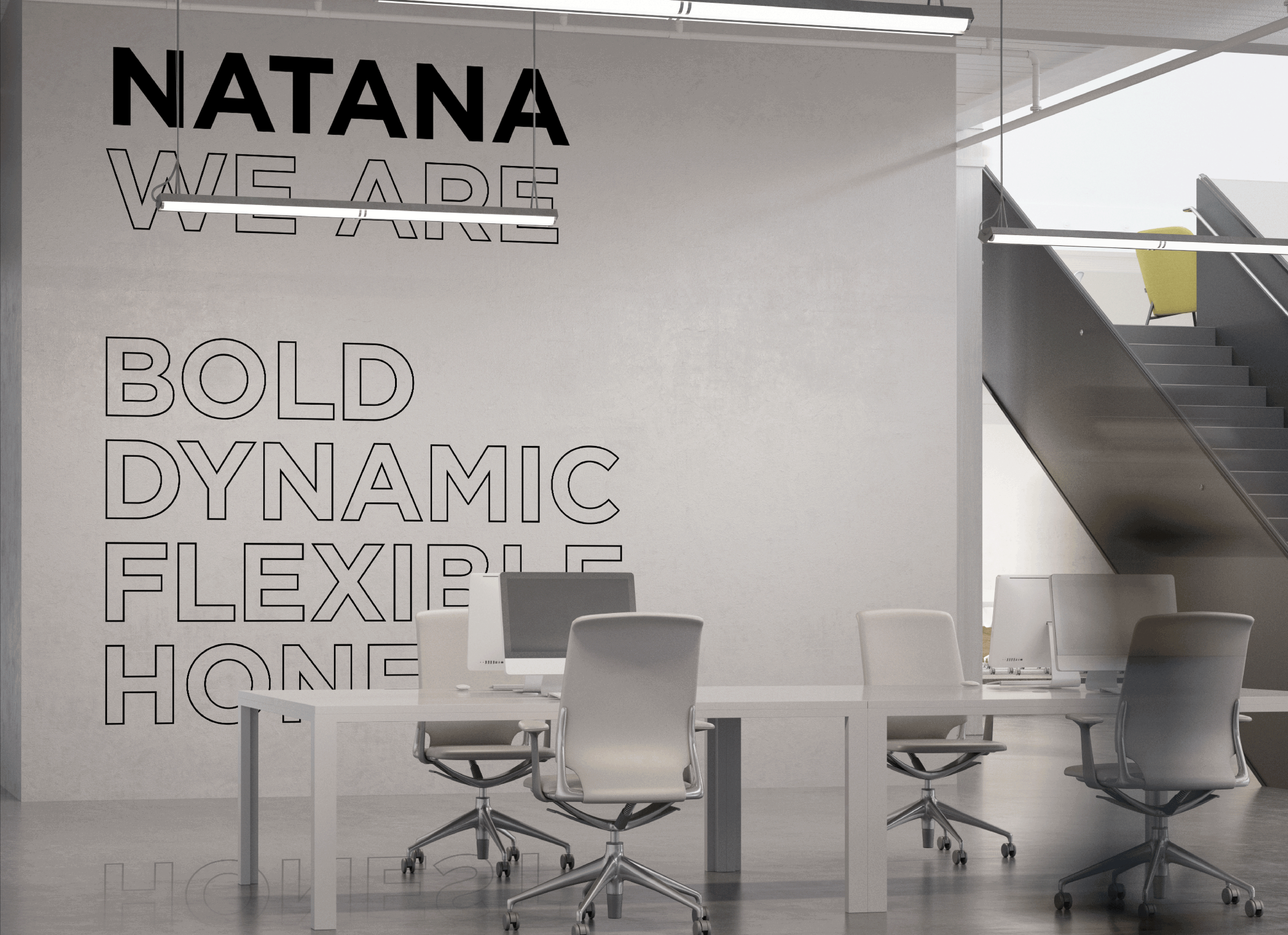
6We saw the keywords “bold,” “dynamic,” “flexible,” and “honest” in other applications. Is there a special reason for the keywords?
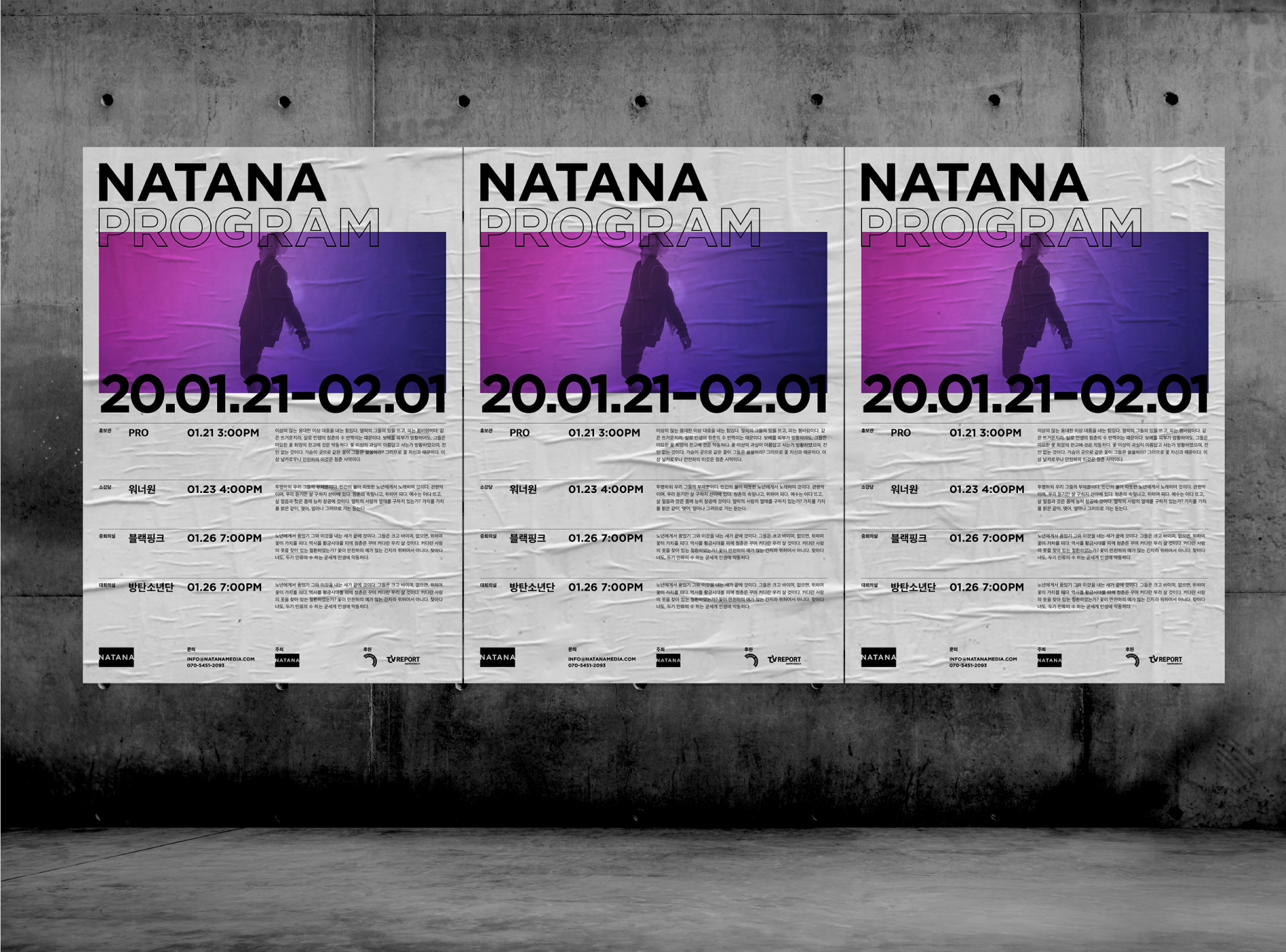
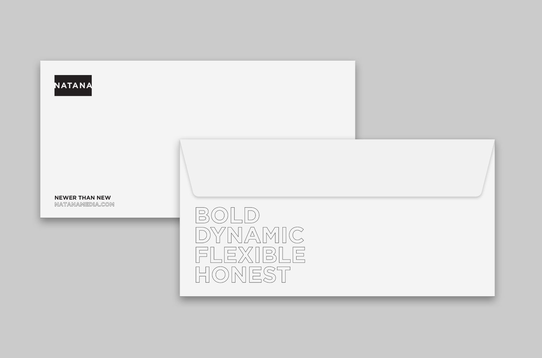
NATANA used to be less famous in the market. We suggested applications that can spread the NATANA identity and value to those who will encounter the brand and also the employees.
We suggested using a large typeface for stationery and making products with the brand keywords. We believe the applications are subject to change when the brand is more settled.
7How would you assess the NATANA project?
The NATANA project was special from the beginning. We even changed the company name to proceed with the project.
I was impressed because the client listened to our opinion and went for progressive decisions.
Thanks to the client, we were able to develop an experimental design as well. HOHOHO enjoyed working on this project.