Introduction
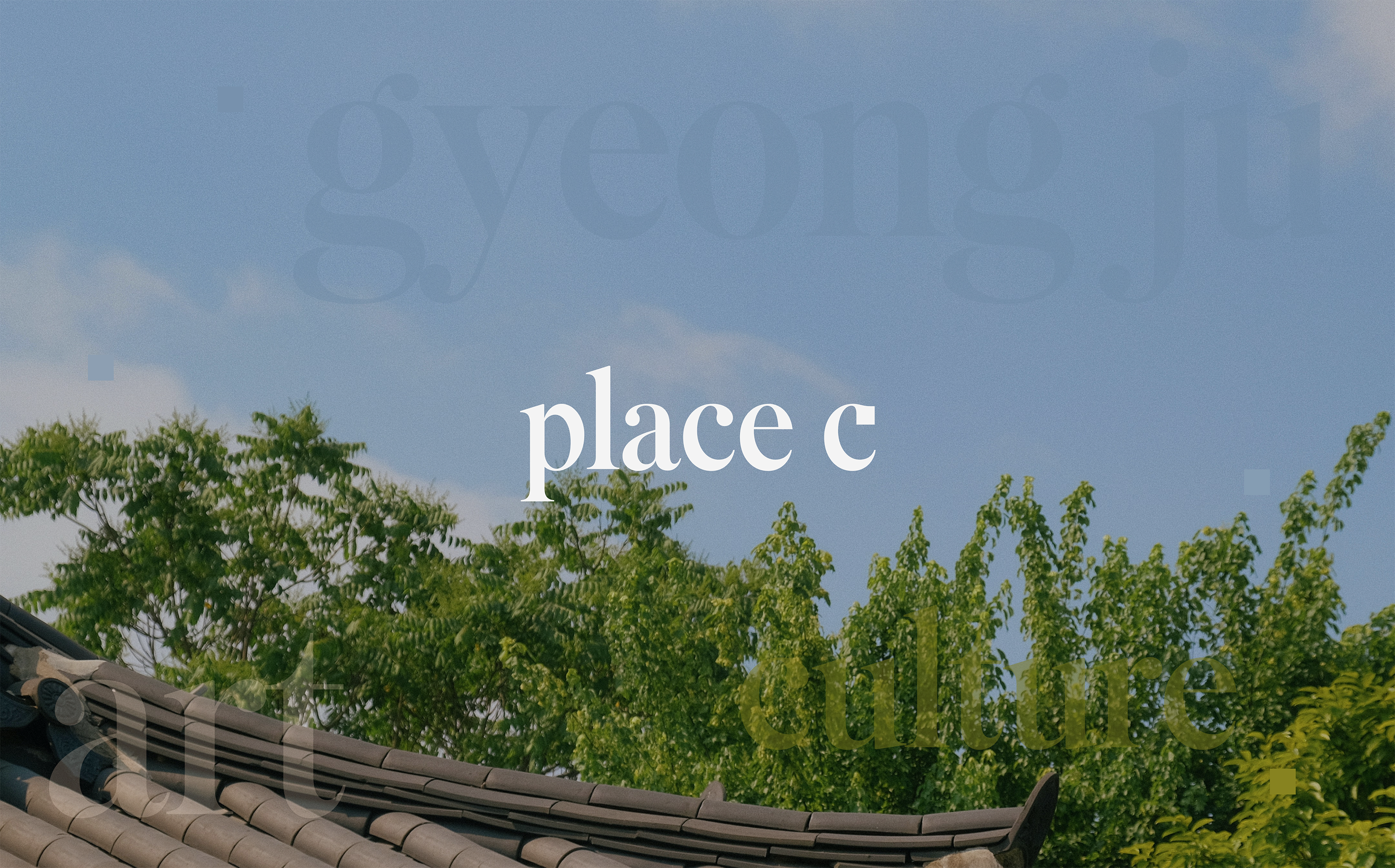
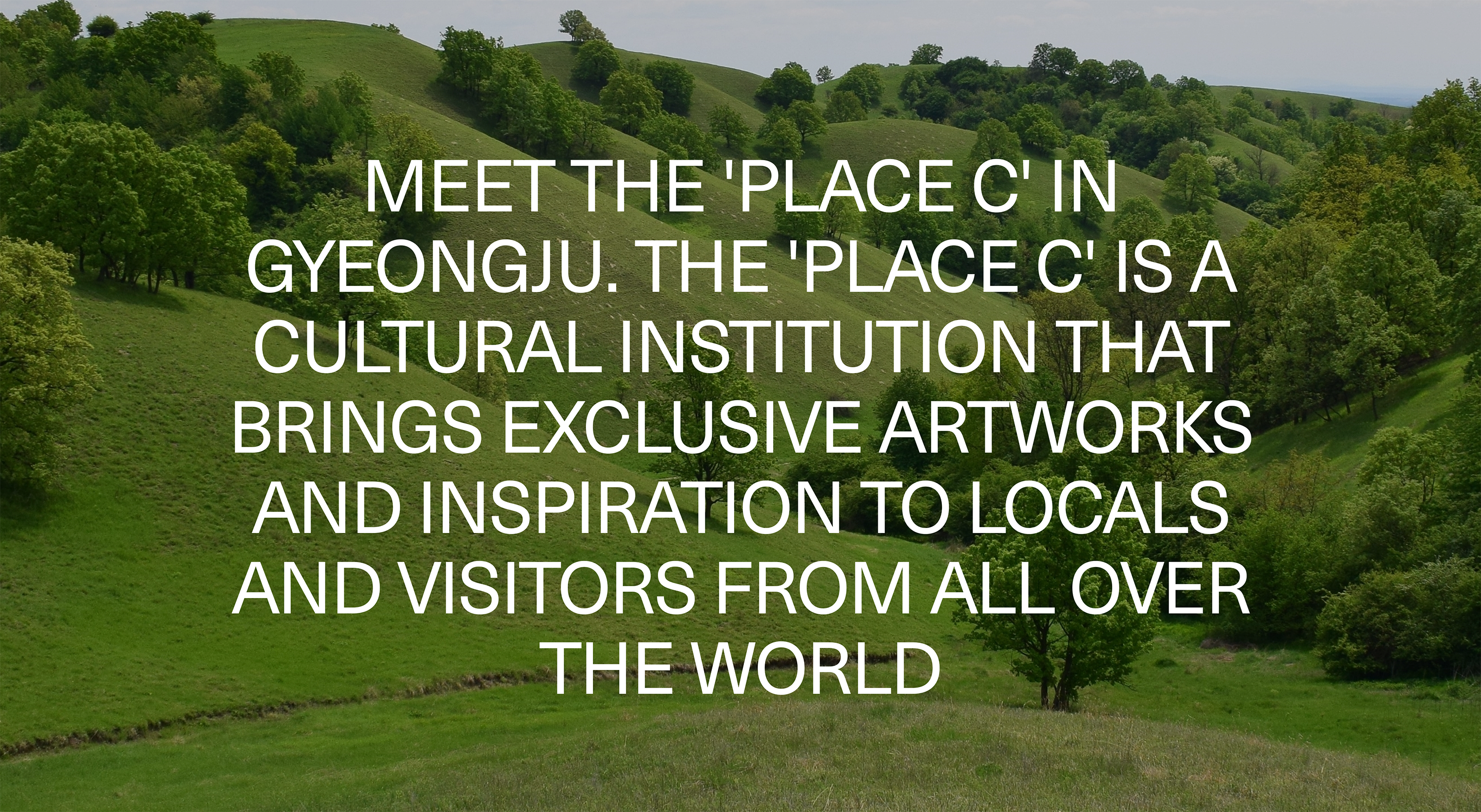
place c is an arts complex that presents the harmonious co-existence of the past and the present of Gyeongju and its beautiful nature. A Hanok (a traditional Korean house), which used to be used as a rental cottage, was renovated into place c retaining its original features. While staying at place c, where the art and the nature harmoniously co-exist, people living in busy modern times can feel relieved and refreshed.
The garden of place c is brimming with wildflowers of Gyeongju and expresses the colorful changes of the four seasons. Moreover, the indoor exhibition hall provides special experience and education programs that can be enjoyed only in Gyeongju in the pursuit of going beyond just displaying an art piece. Visitors can watch, listen to and touch things and have interactive experiences, which makes them more friendly to the arts.
We believe that the more we share knowledges, the greater the value becomes. The best way to enjoy the culture and pass it on to the next generation is to continue experiencing the arts. Thus, this value is implicit in our branding with the keywords of “EDUCATIONAL”, “PLAYFUL”, “REFRESHING” and “SUSTAINABLE”.

Solution
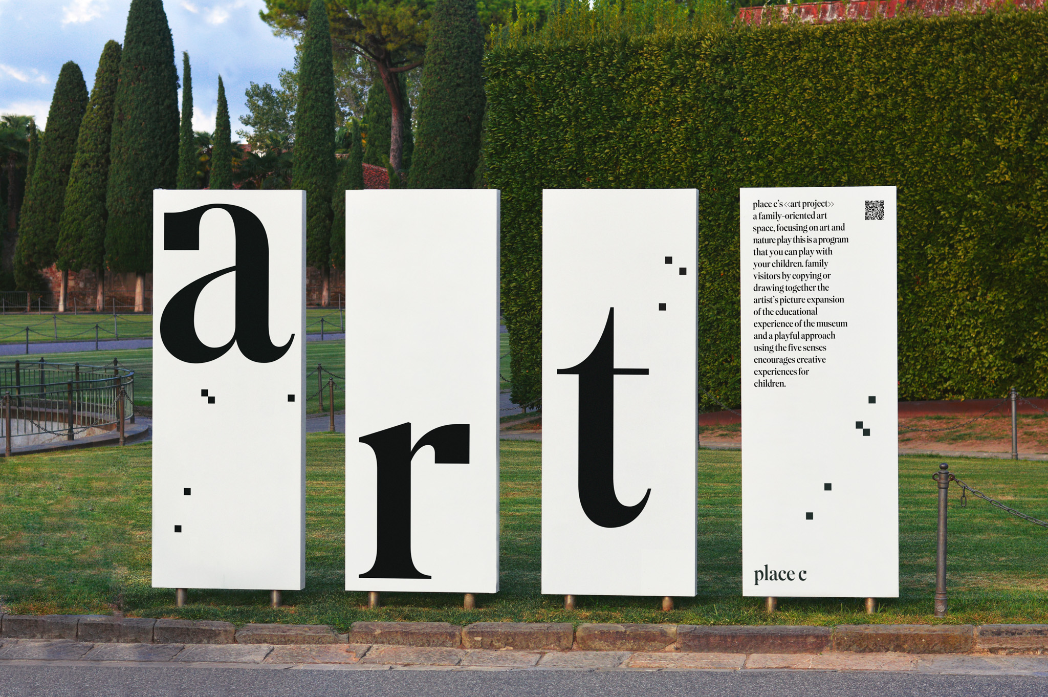
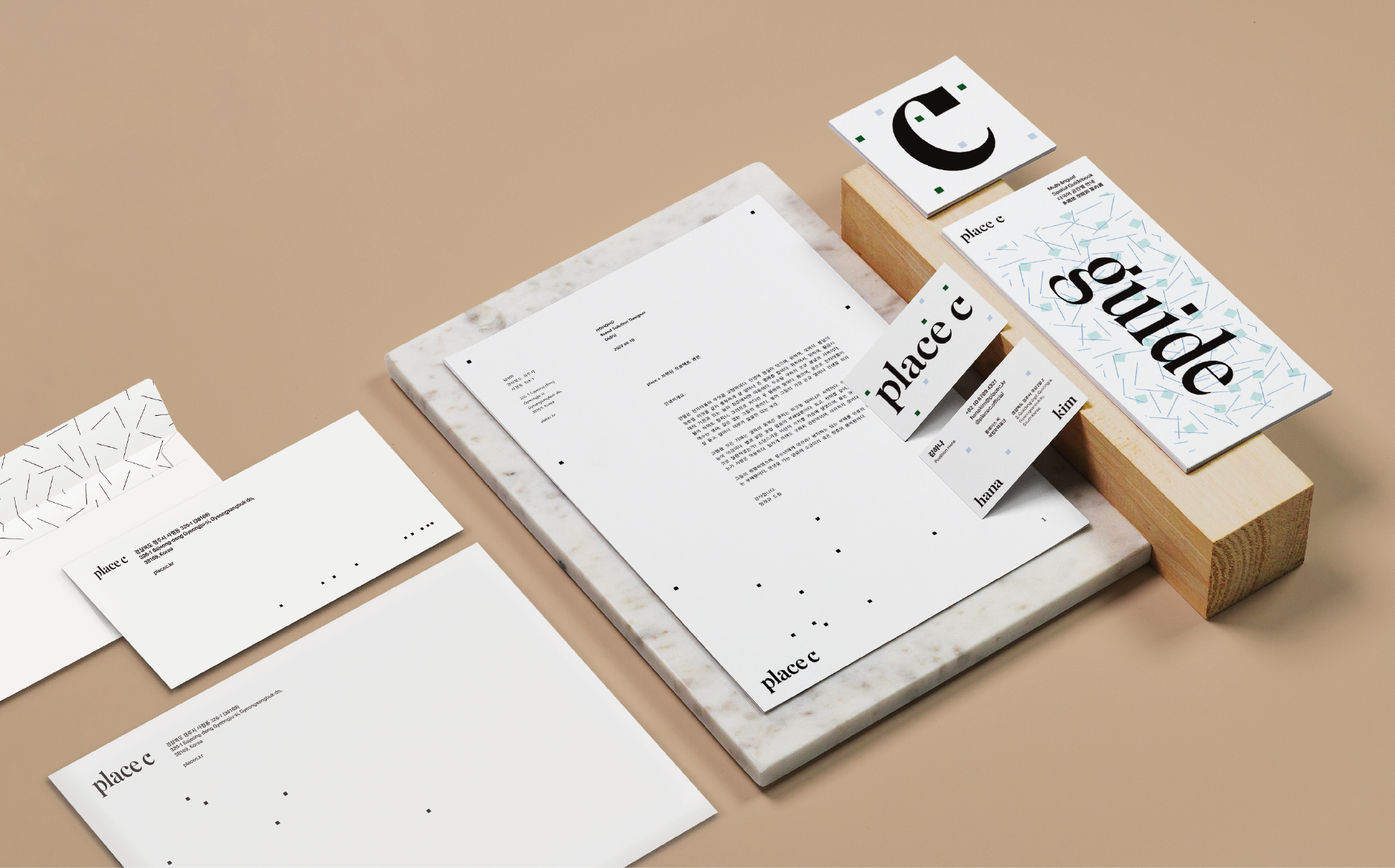
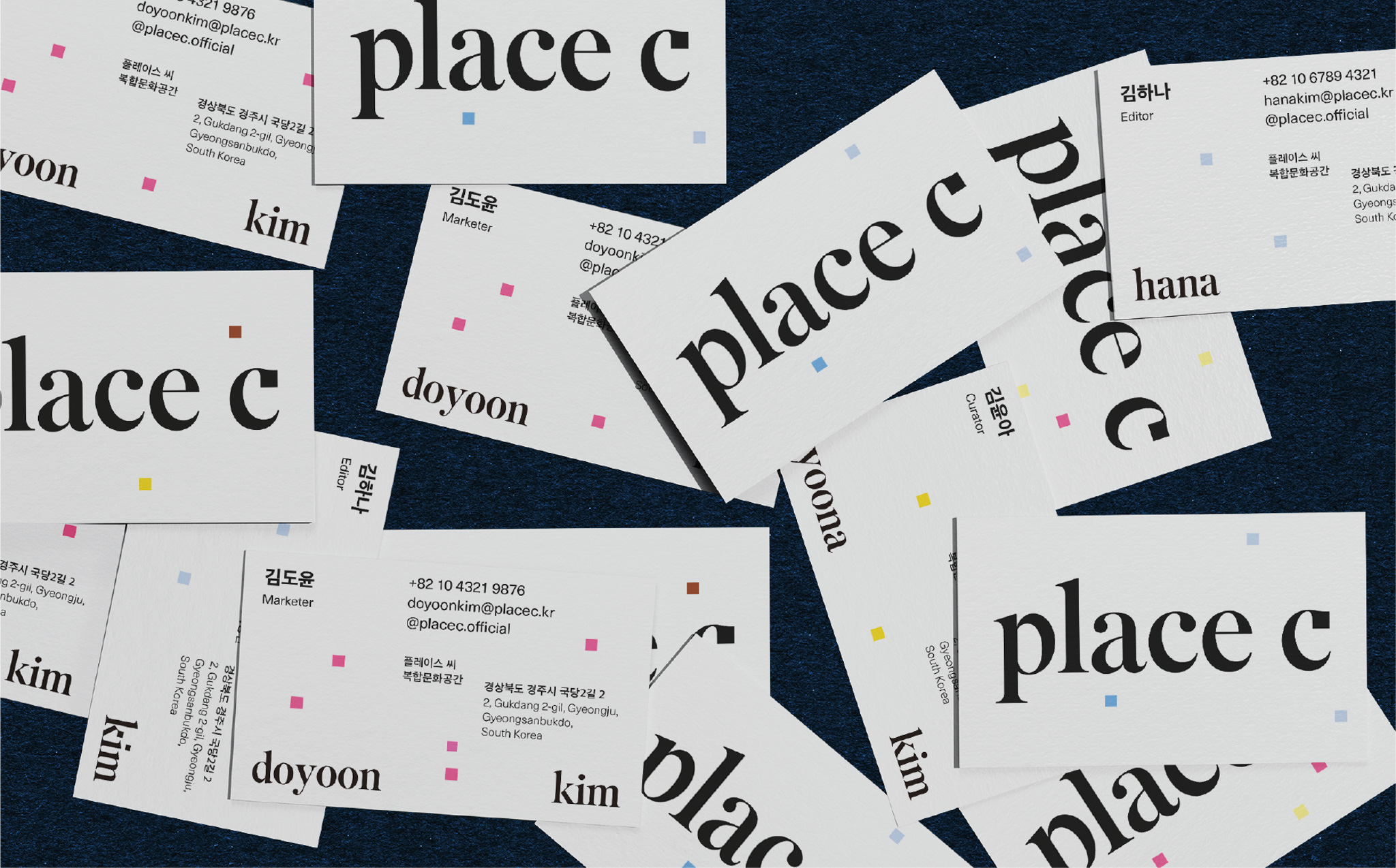
The square of place c means “over the frame”, implicating the arts space we pursue is no more fogey and outdated but something beyond that.
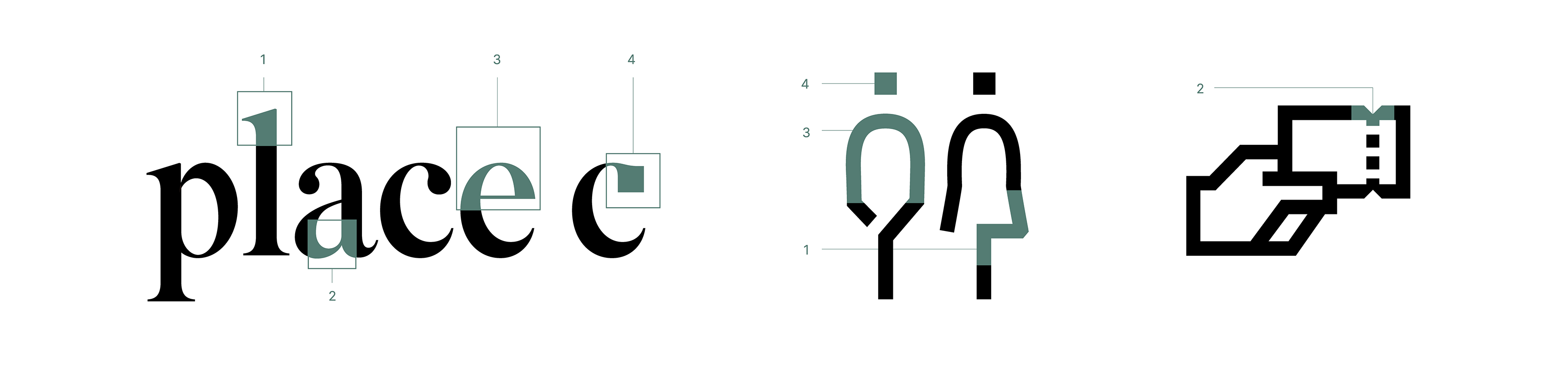
The combination of the serif in type and the squares forms a unique feature and expands into the Custom Typeface of place c, which allows it to express its intrinsic value. We consider the squares, the signature language of place c, as a single artwork and develop them into a distinctive graphic language using diverse variations.
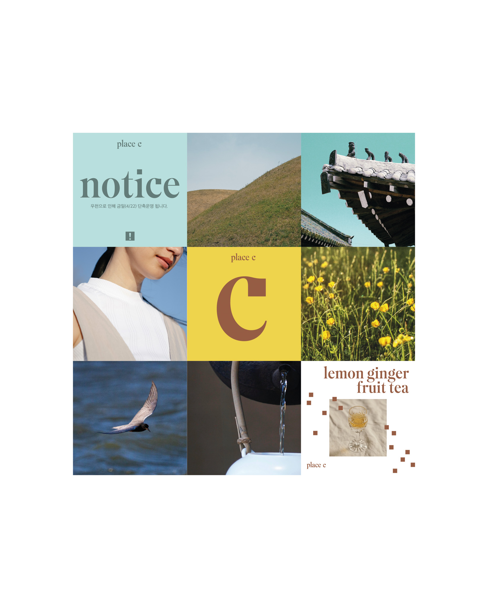
The plants in the garden change with each season and enrich the space with uniquely different colors. The colors created by the nature are actively applied to the space and the branding of place c.

Pictographic system
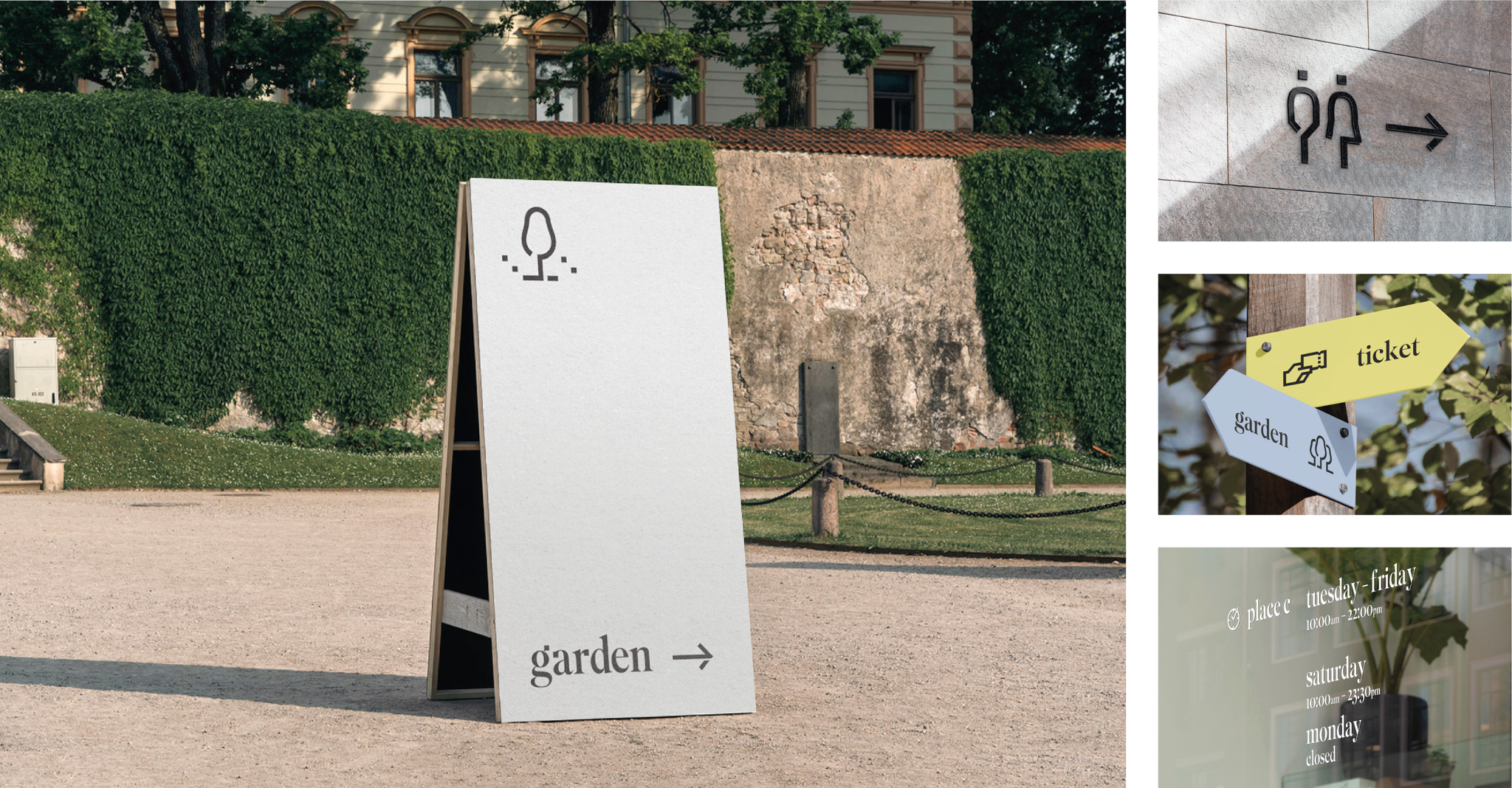
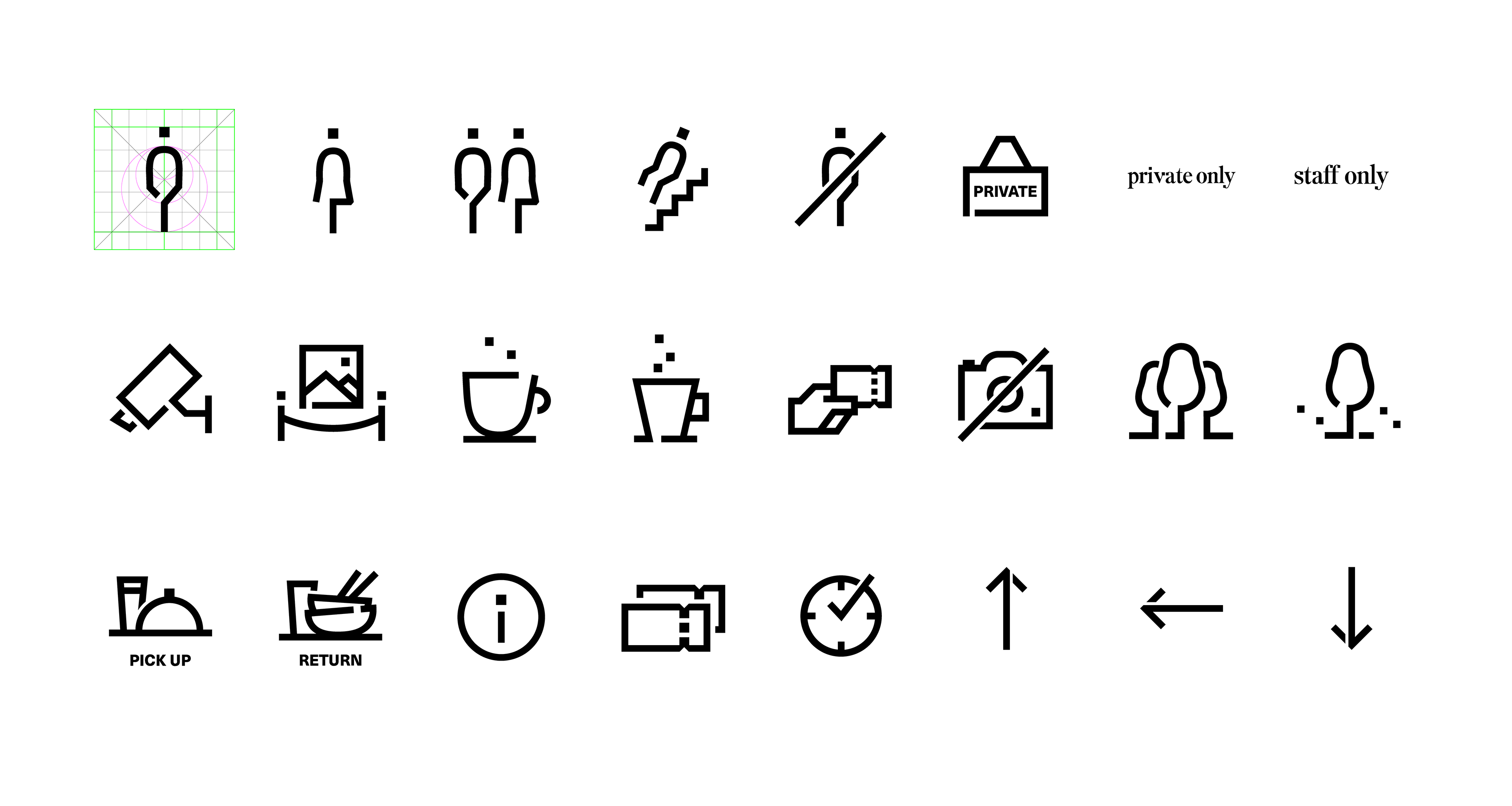
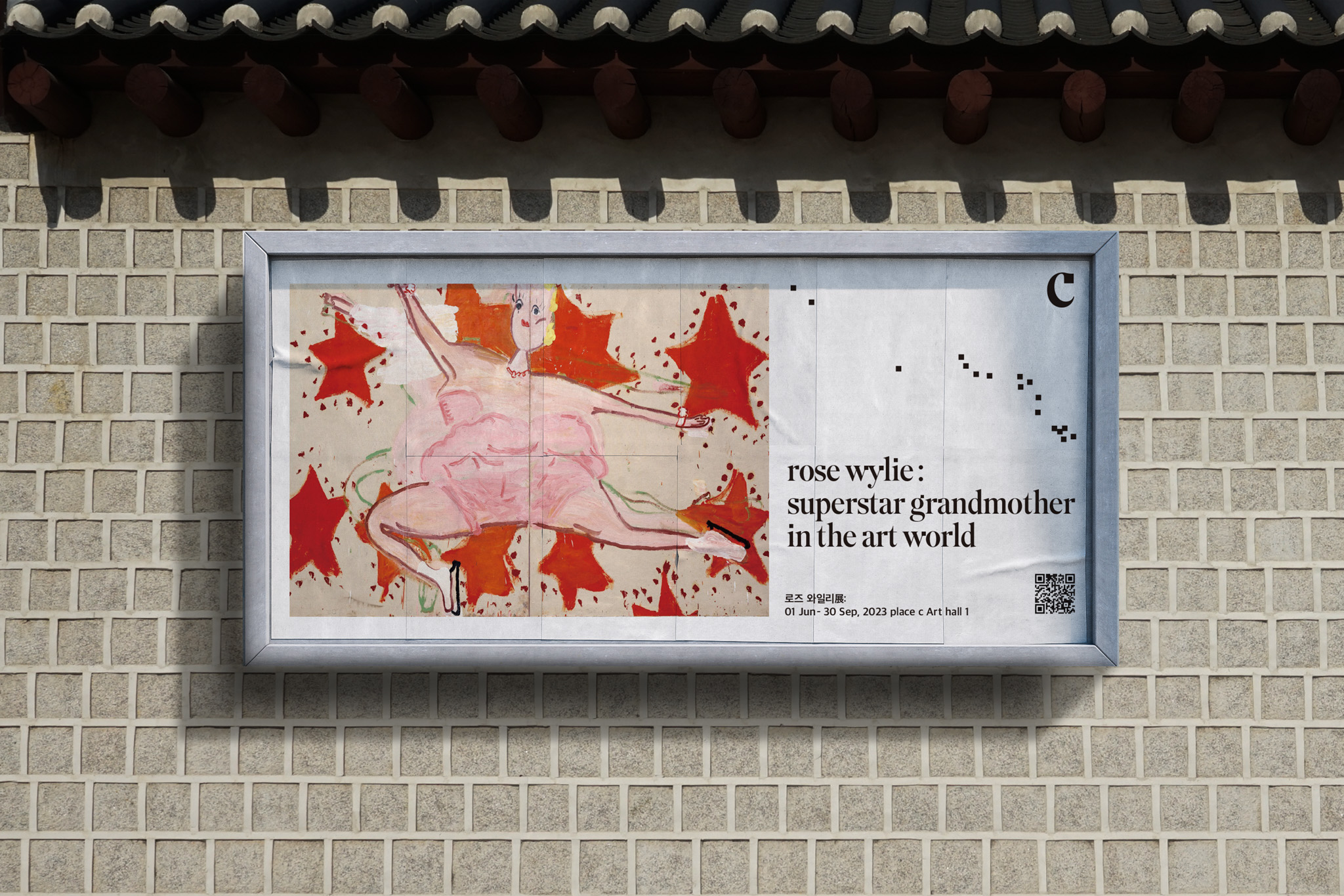
Pictograms are designed based on typographic features of the logotype, such as terminals and curvatures. These are used in signage, packaging, online store, and so on, helping the brand to maintain its visual voice throughout each meeting point with the customers
- Pointed Contact
- Curved Silhouette
- Curvature
- Dot
Result
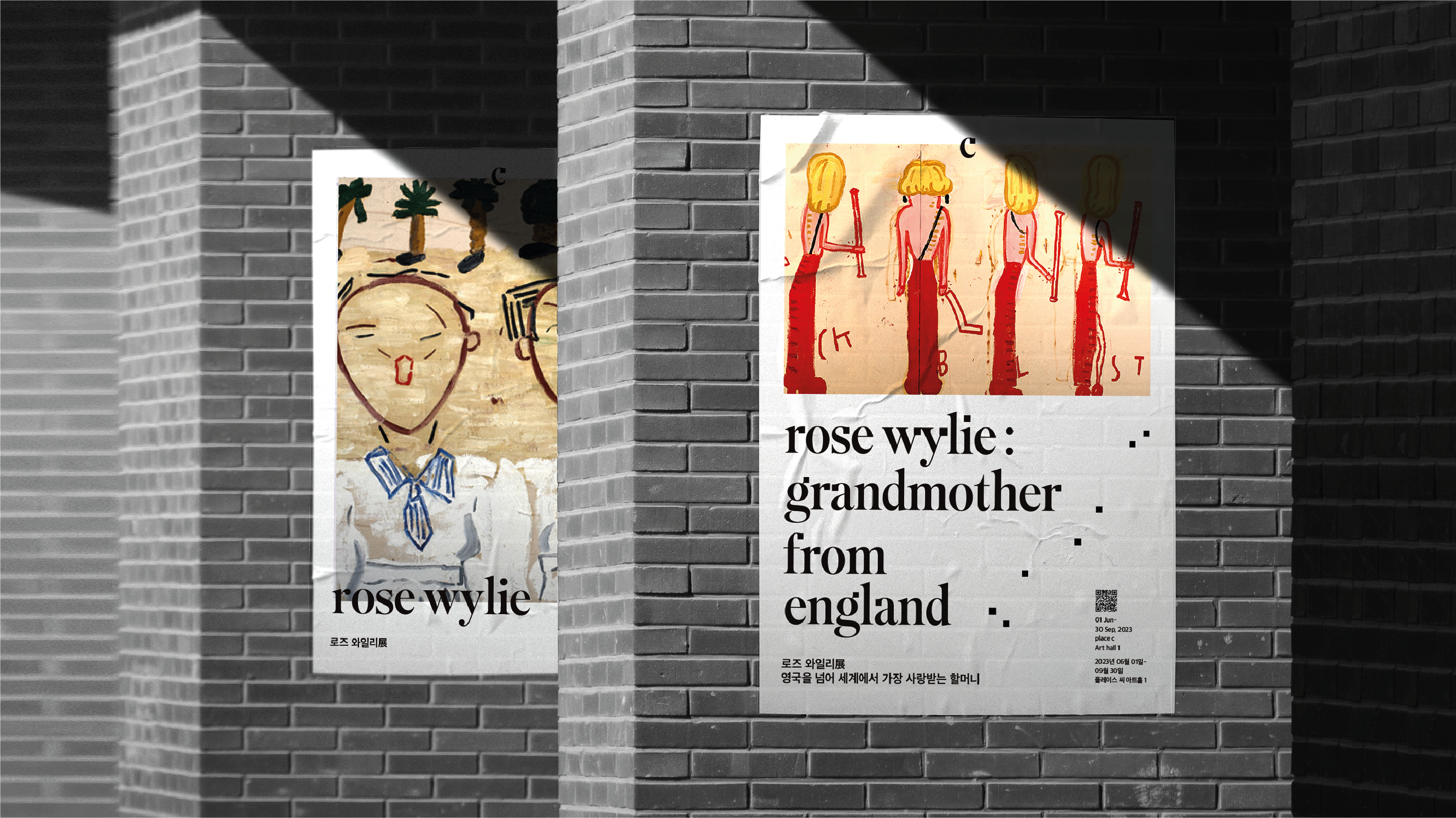
The signature squares in a distinct grid system move freely with no rules in order to maximize the fun visual factors created by the harmonious arrangement of unexpected and nonidentical elements. place c pursues to serve as a cultural space that can synergize and develop with Gyeongju.
The local characteristics of Gyeongju and the artistic values across various artworks can help this grow into a local space for co-existence and co-development.
As such, this space has become a unique and one-and-only brand of Gyeongju incorporating “EDUCATIONAL”, “PLAYFUL”, “REFRESHING” and “SUSTAINABLE” values.