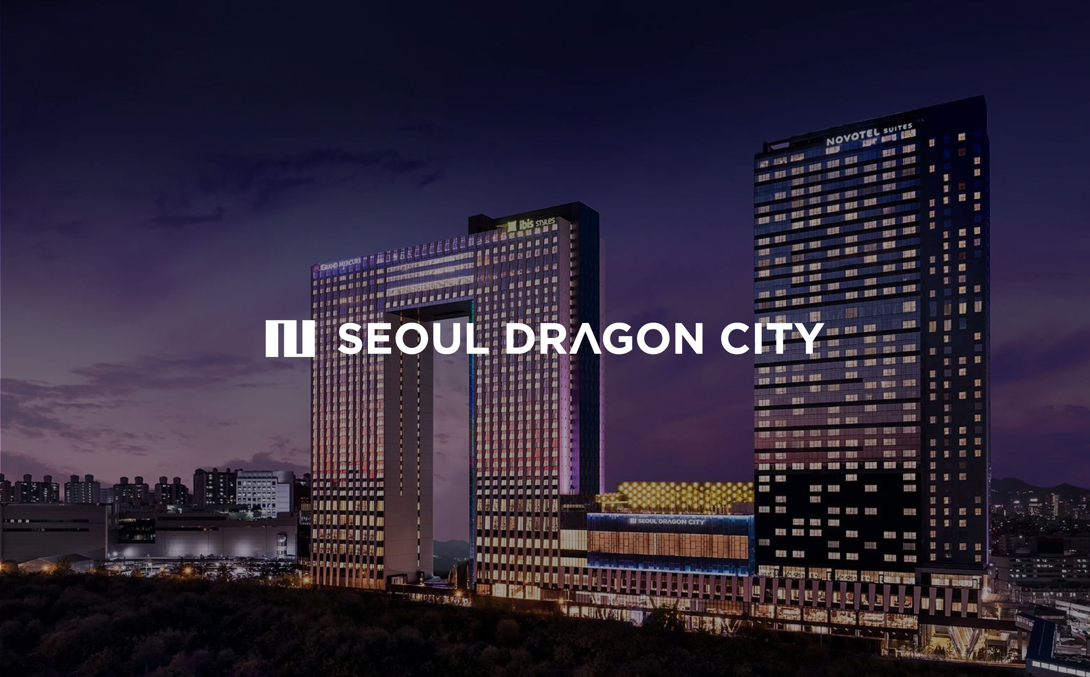
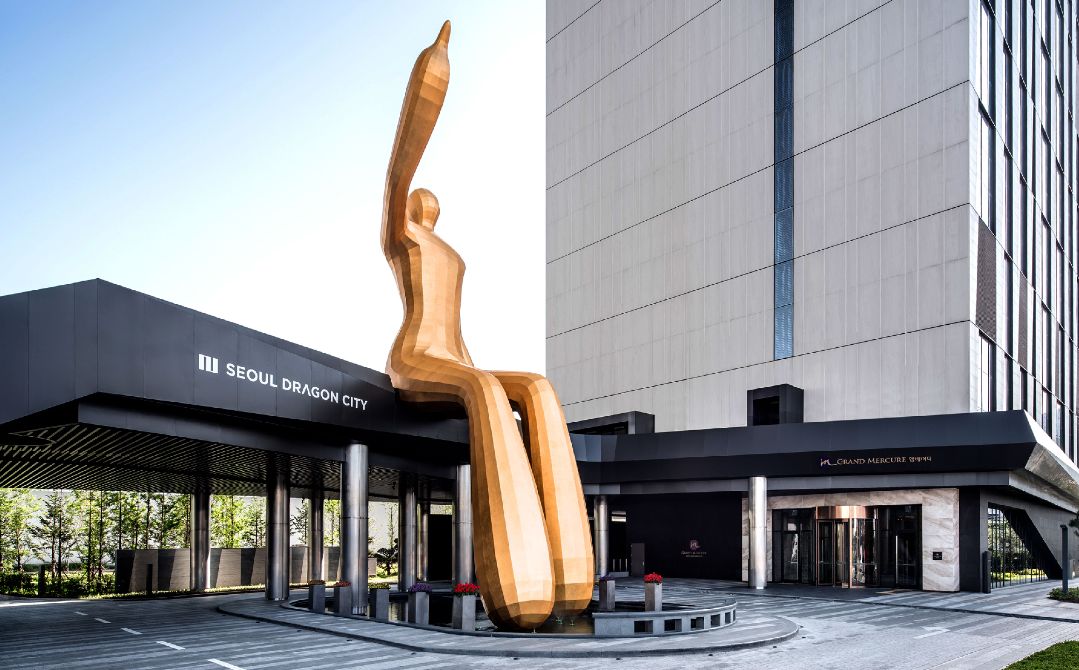
1The hotel has a unique structure. Can you explain its format?
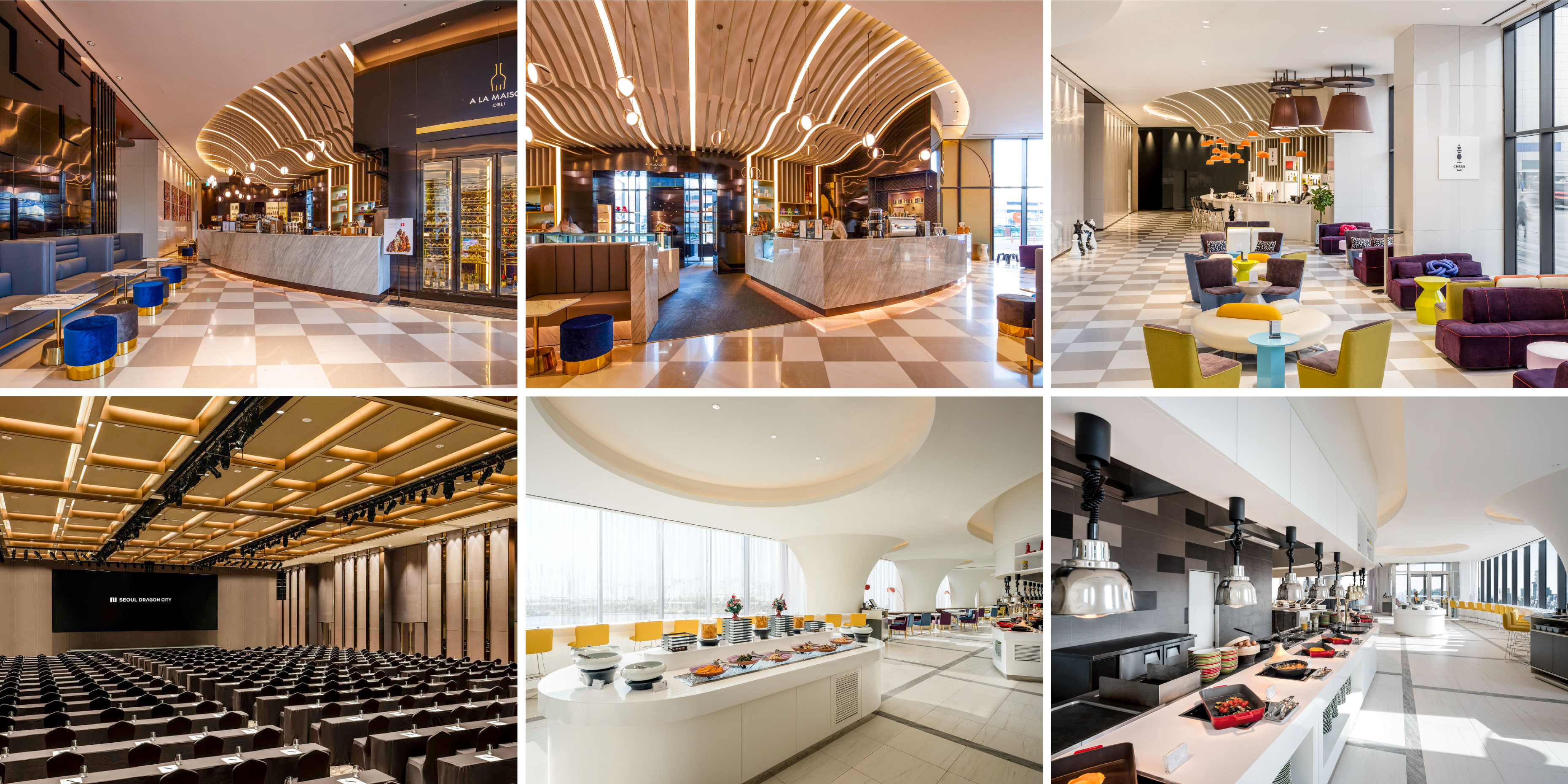
The three towers are connected to make the overall structure look like a dragon from Asia. The four hotels (Grand Mercure, Novotel Suites, Novotel, and Ibis Styles) and amenities complete the hotel-plex together. The space consists of not only hotel and convention center, but also the cultural infrastructure for leisure activities, cultural experience, and entertainment.
2It would have been a difficult project because each hotel has different characteristics. What did HOHOHO focus on in the branding process?
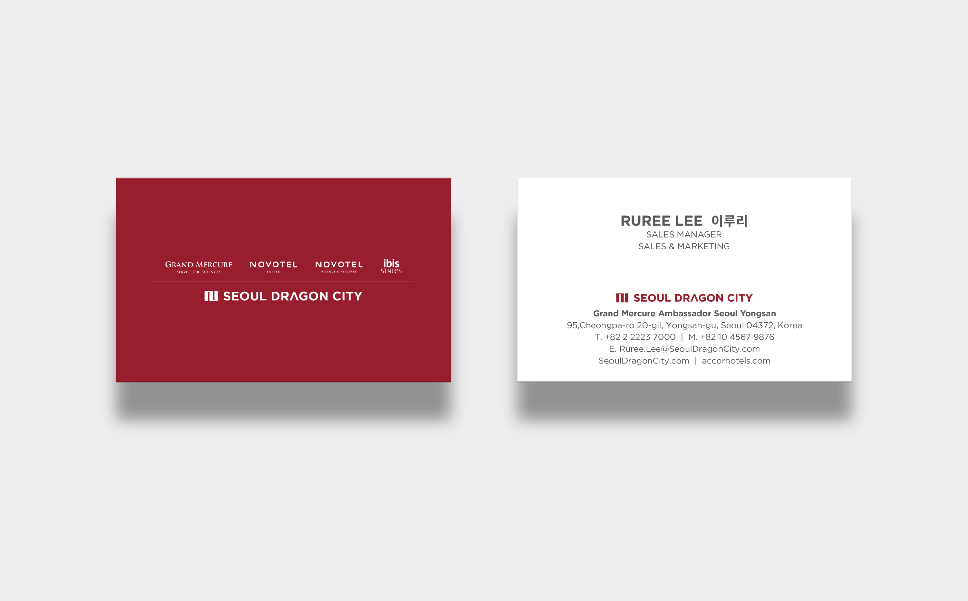
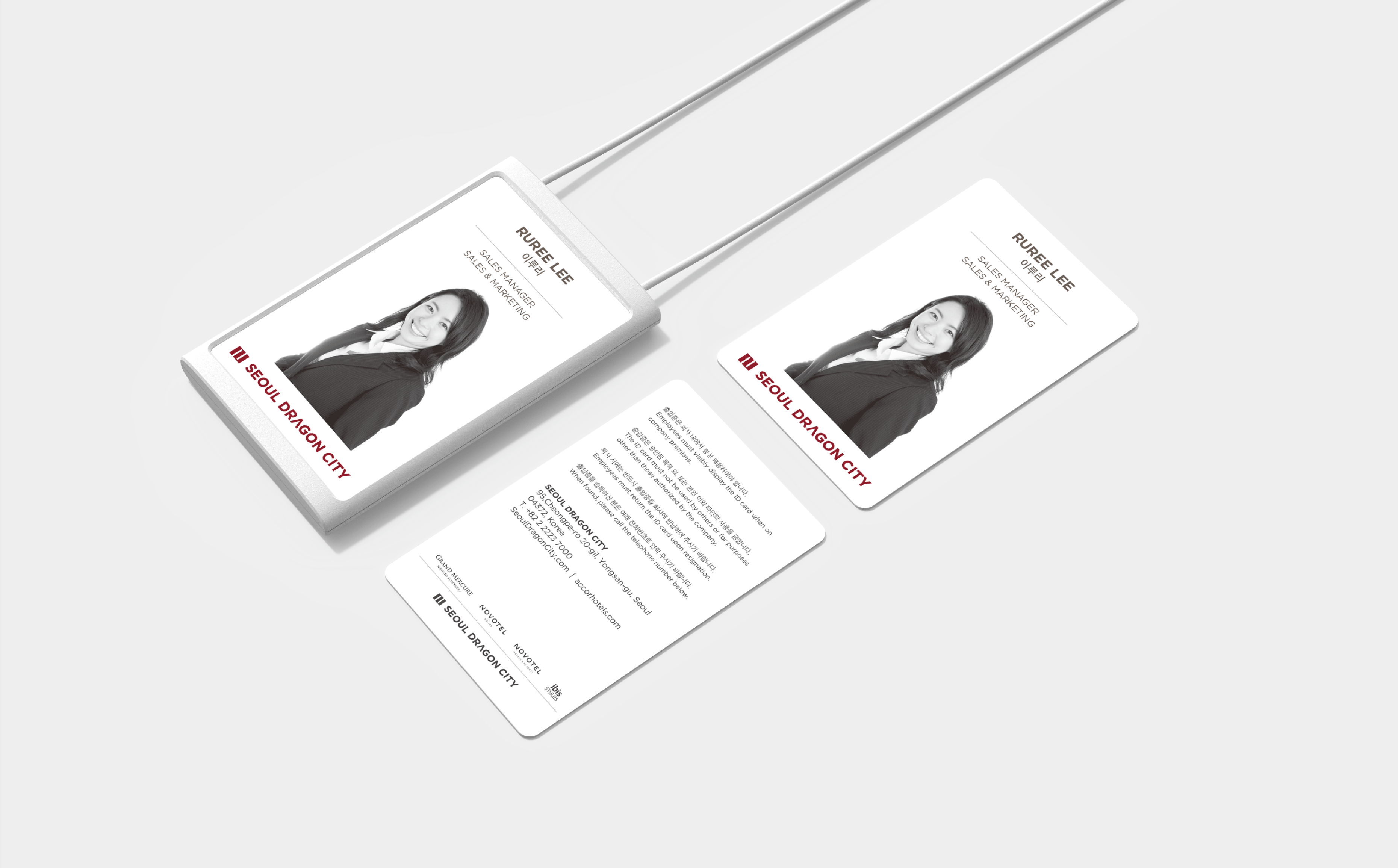
Each hotel has different targeting methods, but we focused on the fact that they belong to the same hotel-plex. Therefore, we strived to present that the hotels belong to Seoul Dragon City. The brand “Seoul Dragon City” needs to include the four different hotels; therefore, we built the system to embrace all, not to differentiate each hotel.
3The brand logo looks very intuitive, and it looks like a building. Is there another significance?
We cannot say one hotel is more special than others because each has a different role in the brand. We designed the four grids and simplified the main logo that is shaped like a hotel. In order to match with the logo, we used a geometric typeface (Gotham). By taking this approach, we designed clear and simple images that led to other applications.
Also, the emblem design is an extended version of the logo. Based on the logo shape, it creates the ‘D’ the initial letter of dragon. The emblem can be applied to various types of applications followed by the guideline.
4I would like to ask about the meaning of a “system” that you mentioned.
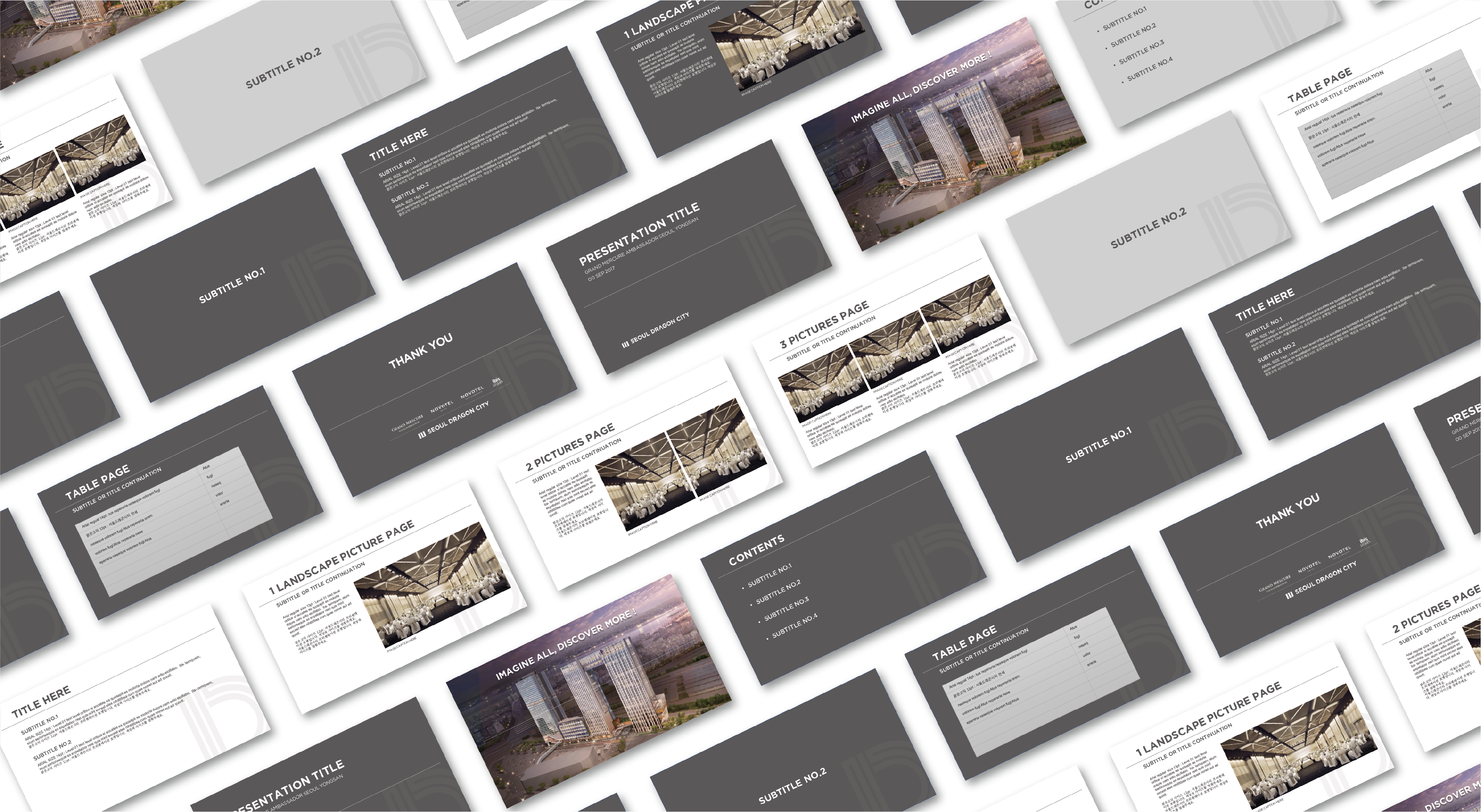
I have met people who seem to believe that branding is simply about making a logo. What we do is to let customers recognize a brand more easily. In this project, we wanted to build a coherent brand design with various visual aspects of hotels. We developed a guideline on assets that will continue to be used after the design process.
5I heard that HOHOHO carried out the branding process for other businesses in the hotel-plex as well.
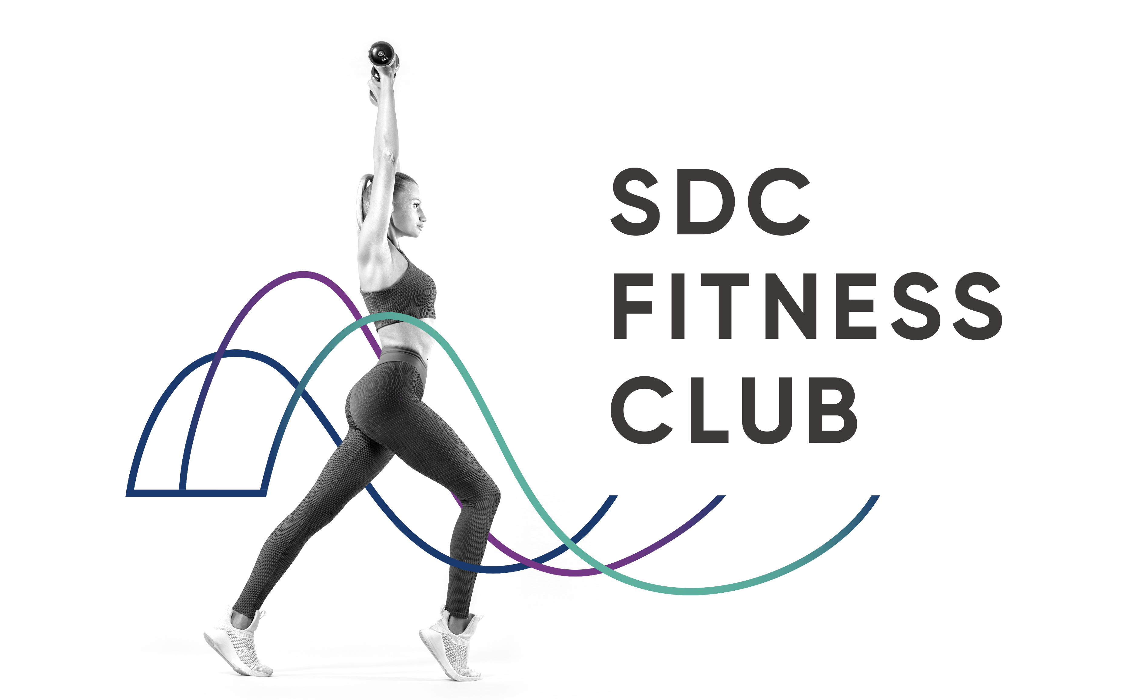
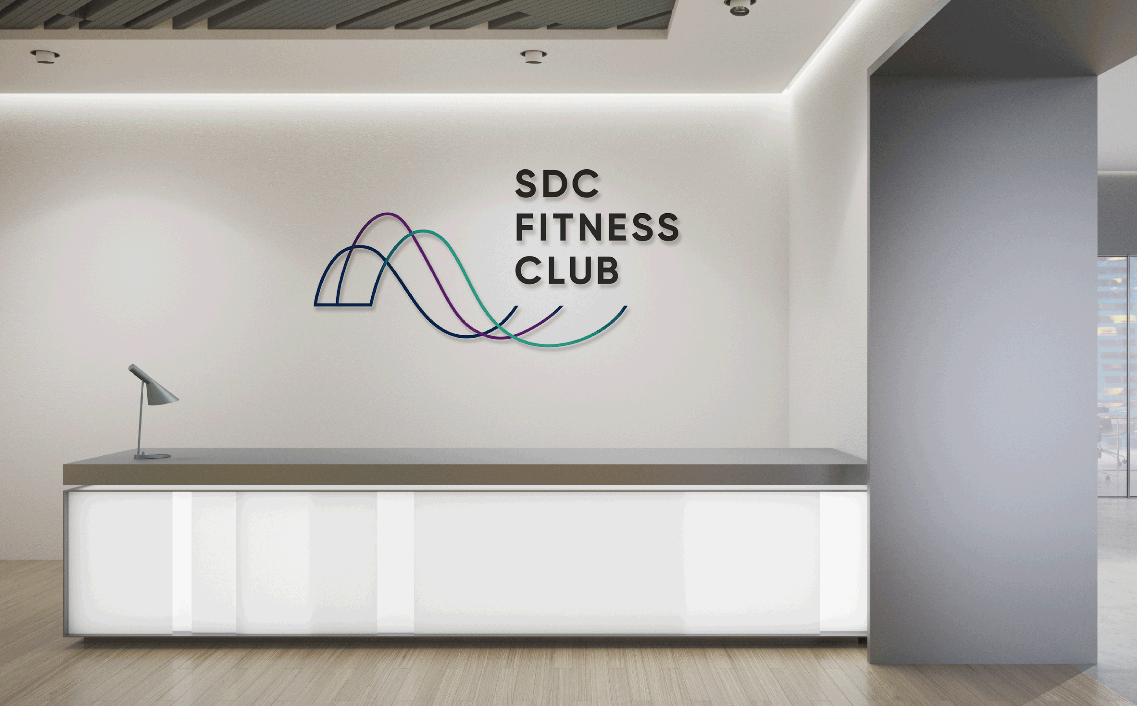
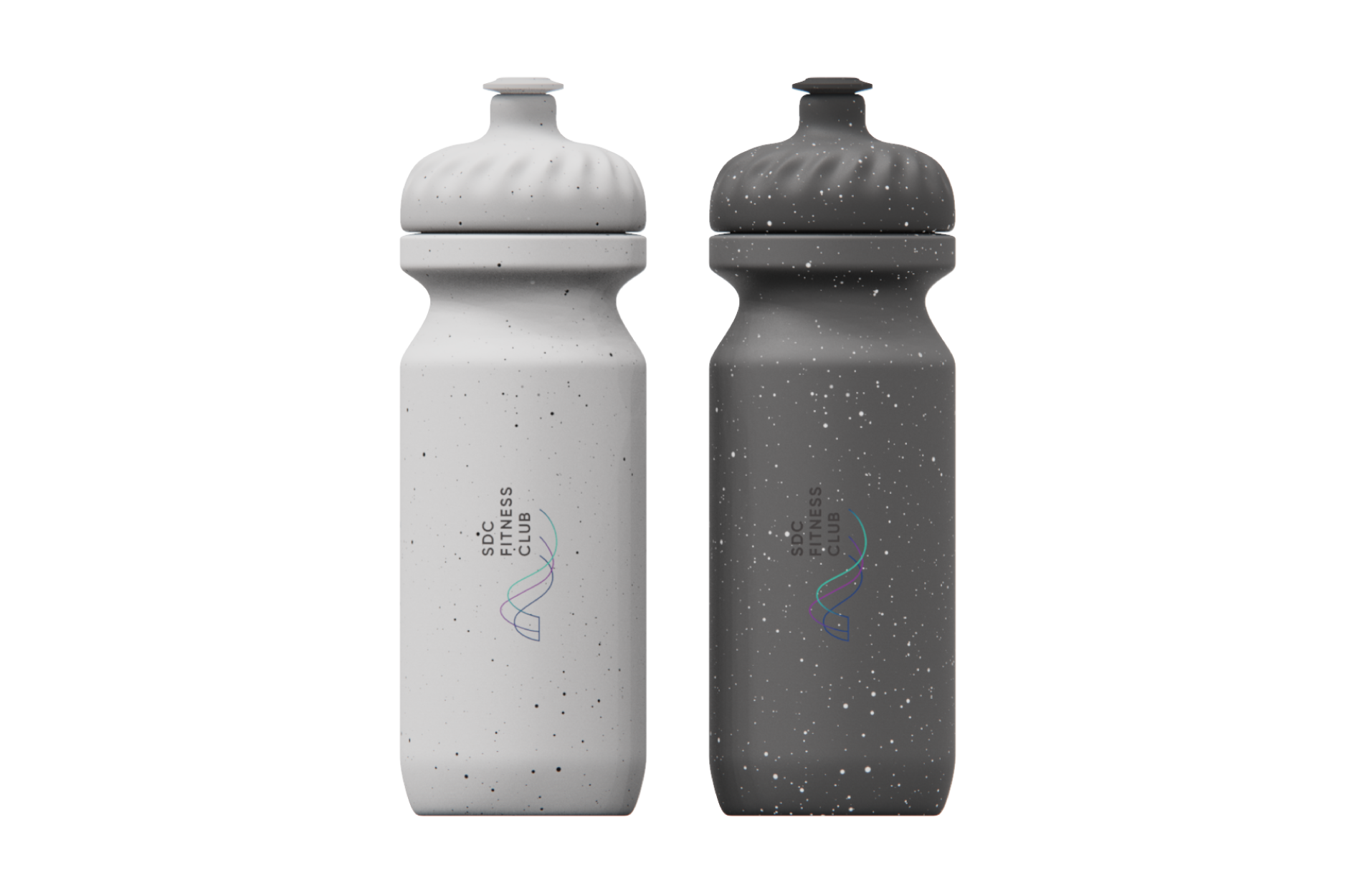
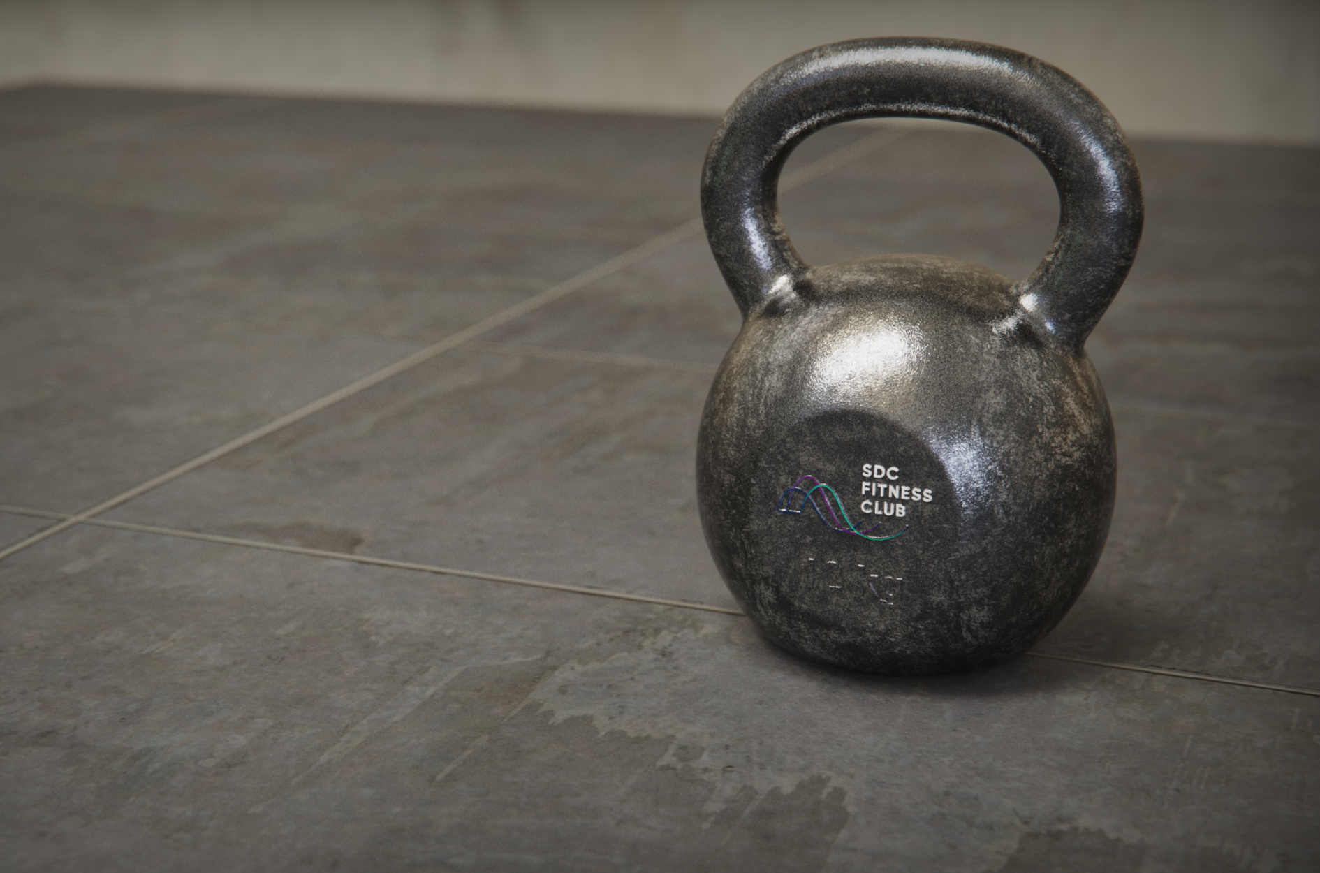
We designed a logo for SDC Fitness Club on the understanding that it is line with Seoul Dragon City. We made the logo with three colors of each hotel and with track lanes found in a biorhythm, swimming pool or sports field; also, we used thin lines to make it look more high-end.
6What else have HOHOHO done?
In addition, HOHOHO designed logos for hotel restaurants including In Style, Mega Bites, A La Maison, and Chess Bar; we made them reflect characteristics of each restaurant. As we built the brand identity for Seoul Dragon City and its five facilities, we were able to communicate with the client and provide a coherent design for internal and external purposes. It made us enjoy the entire project.