1Can you explain what platform Tella is? We heard that people can learn English on chat via Tella.
Korea is known for its highly advanced education sector. In Korea, you can go to private schools and can access so-called “edu-technology” with data and analysis engine. It shows how learning methods and content continue to evolve in Korea.
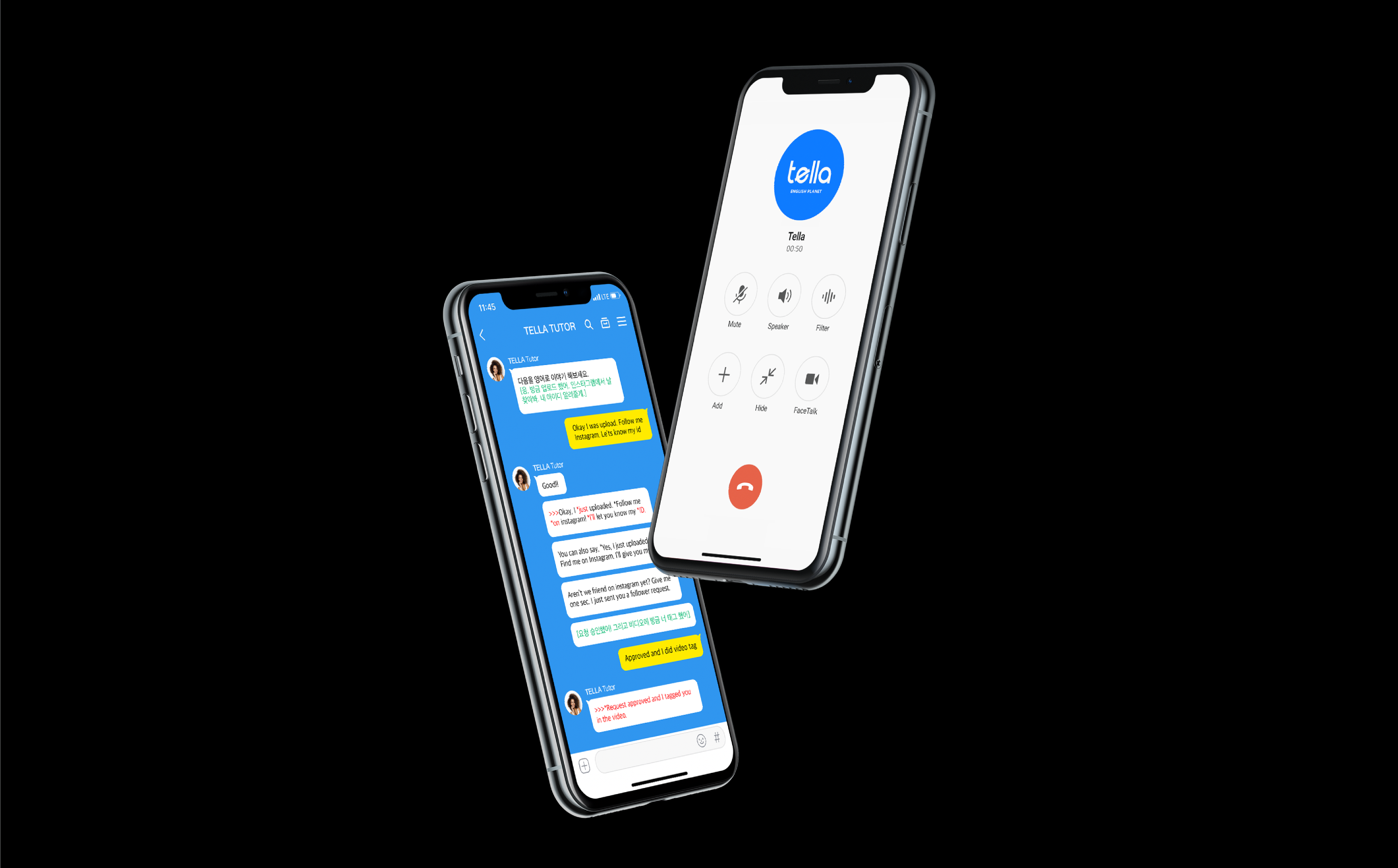
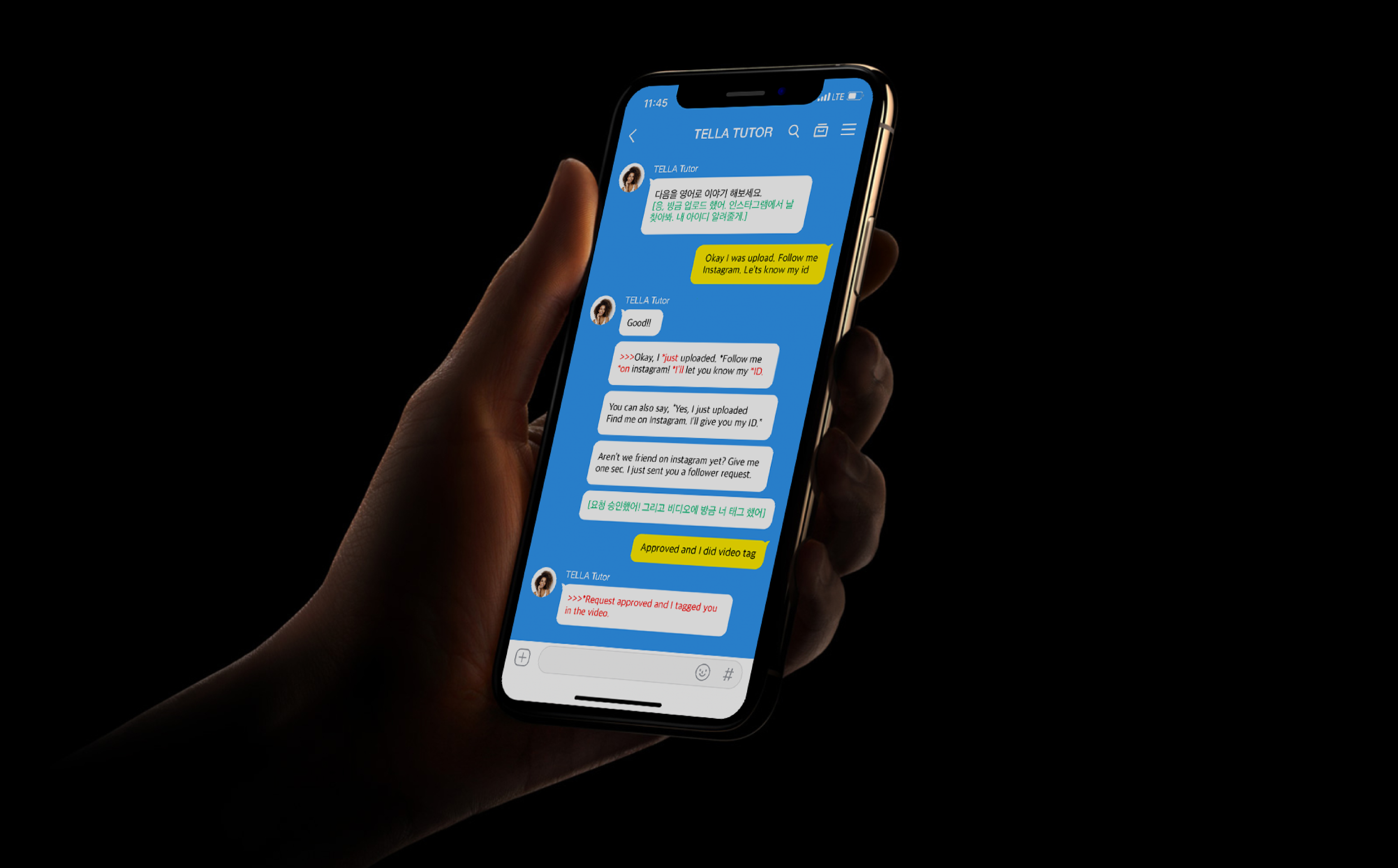
With the changing trend, people choose to learn in different ways as well. In the past, most people studied English at private schools or took English classes by phone. However, many people nowadays choose to use a mobile app to solve questions and learn English. Tella was created to enable people to learn English on chat with teachers from English-speaking countries.
You can learn English much more conveniently on chat; when there are people around or noises in a room, it is often challenging to take English classes by phone. However, you can continue to study without burden or stress if there is a chat history. One of Tella’s strengths is that students can keep records of feedback that they receive in their chat history.
2The brand name “Tella” sounds like it is from outer space. Is there any special significance?
We looked into many other brands that teach people how to speak English. Most platforms do not have a brand system that strategically links with their core service because many platforms only focus on marketing.
On a side note, it was challenging to represent the entire identity of Tella in the branding process while Tella has undergone other renewal processes. We wanted to develop a unique concept and story, and we wanted to build a new identity to attract target customers.
Tella aspires to become a new world and ecosystem for English education; we built the strong concept called “Tella Planet” to represent another world created by Tella.
3Is that why the letter “e” looks like a planet?
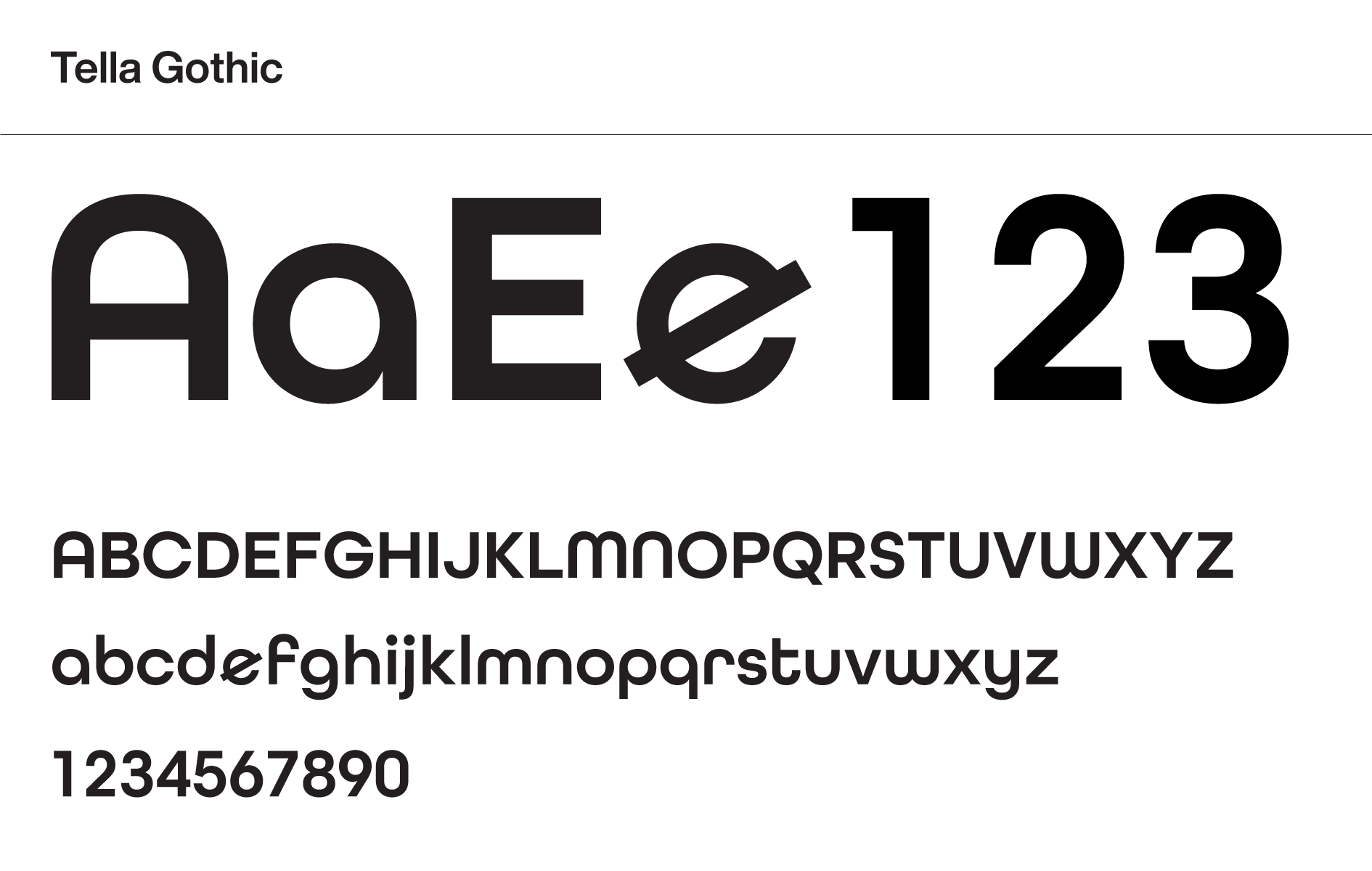
We found out that there was an icon that looked like a speech bubble. We applied the same idea and simplified its logo. The letter “e” stands for “English” after all, and we modified the letter shape to make it resemble a planet and added significance. This element can serve as a symbol as well.
4The colors have become much brighter now. Can you tell us why you chose these colors?
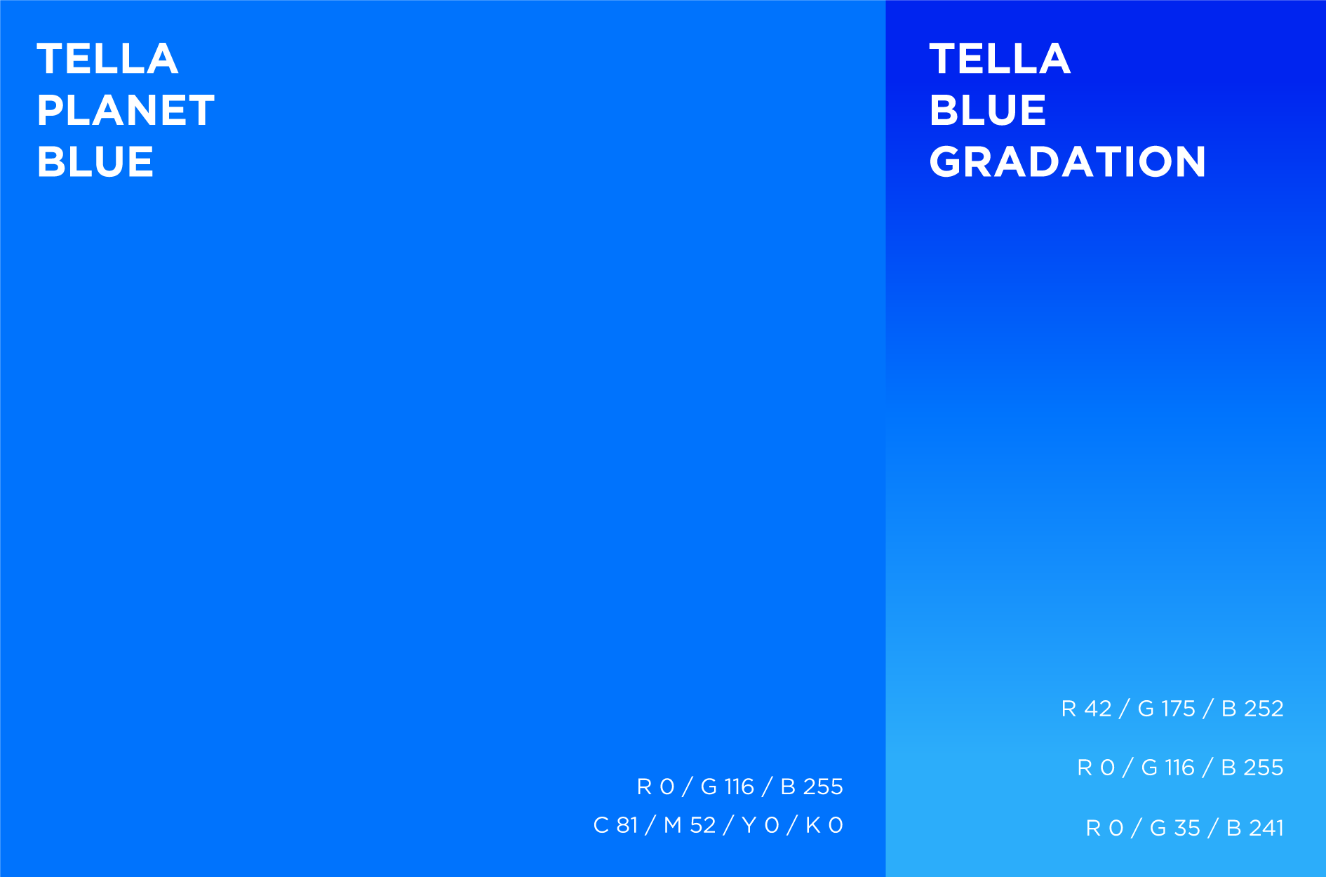
As you know, Tella provides education service, which means that credibility is the most important value. The color blue is chosen by many social media, finance, or IT corporations in order to give a credible or trustworthy look for their business.
We chose blue as the main color for Tella. There is another reason; customers often read about Tella from a screen, not a sheet of paper. That is why HOHOHO chose blue; it can be expressed on digital screen.
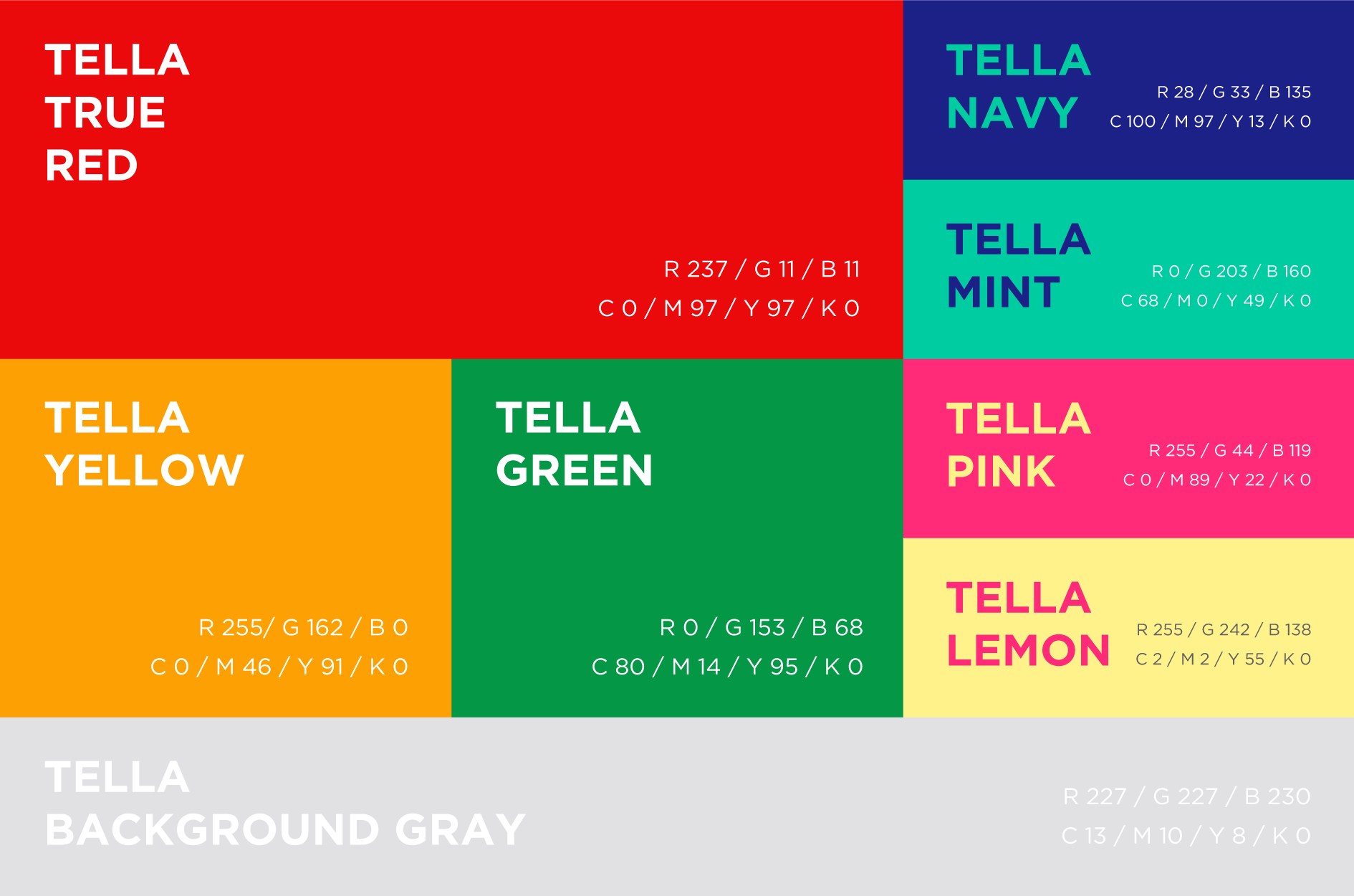
Thanks to the choice of color, the brand expresses the credibility of its service and has a mysterious look as a “planet.” A secondary color is also in place to match the main color that is called “Tella Planet Blue.” HOHOHO generated a color palette that can be utilized for marketing purposes to keep a coherent brand image.
5After listening to what you just said, the color does look mysterious. We also found the typeface interesting. What did HOHOHO intend by choosing this typeface in the rebranding process?
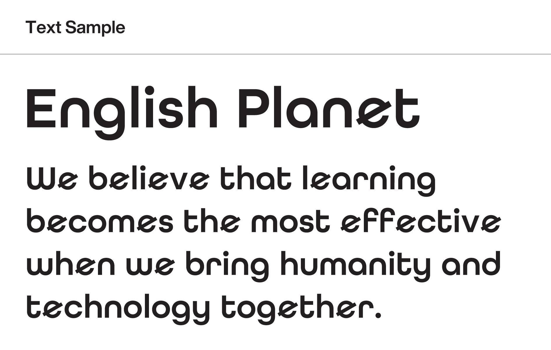
We focused on building text identity since Tella provides a text-based service. We went on to modify the shape of “e.” Instead of using All Round Gothic, we chose to use “Tella Gothic,” which is a unique typeface created for Tella. The typeface is found in Tella’s marketing materials, document forms, and presentation materials, and they together build the Tella identity.
6The icon resembles “e” as well.
You are correct. The icon also was created with the same principle which was used to make the symbol. We designed the icon by using a geometric shape and angle of the letter “e.” I believe I mentioned it along with the colors, icon, and typeface, but I would like to mention again that HOHOHO expresses the Tella identity in every item that Tella has.
7We heard that the rebranding process positively affected sales volume of Tella.
While there is no designated method to measure how design can impact sales, it is certainly true that Tella recorded a significant increase in its sales volume after the rebranding process. There are more users, and the sales volume increased by more than three times. We are very glad to hear this news as we were in charge of design. We hope that Tella will continue its positive growth.