YVIP, becomes an innovation platform”

1What does YVIP mean, and what is it short for?
YVIP stands for Yonsei Venture Innovation and Startup Program, and it is a startup innovation program for Yonsei School of Business. Creative innovators with diverse backgrounds join the program to share and cooperate to innovate. YVIP was established to become more than a space to start business;it is meant to be a global hub that serves as the knowledge platform for startup innovation in the 21st century.
2The terms “21st startup innovation,” “knowledge platform,” and “global hub” sound complicated. How did HOHOHO identify a brand concept with the terms?
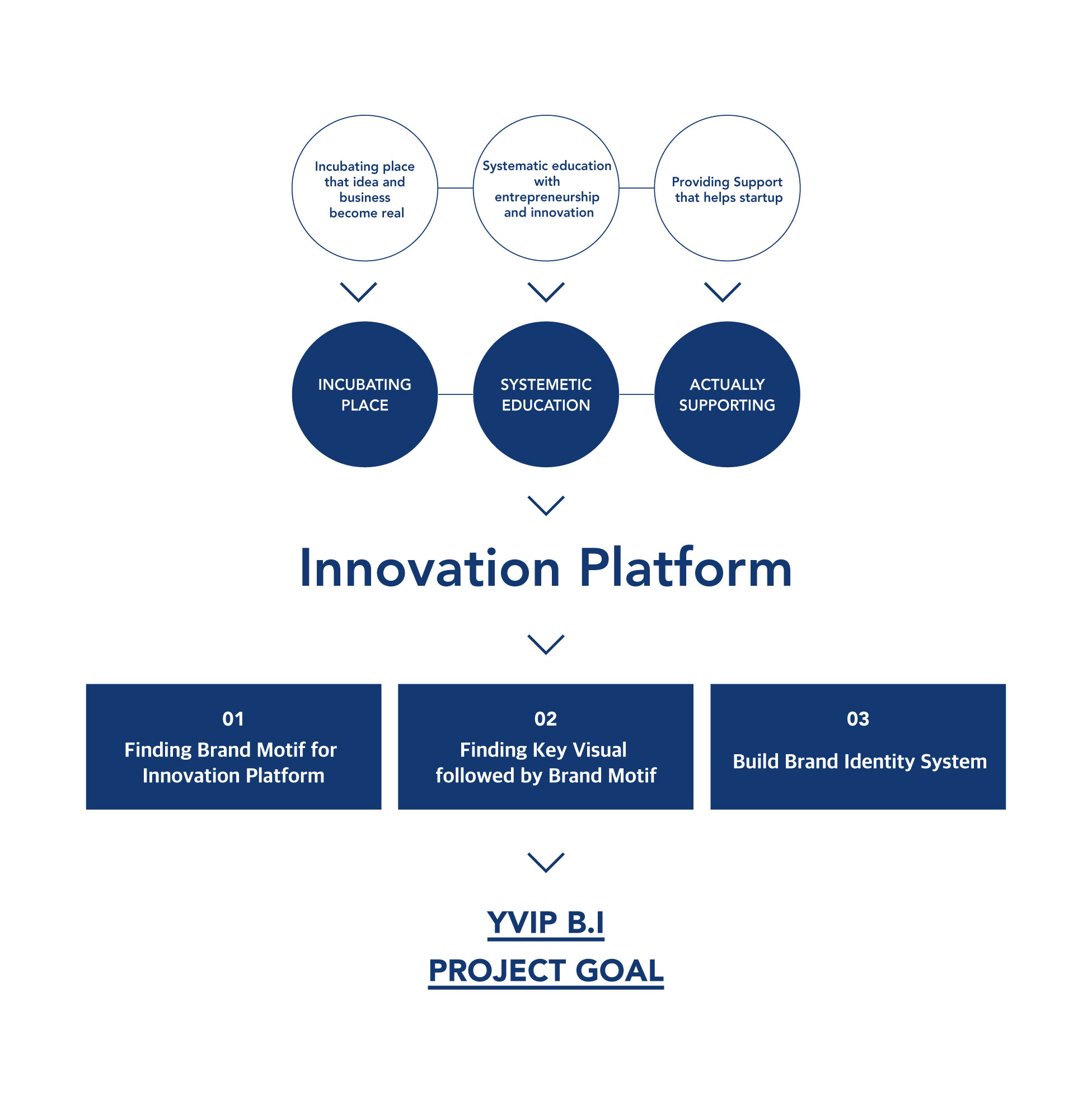
We study the meaning of YVIP and summarized three missions in branding process. The three missions are making a “space to incubate,” providing “systematic education” of entrepreneurship and innovation, and “providing support” to help startups. With this, we identified three keywords for the brand: “Incubating Place,” “System Education,” and “Actually Supporting” are the three keywords that led to the overarching brand concept, which is “innovative platform.”
3The concept sounds complex as well. Was there any challenge during the project?
In fact, it was difficult to narrow down to a single concept because YVIP has enormous potential. We thought that any student should be able to dream of innovation since YVIP is a platform for startups. We decided to set the concept “innovative platform” because YVIP aims to discover startups that can lead to socioeconomic innovation. We found a brand motif and then developed a key visual element; after this step, we built a system to expand brand identity.

4The logo consists of many lines. How did a linear shape become its motif?
In fact, there were other two concepts for logo design that consist of a flag and a special typography. The concept with a flag signifies startup entrepreneurship, can-do spirit, adventure, and passion. The concept with special typography projects the meaning of YVIP. However, we started to think that these concepts are not enough to represent the keywords.
We designed a concept with linear forms to embrace more keywords. The lines do not have an edge, which signifies keywords such as a “guide,” “to lead,” “to go forward,” or “incubating.” The direction of lines represents keywords such as “rise,” “growth,” “expansion,” or “acceleration.”
The connected dots signify keywords such as “knowledge,” “idea,” “network,” “connection,” “interactive,” or “organic.” In sum, we wanted to reflect various keywords in the logo.
5What did you focus on in designing process?
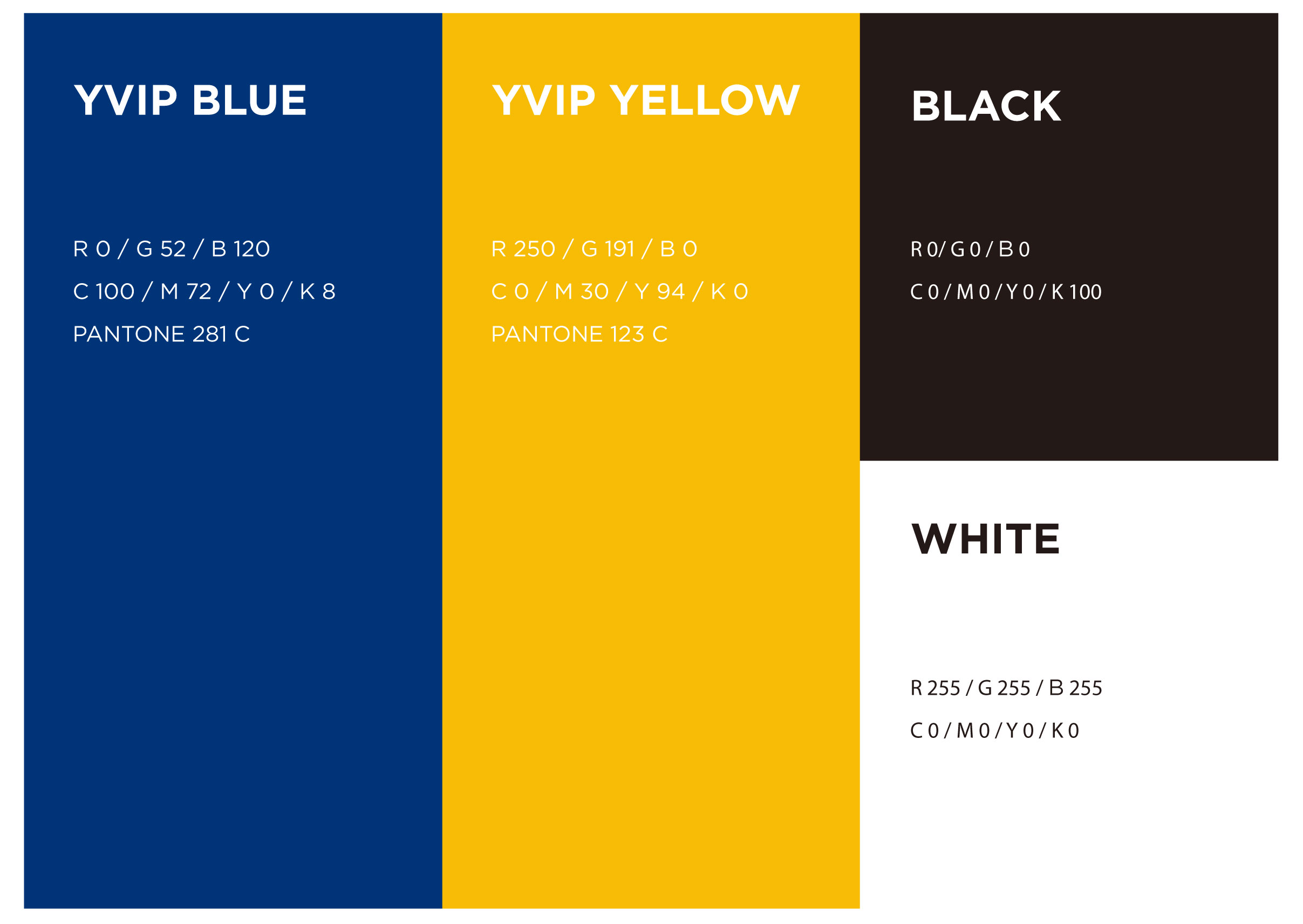
At first, we studied the market for startup incubators. We found inspiration because most market players picked a color of parent company to create a logo. Since the identity of YVIP comes from Yonsei University, we reflected it in the brand identity as well. In order to express the identity of Yonsei, we decided to use Yonsei blue (the main color of Yonsei University) and yellow that symbolizes the futuristic and creative image of innovation. Since the YVIP nurtures startups, we designed a trendy logo that can attract millennials and the genre generation.
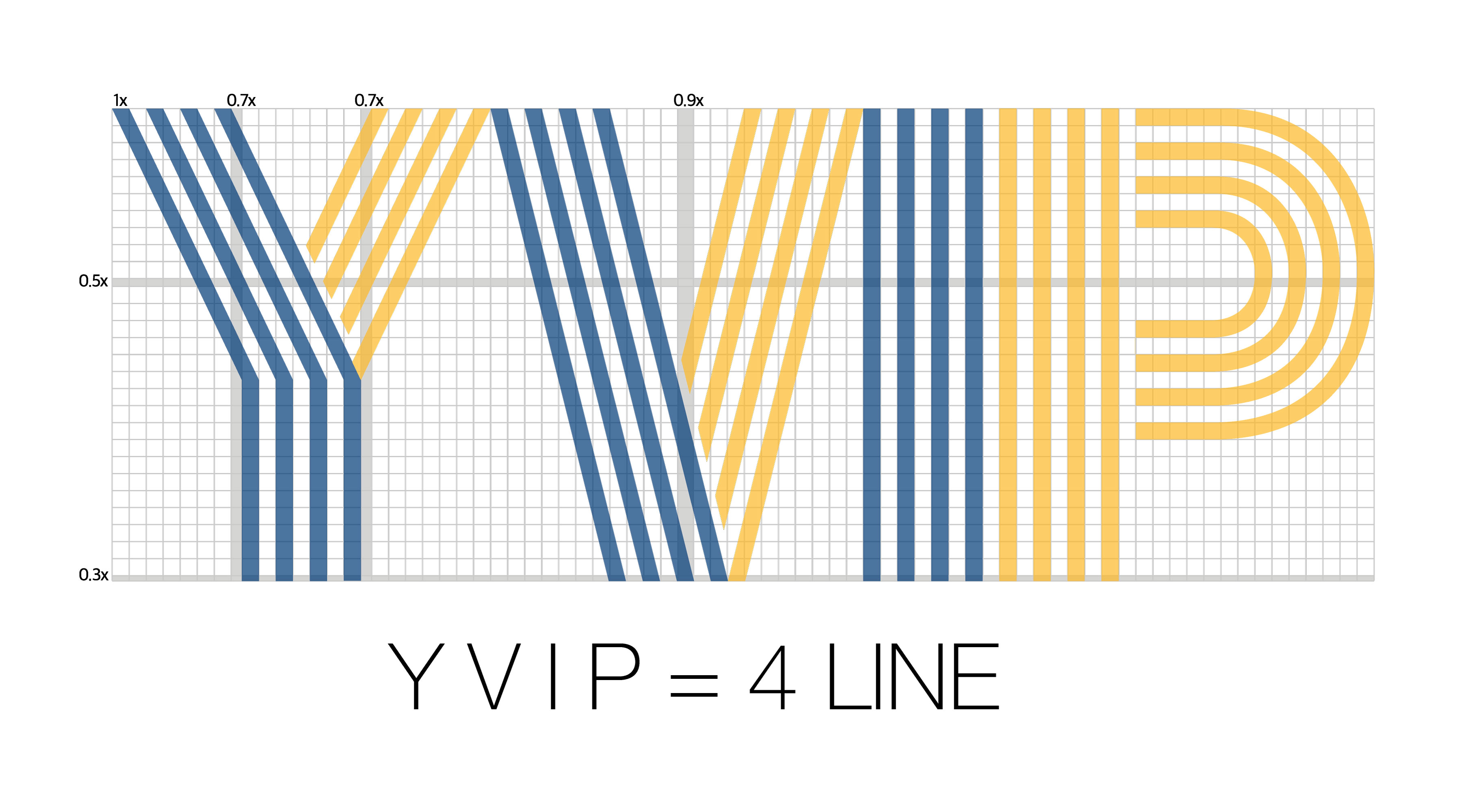
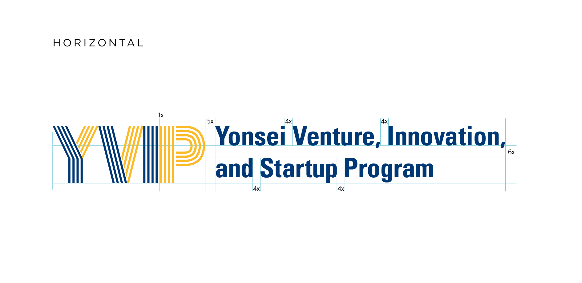
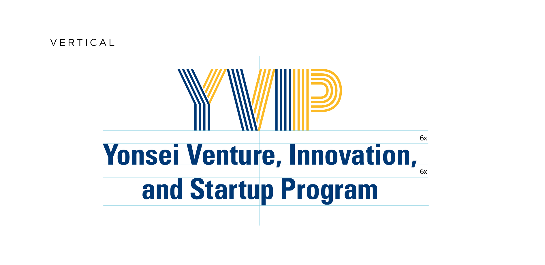
6Is there a specific reason for using four lines?
The name “YVIP” itself is unique and it can even serve as a symbol; we developed a logo with the name so that the name alone can resonate to its target audience. The four letters in “YVIP” became four lines, and we conveyed a sense of innovation and the rise of YVIP with the four striped alphabet letters.
7How did you bring the Yonsei identity to this project?
We wanted to create a unified look through signature, emblem, poster, and signboard so that members can feel more involved and confident. There are two types of YVIP signature; one is wide and the other is long. The emblem consists of the four striped alphabet letters of its brand identity, and it can be utilized as a watermark or a graphic pattern.
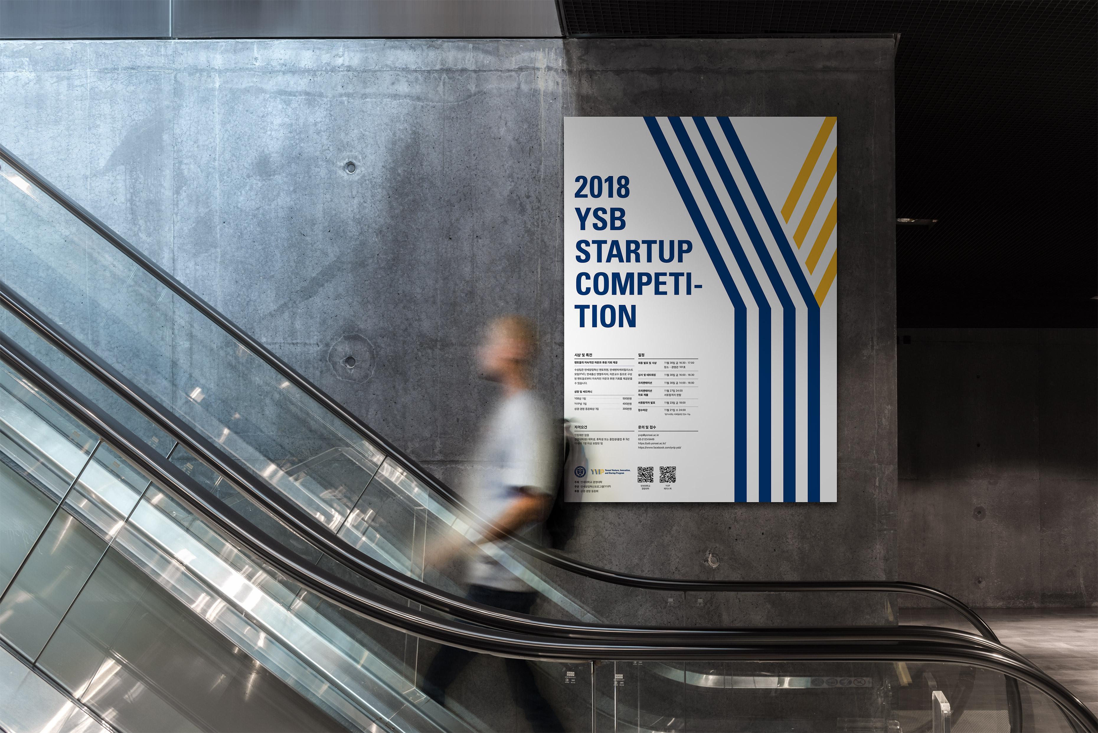
8How did YVIP grow further after the project?
After building the brand identity, we designed a poster for 2018 YSB Startup Competition. While coming up with draft ideas, we thought about what should be emphasized in the poster. The members of HOHOHO were unsure whether to focus on YVIP itself or on students and make the event more playful.
In the end, the poster with rather conservative design was selected among many options since it was the first time to hold the competition after building the brand identity. At the same time, we saw how the YVIP brand value increased after promotion and marketing activities with the new YVIP brand identity. Subsequently, a number of startups have emerged from YVIP.